PXGEN
UI/UX


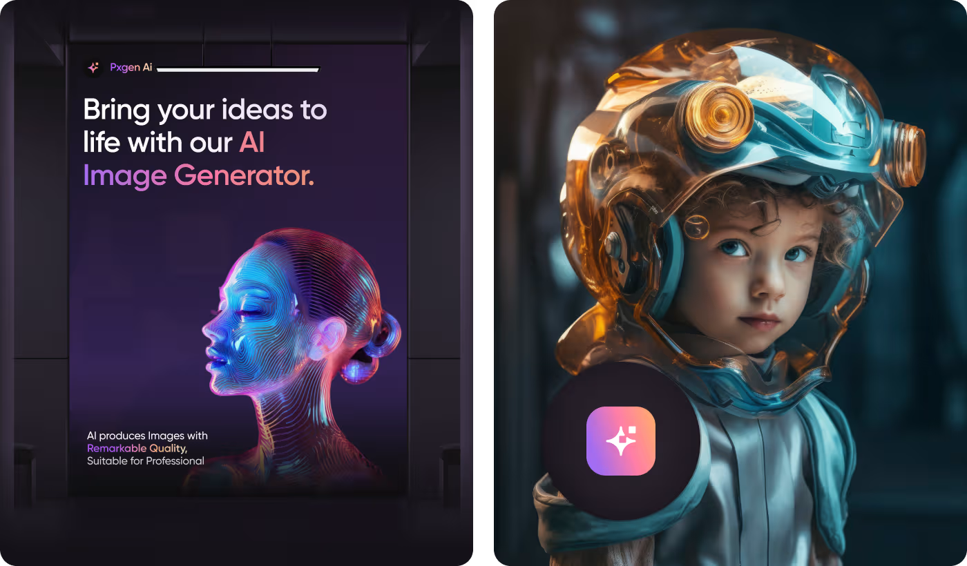
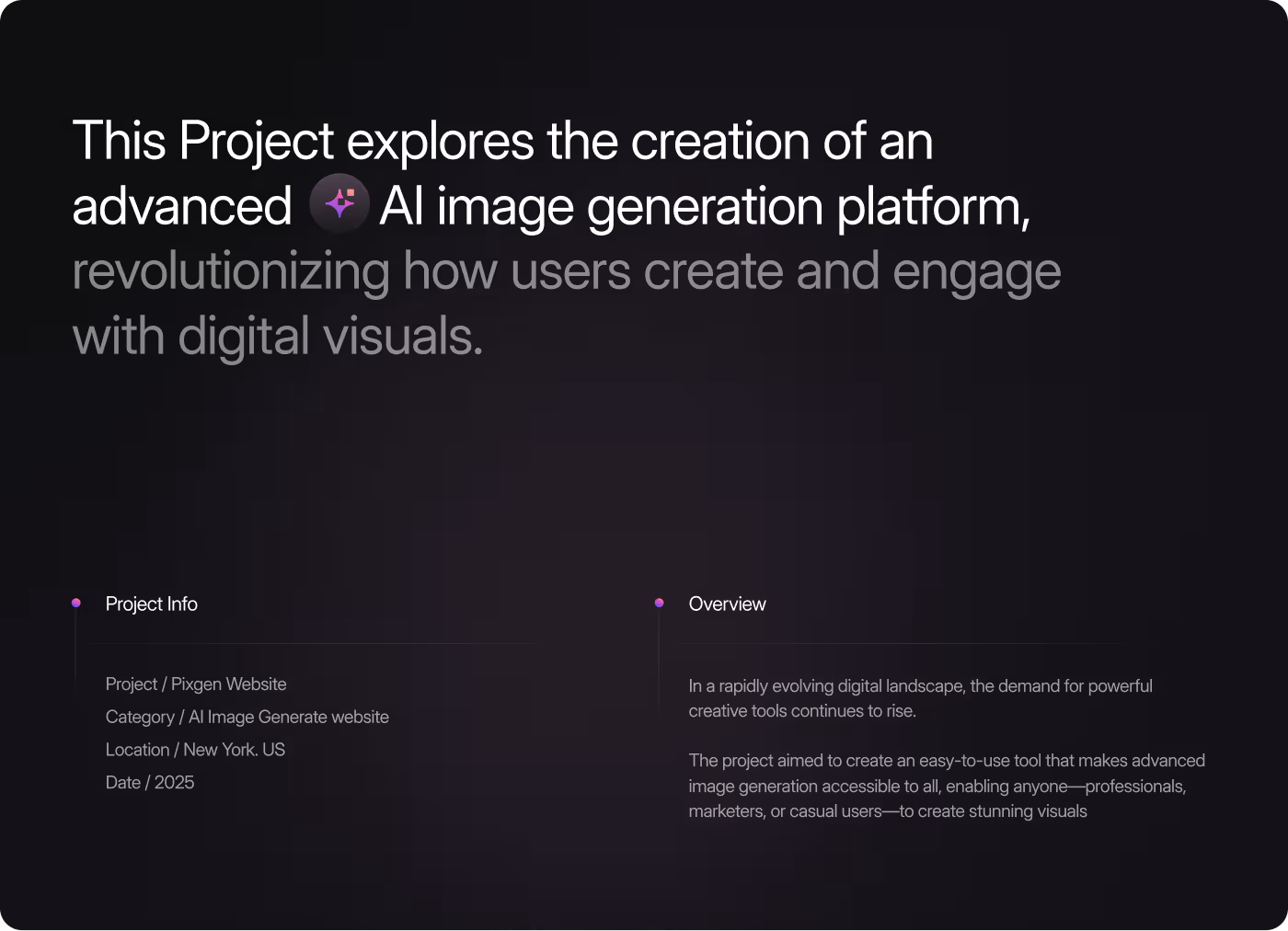
PXGEN is an AI-powered image generation platform that creates images from text descriptions.
The project focused on making the website easy to understand, showing what the tool can do upfront, and helping users go from landing on the site to actually generating an image without confusion.
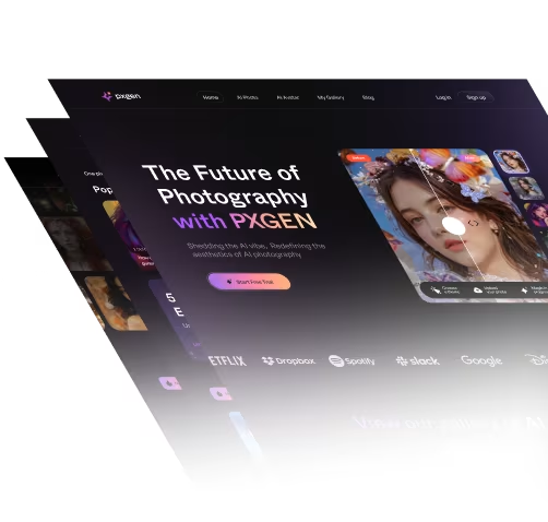
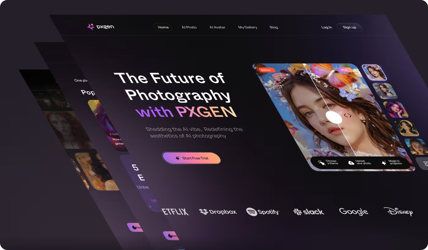
Our task was to design PXGEN's website so that anyone could understand what the platform does and start generating images. Users needed a clear way to enter prompts, see results, and buy credits. At the same time, the site had to handle promotional campaigns without making the experience feel messy.
PROBLEM
Making AI Image Generation Easier to Understand and Use
The biggest challenge was helping first-time users quickly understand what PXGEN does and making the AI image generation experience feel simple instead of confusing.
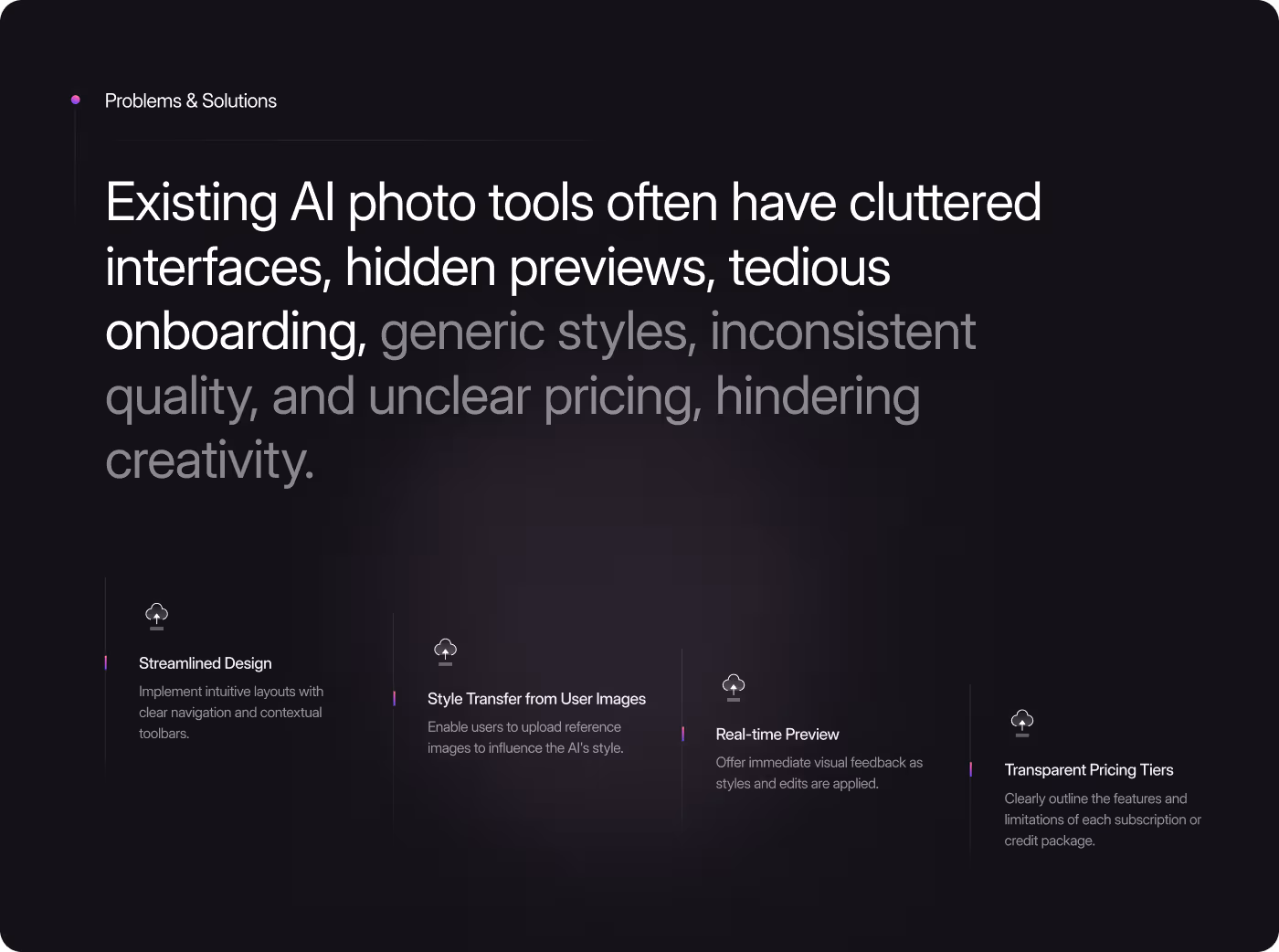
- Unclear Product Purpose: Many users could not immediately understand what the platform actually does after landing on the website.
- Complicated Generator Experience: Too many controls and settings made the image generation process feel overwhelming for beginners.
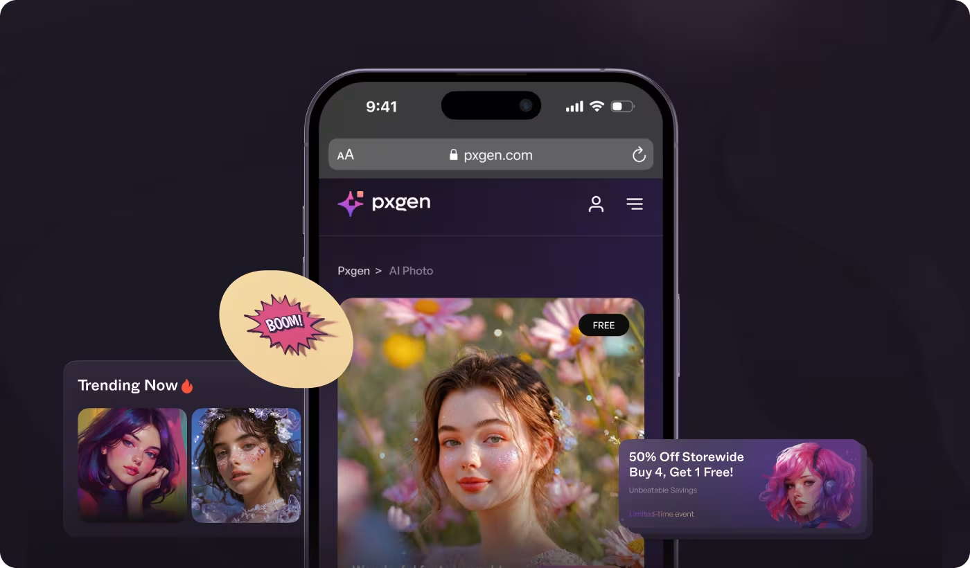
- Disconnected Promotions: Credit offers and promotional sections felt separated from the main product experience.
- Inconsistent Visual Style: Different pages used different layouts and styles, making the platform feel less connected overall.
SOLUTION
Creating a Simpler and More Visual AI Experience
The platform was redesigned to help users understand AI image generation faster, navigate the experience more easily, and interact with the product without feeling overwhelmed.
- Clearer Homepage Experience: The landing page was redesigned to show generated images first so users could instantly understand the product.
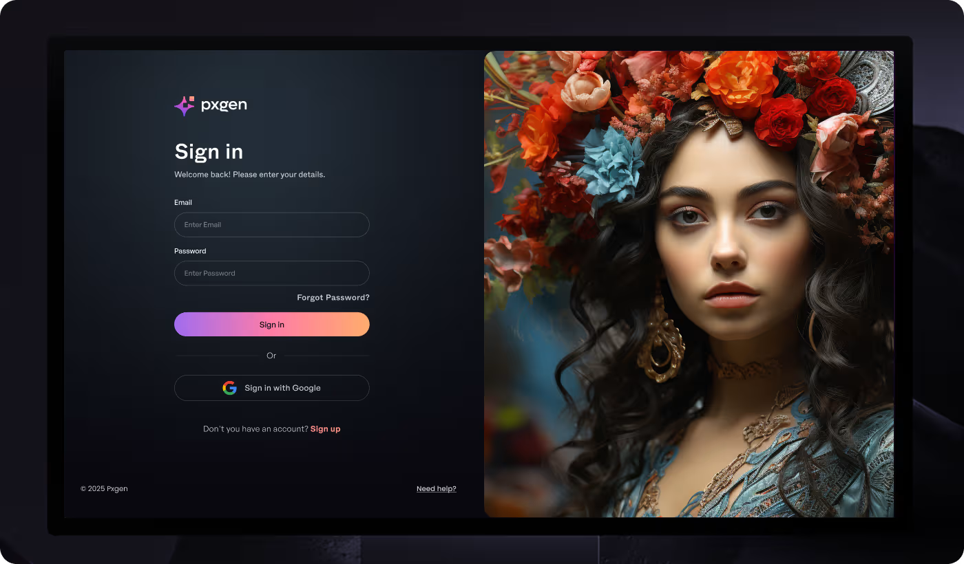
- Simplified Generator Flow: The image generator was rebuilt with a cleaner layout and fewer visible controls for first-time users.
- Connected Promotional Experience: Credit offers and promotional sections were integrated more naturally into the overall platform flow.
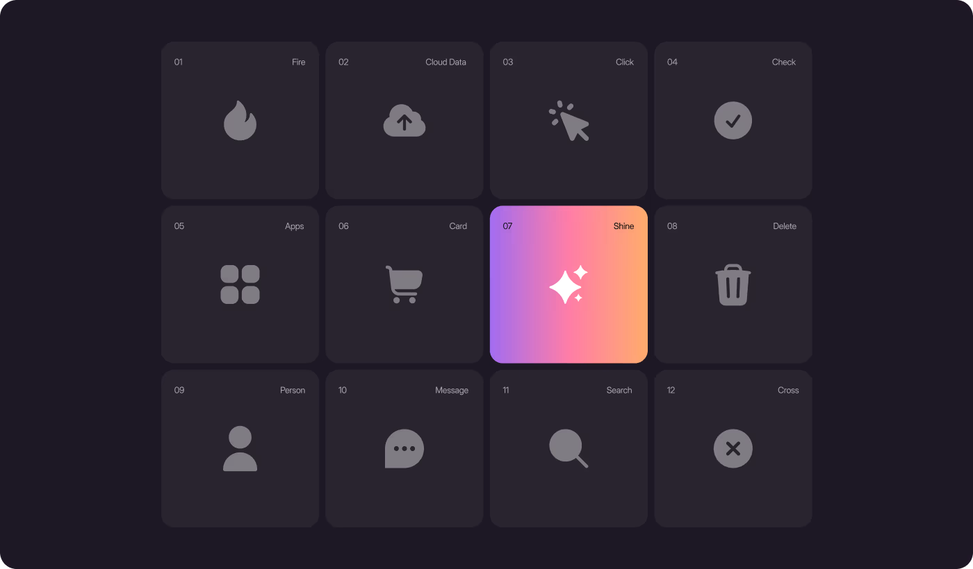
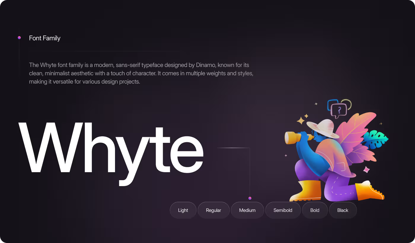
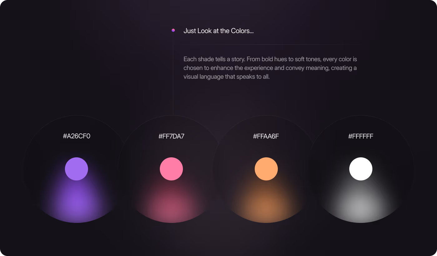
- Unified Visual System: A consistent design system was created using shared colors, typography, layouts, and UI components across the platform.

PROCESS
Designing a Clearer and More User-Friendly AI Platform
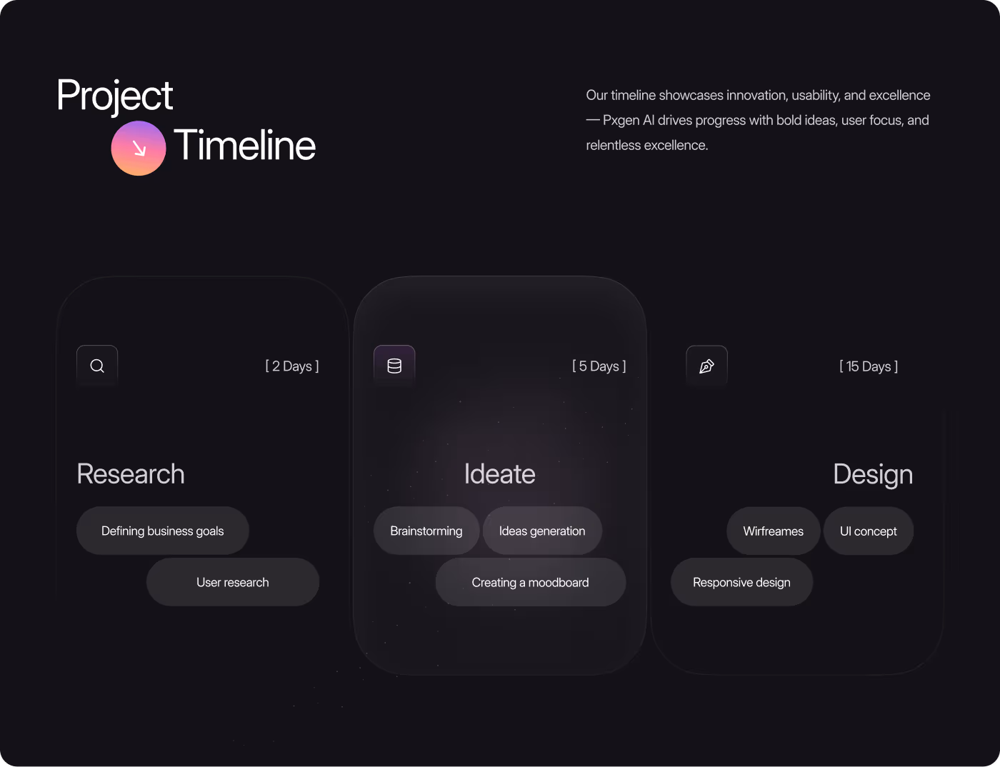
The project focused on simplifying the user journey, improving visual clarity, and creating a more connected experience across the entire platform.
01
Discovery
- User behavior review
- Homepage analysis
- Generator flow
- Navigation issues
02
Experience Planning
- Simpler user flow
- Clearer hierarchy
- Reduced clutter
- Guided interactions
03
Visual System
- Dark UI system
- Shared components
- Typography styling
- Color consistency
04
Refinement
- Mobile optimization
- UI polishing
- Smoother interactions
- Experience consistency

RESULTS & OUTCOMES
Outcome
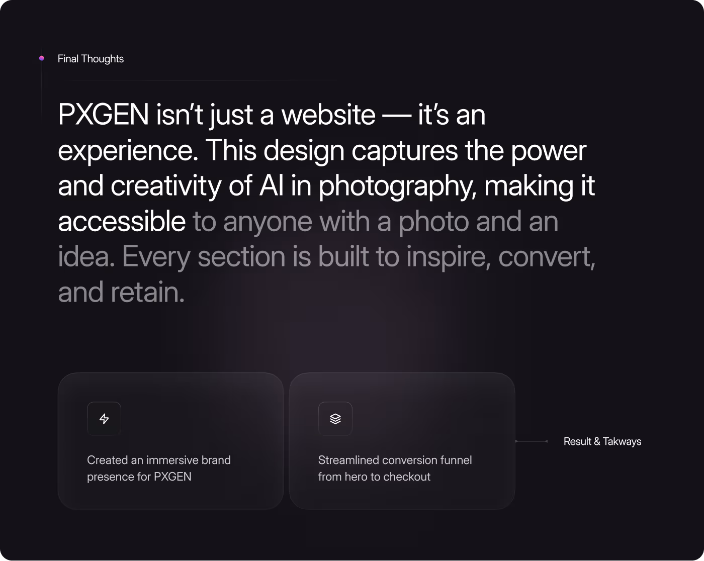
The changes made PXGEN easier to understand and use. Users could see what the tool does right away, try the generator without confusion, and move between creating and buying credits smoothly.
- More users reached the generator from the homepage with fewer drop-offs
- First-time users spent more time on the generator page
- Promotional offers felt like part of the experience instead of something separate
- New pages could be built faster using the design system
- The site looked and felt like a finished product