Cardboard Stage
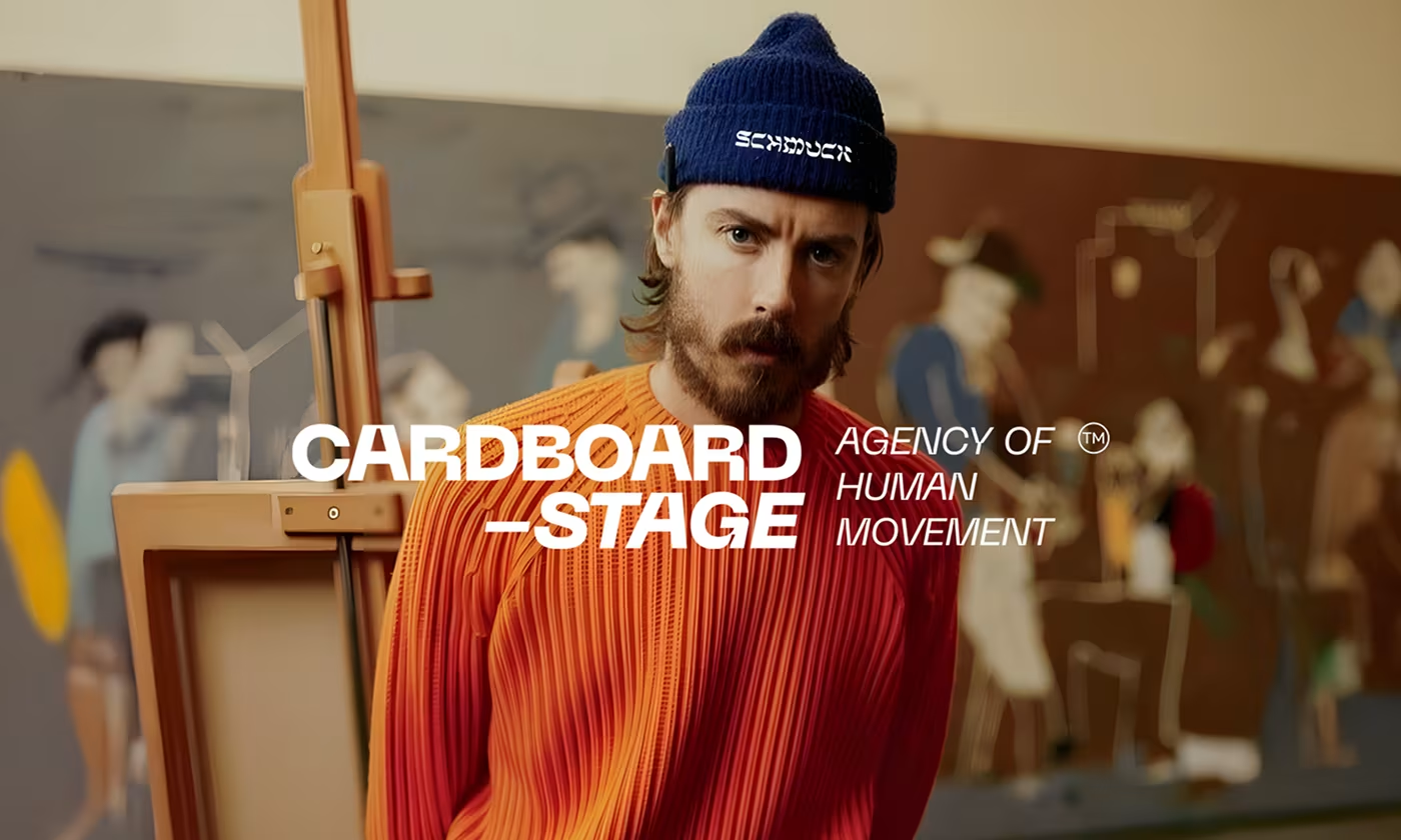
Cardboard Stage is an agency focused on human movement.
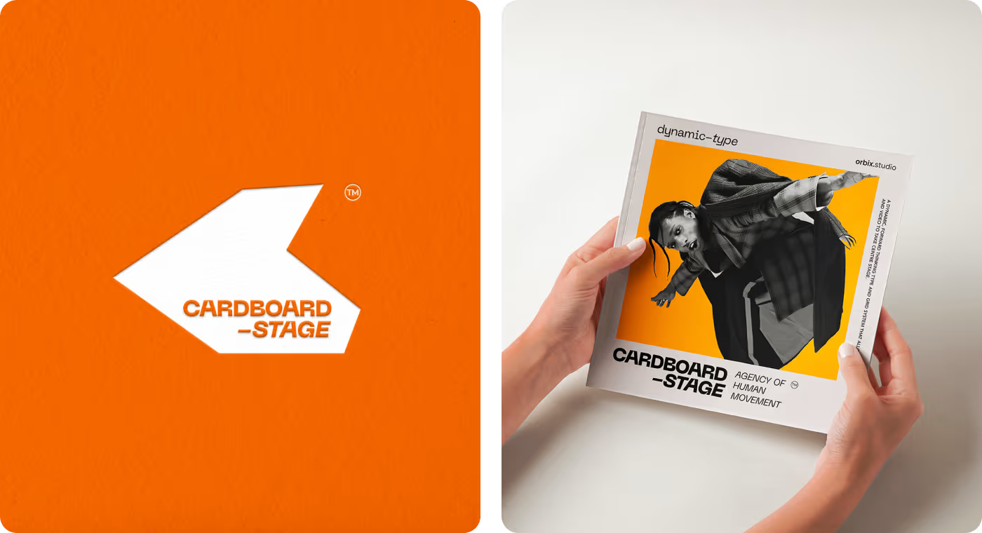
The project focused on creating a brand identity that shows this off, using bold designs that are still easy to read across both physical items like custom boxes and digital screens like app stores.
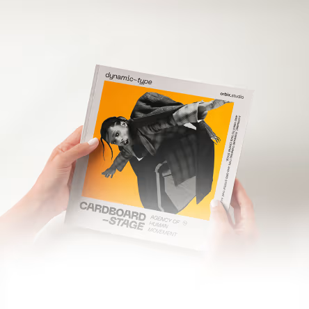
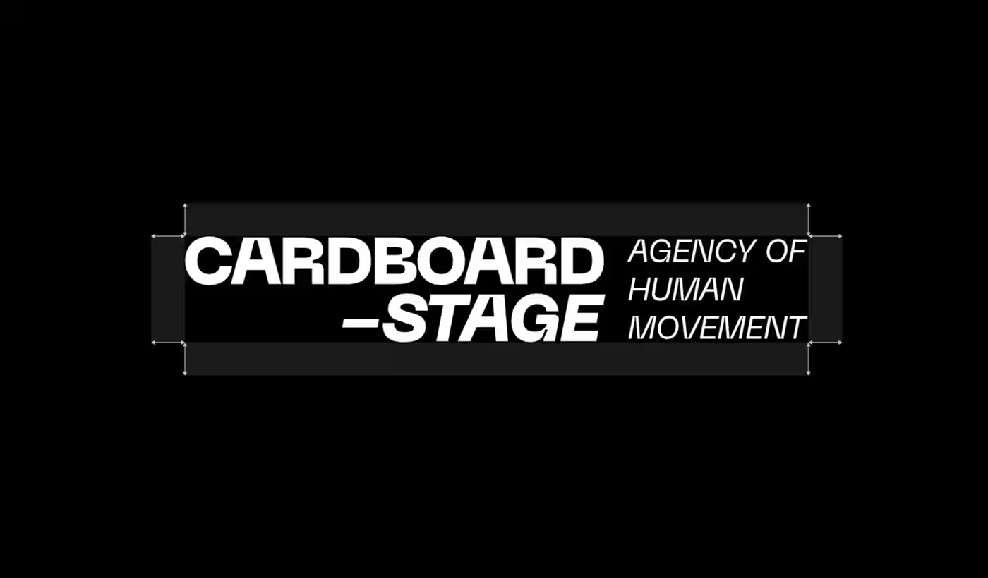
Our task was to build a complete visual identity for Cardboard Stage. The brand needed to clearly state its purpose as an "Agency of Human Movement." We had to design a system that felt active and alive, while remaining structured enough to be applied consistently across different materials by the OrbitVex. team.
PROBLEM
Capturing raw movement without making layouts messy
When you try to show high-energy human movement in a still design, things usually get chaotic quickly or end up looking completely stiff.
- Layouts that feel completely dead: making a design too rigid kills the energy of the movement, but going too loose just creates visual chaos.
- Branding that smothers the content: heavy logos and graphics often get in the way of high-energy photography instead of letting the imagery do the talking.
- Inconsistent scaling across mediums: design choices didn't translate cleanly between large physical print assets and small digital mobile screens.
- Missing a foundational system: without clear design rules, creating new assets meant guessing, which hurts long-term brand consistency.
SOLUTION
Framing high-energy movement with a rigid grid
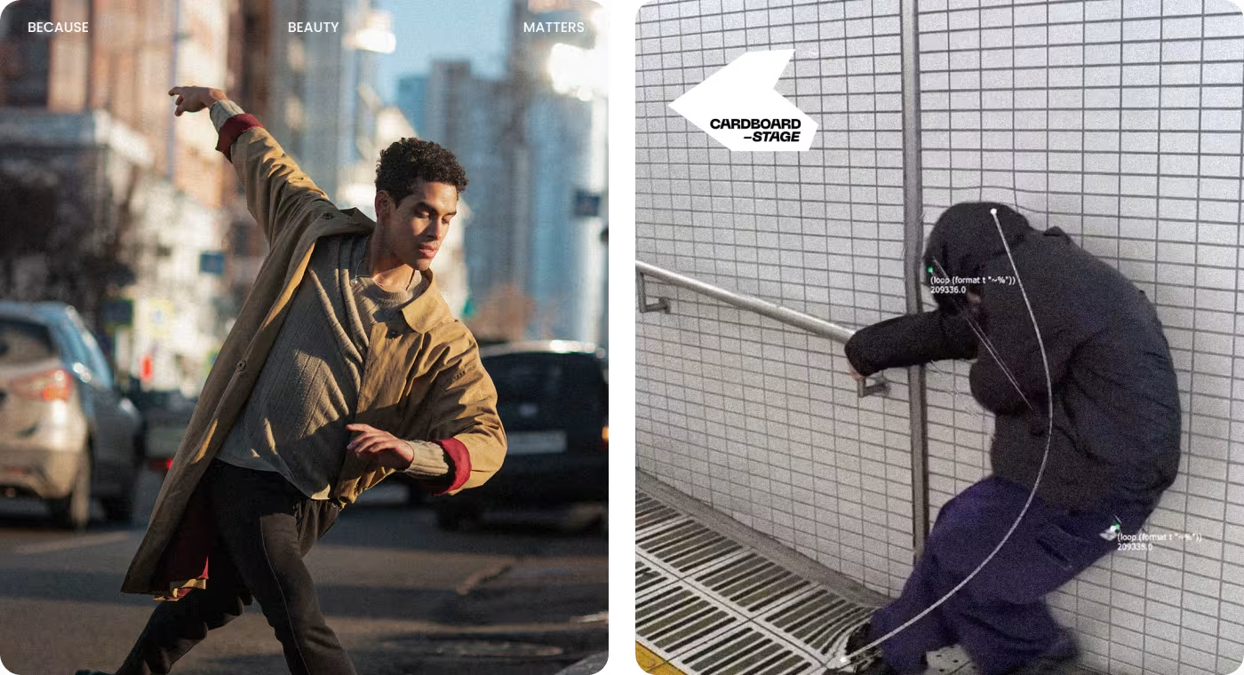
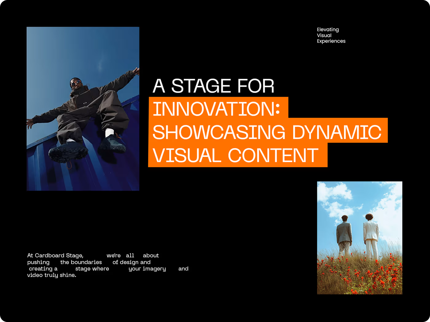
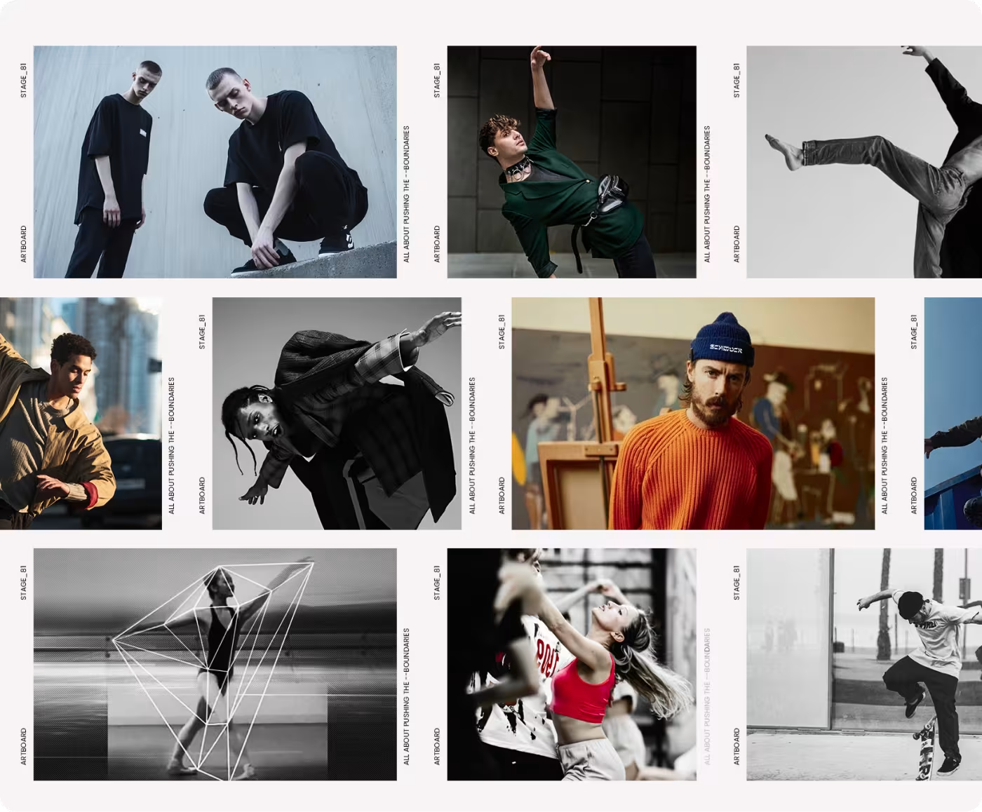
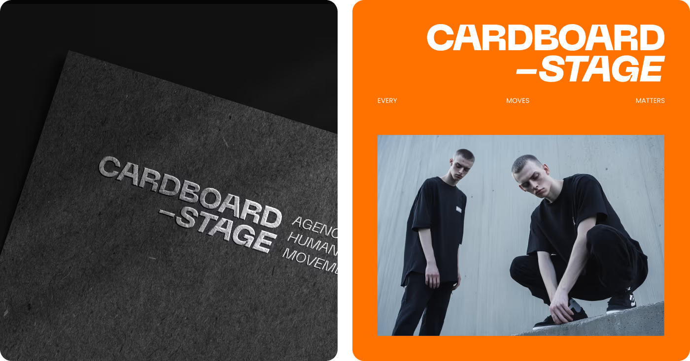
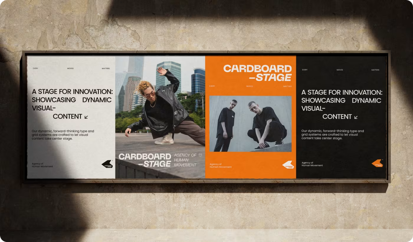
We built a clean, high-contrast visual framework that acts like a physical stage, giving the dynamic photography room to breathe while keeping layouts perfectly structured.
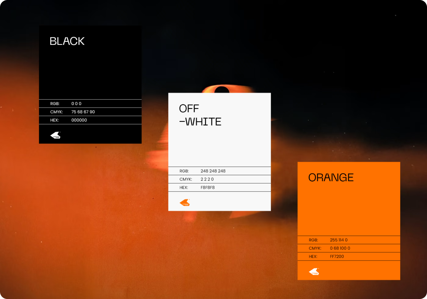
- Strict three-color palette: restricting the colors to black, off-white, and a high-visibility orange to eliminate visual clutter and spotlight the photography.
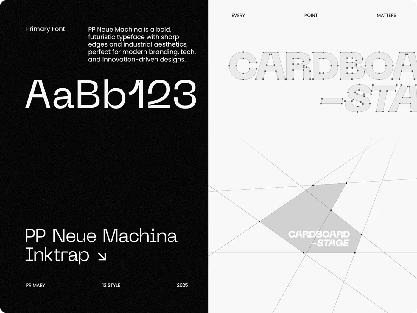
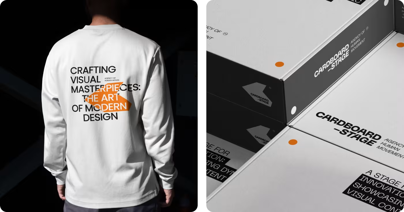
- Industrial typography and lines: using bold, sharp typefaces and geometric shapes to create a satisfying visual contrast against organic human movement.
- Scalable layout rules: establishing a solid grid system that translates seamlessly from large physical print assets to digital app store previews.
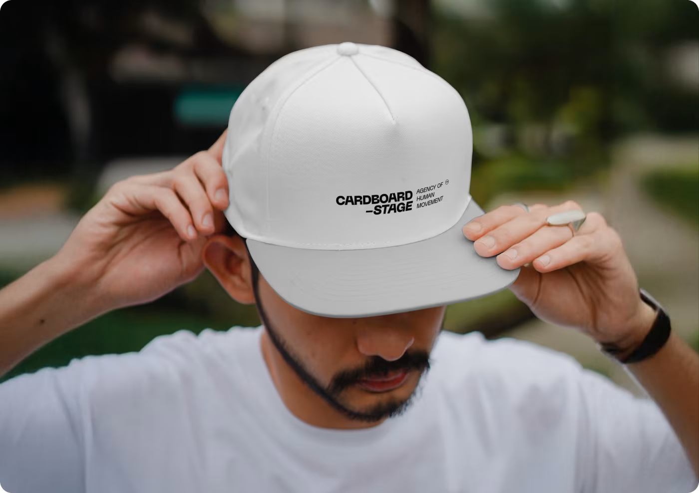
- Action-first design assets: building out real-world applications where the branding elements frame the subjects rather than crowding the page.
PROCESS
Turning unpredictable human action into Organized design patterns
We broke our design workflow into four practical stages to ensure the brand stays incredibly dynamic without losing its organizational grid.
01
Brand Strategy
- Brand positioning
- Human movement focus
- Real-world photography
- Storytelling direction
02
Visual Identity
- Three-color palette
- Vivid orange spotlighting
- High-contrast elements
- Asset reduction
03
Typography & Layout
- PP Neue Machina font
- Industrial aesthetics
- Geometric wireframes
- Visual tension layout
04
Application Design
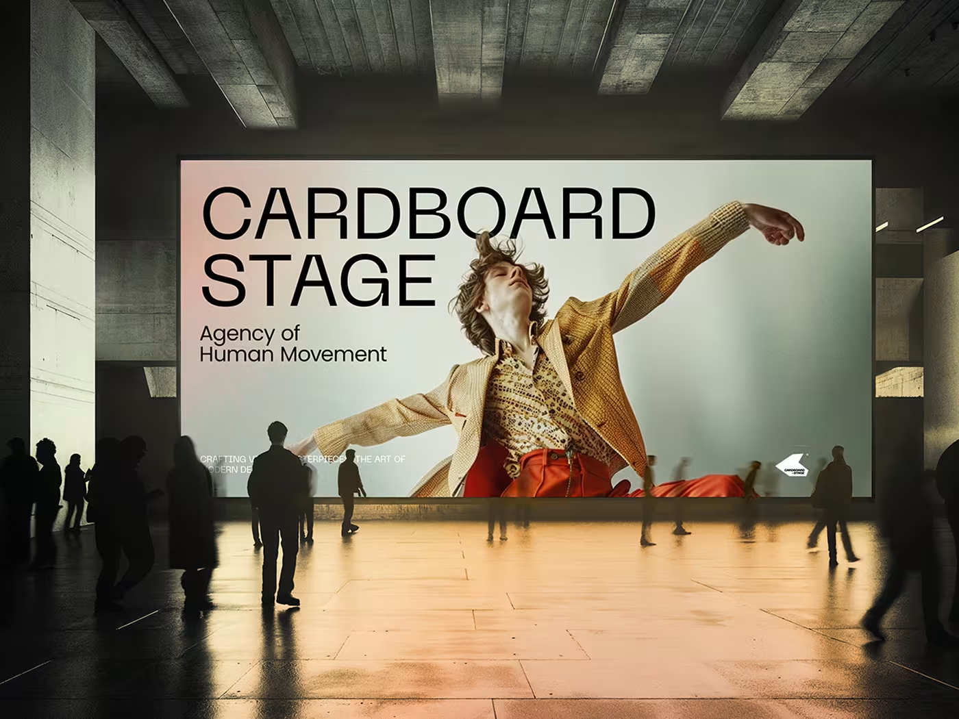
- Large billboard layouts
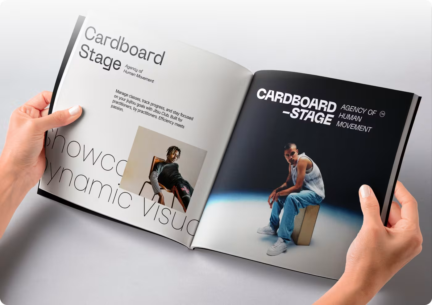
- Magazine print spreads
- App Store interface
- Grid system validation
RESEARCH
Figuring out how to balance movement with readability
We looked closely at how action photos behave in different layouts to see exactly where traditional branding gets in the way.
- The static image trap: we found that trying to mimic motion with complex graphics usually creates a massive visual mess, while standard rigid grids make the photos feel completely flat.
- Graphic clutter over photography: studying typical creative layouts showed that heavy logos and loud visual elements routinely smother high-energy imagery instead of supporting it.
- The physical-to-digital gap: we analyzed how assets perform across mediums, noting that designs built for a physical box or giant billboard often break down when shrunk onto a mobile screen.
- System friction for internal teams: we realized that without a highly restricted foundation, creators struggle to maintain brand consistency when pushing out new content quickly.
Services
Building a high-contrast visual toolkit that grounds raw motion
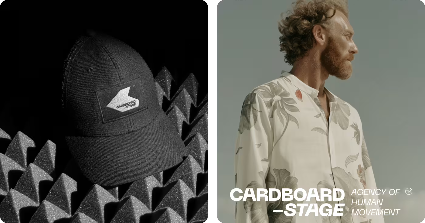
The identity relies on extreme contrast to balance out the fluid, unpredictable nature of human movement. By locking in a strict three-color palette - black, off-white, and a vivid orange - the design elements actively step back and act as a structural frame.
This restraint allows the high-energy photography to carry the brand's narrative without getting buried under unnecessary graphic noise.
Services
Stress-testing the framework across physical layouts and mobile screens
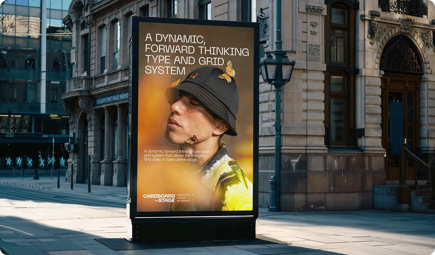
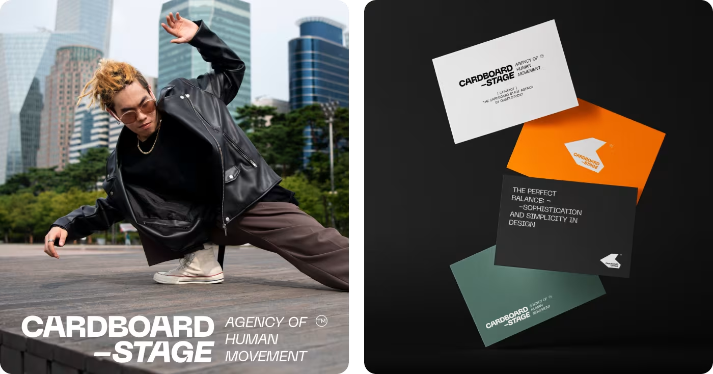
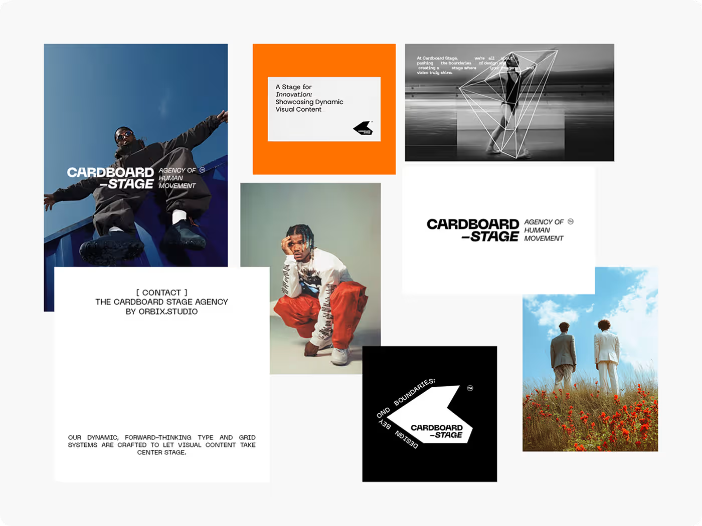
A design system is only as good as its real-world execution. The application phase focused on stretching the visual rules across completely different mediums to ensure total scalability.
The exact same grid and alignment principles used for a large outdoor billboard scale down seamlessly to format the editorial layouts of a printed magazine, proving the rules hold up under any layout constraint.
RESULTS & OUTCOMES
Moving from a messy puzzle to a clear layout playbook
Everything finally clicked into place because we replaced confusing guesswork with clear, simple design rules. Now, the brand looks cohesive and professional whether it is printed on a physical box or opened on a mobile phone screen.
- Single playbook for everything: the team can now roll out large physical billboards and digital app layouts using the exact same grid setup.
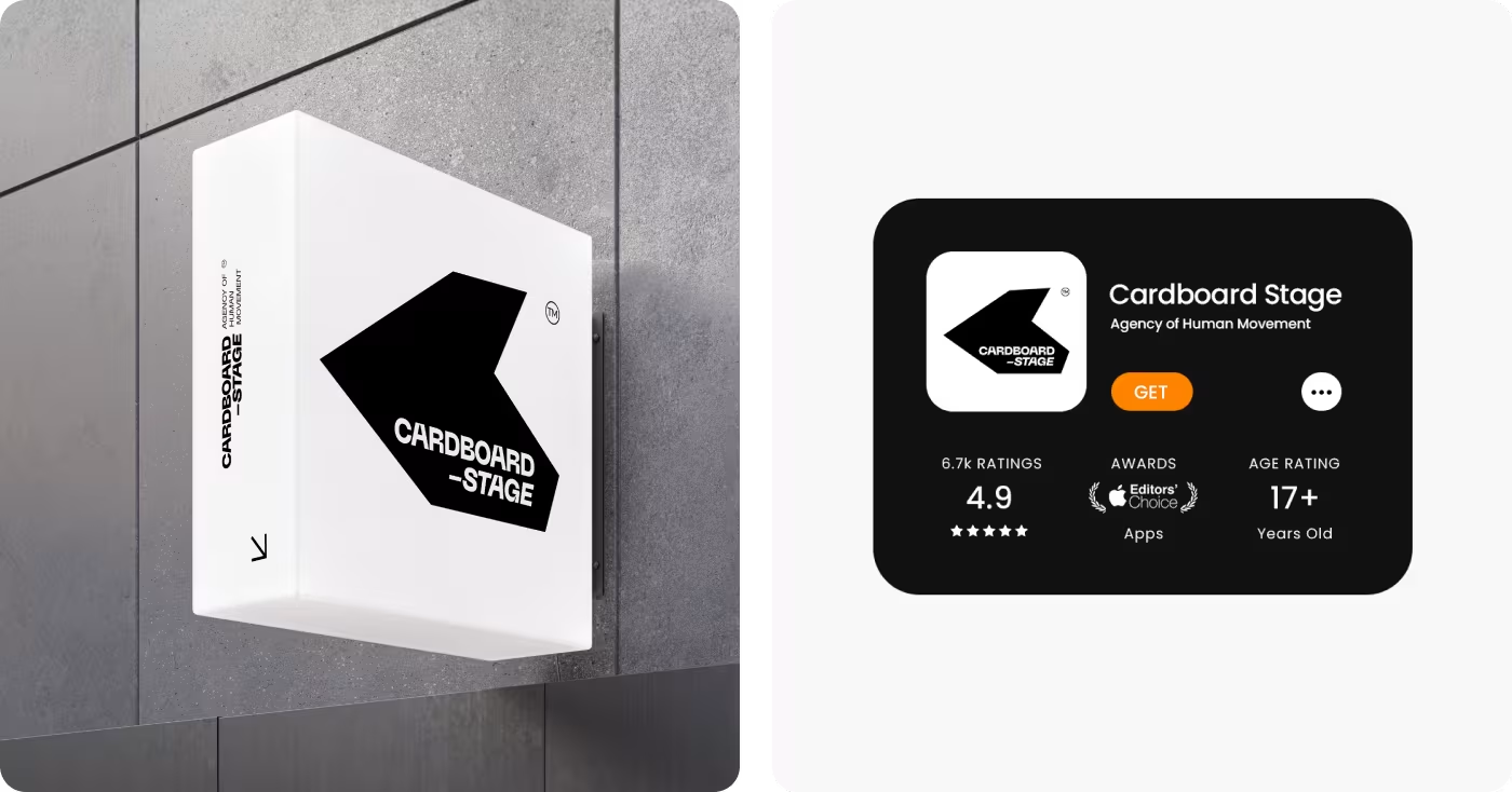
- A trusted mobile presence: the clean new interface successfully launched on the App Store, showcasing a 4.9-star rating backed by over 6.7k user reviews.
- High contrast, better reading: locking down a strict 3-color palette instantly made the text easier to read while highlighting the action photography.