Furmate
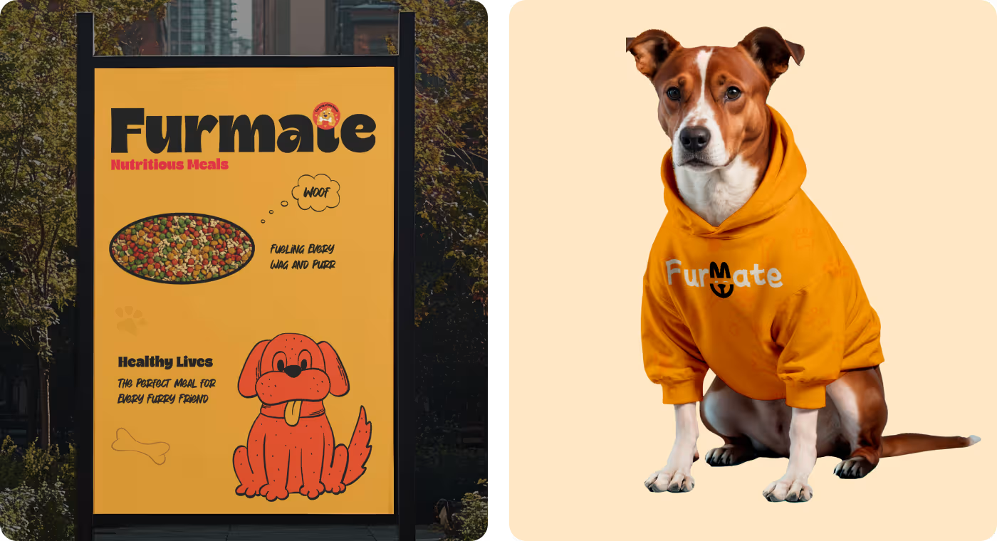
Furmate is a comprehensive visual identity system designed for a pet food company aiming to stand out through charm and warmth.
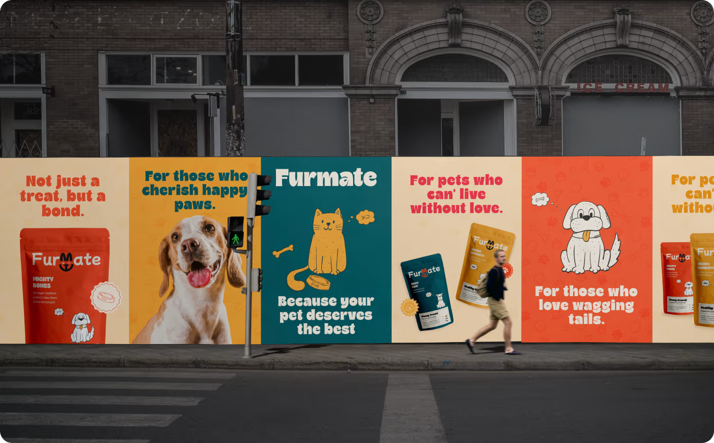
The project centered on building a cohesive design language that communicates pet health and happiness, stretching from physical product packaging and merchandise to a digital mobile app and large-scale outdoor advertising.
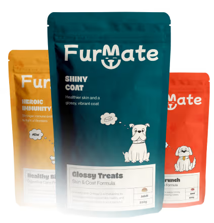
The objective was to establish a distinct, memorable presence for Furmate in a crowded market. We needed to create a design system that felt highly approachable to pet parents, clearly communicated the brand's focus on nutritious meals from a small kibble bag to a delivery van.
PROBLEM
Pet food aisles look super boring
When you walk down the pet food aisle, most boxes and bags look like boring medicine bottles or use the exact same fake stock photos. Furmate wanted to show they make healthy food that makes pets happy, but they didn't know how to stand out.
- Boring Packages: Most pet foods look cold and sterile instead of tasty and fun.
- No Unique Look: The brand didn't have a special visual style to show "happy pets".
- The Screen Split: Their physical food bags didn't look anything like their mobile phone app.
- Vanishing Acts: It was tough to make a design that looks good on a tiny can and a giant truck.
SOLUTION
Cute drawings and happy colors that stand out
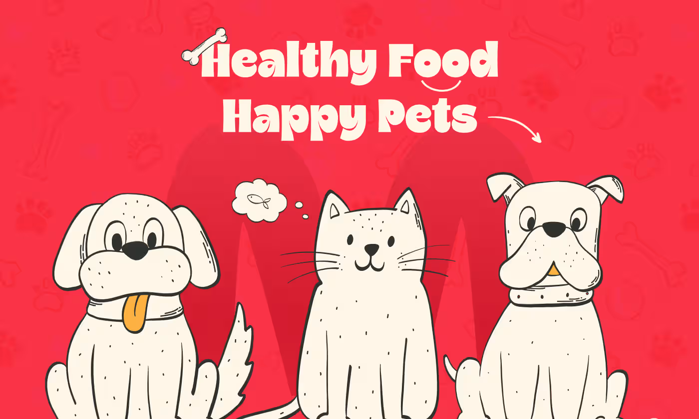
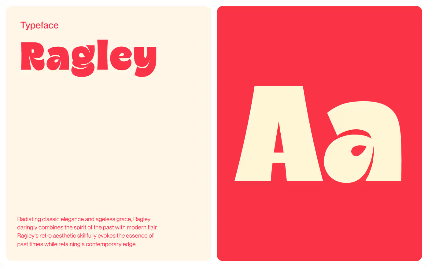
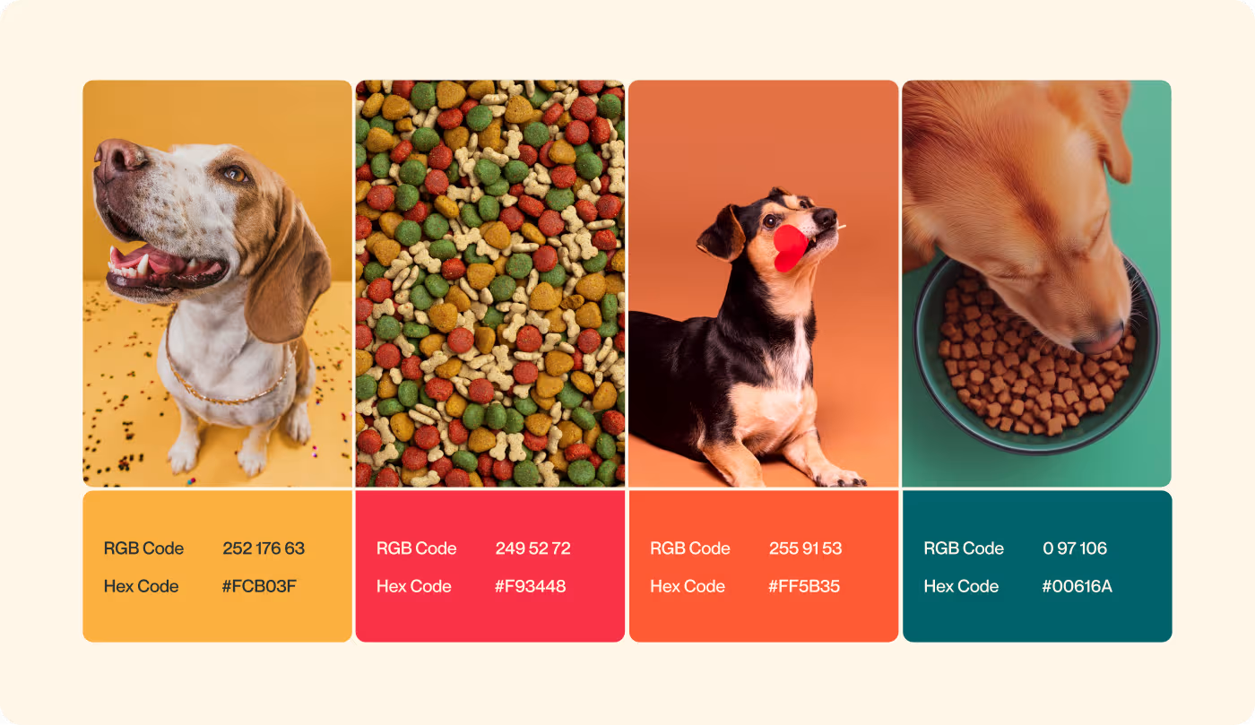
We threw out the boring charts and drew cute, friendly cats and dogs by hand. Then, we used bright orange and trusted blue colors to catch people's eyes instantly and make them smile.
- Friendly Cartoons: Hand-drawn pets make the brand feel warm, loving, and trustworthy.
- Popping Colors: Happy orange and blue stop shoppers in their tracks.
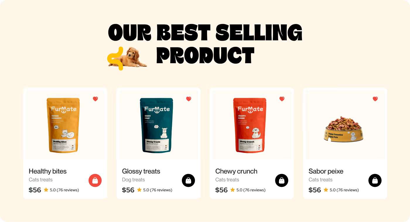
- Fun Food Bags: Made packages that lead with personality so they pop on retail shelves.
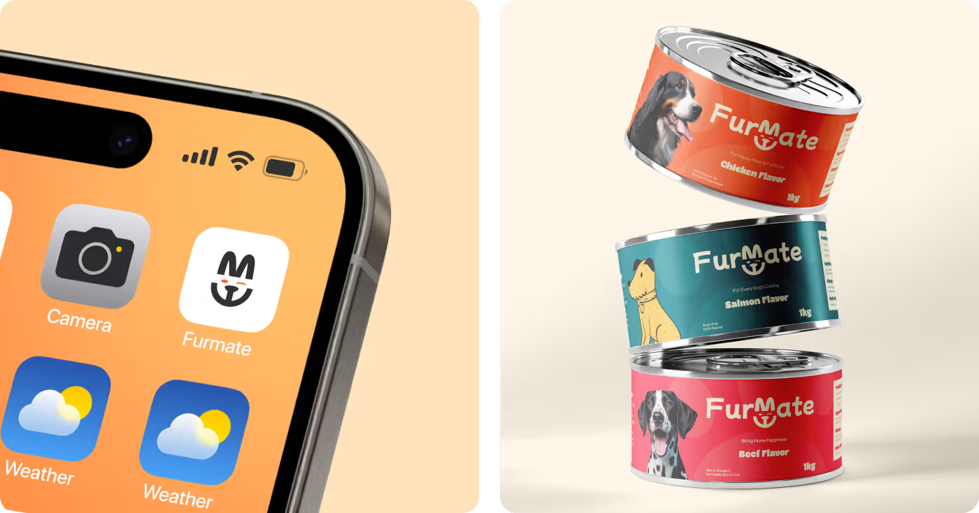
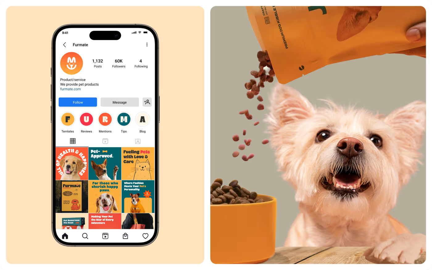
- Matching App: Brought cute cartoons into the phone screen so ordering food feels like a game.
PROCESS
A user-centered design process
We followed a clear, user-first method to make sure the entire shopping journey is simple, clear, and gives buyers confidence.
01
Research & Discovery
- Running user research
- Analyzing buyer behavior
- Creating customer profiles (personas)
- Pinpointing exact user needs
02
IA & Flows
- Building the information architecture
- Mapping out smooth user flows
- Drawing basic screen outlines (wireframes)
- Planning clear navigation logic
03
UI & Interaction Design
- Creating the user interface (UI design)
- Setting up a clear visual hierarchy
- Designing buttons and active interaction states
- Refining layouts through continuous iteration
04
Usability Testing
- Conducting real usability testing
- Building fast feedback loops
- Validating user steps and app flows
- Polishing through final UX iteration
RESEARCH
Learning what pet owners actually look at
We watched how pet parents shop in real stores. We learned that people ignore big walls of technical text, but their eyes slide right to happy, smiling animals.
Similar to the clean layout rules, this research helped us remove all the messy clutter. We replaced boring health data with giant drawings and big headers, making it incredibly easy for busy parents to trust the food instantly.
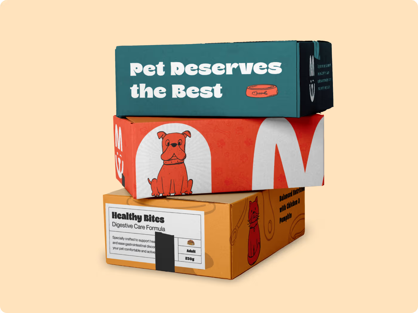
Services
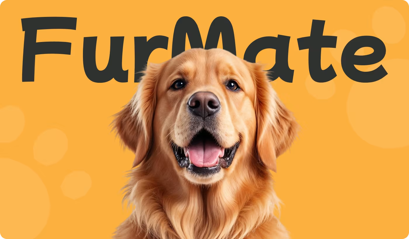
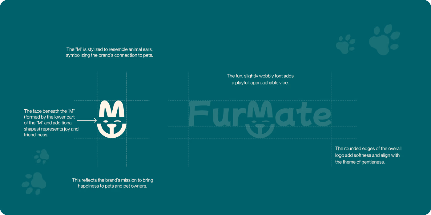
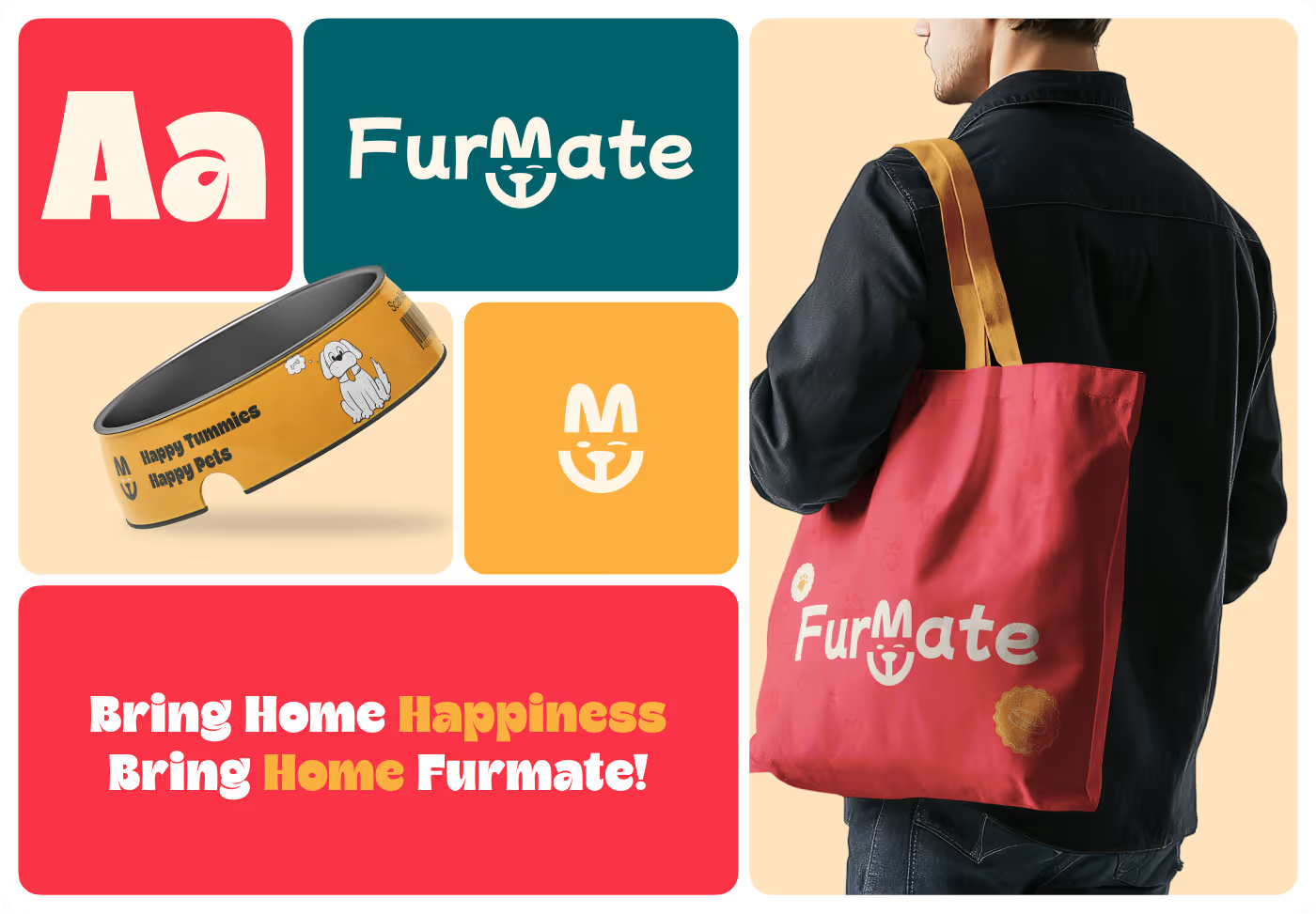
Brand Identity: Friendly cartoons and happy text
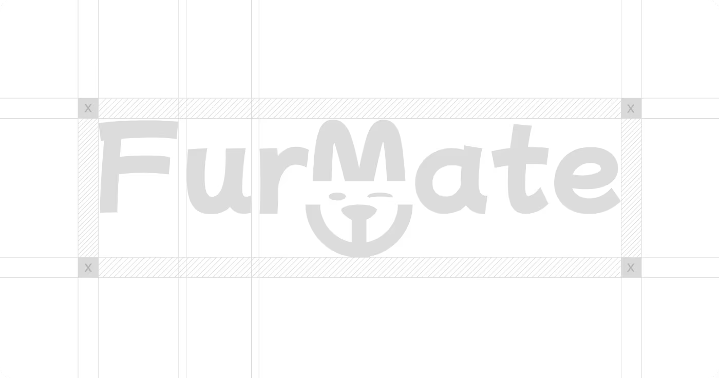
We made a warm logo and hand-drawn pets to make the brand feel like a real friend to your animal.
The master look uses a thick, friendly logo font right above our custom pet drawings. It clearly spells out "Healthy Food, Happy Pets" so you know exactly what the company stands for without guessing.
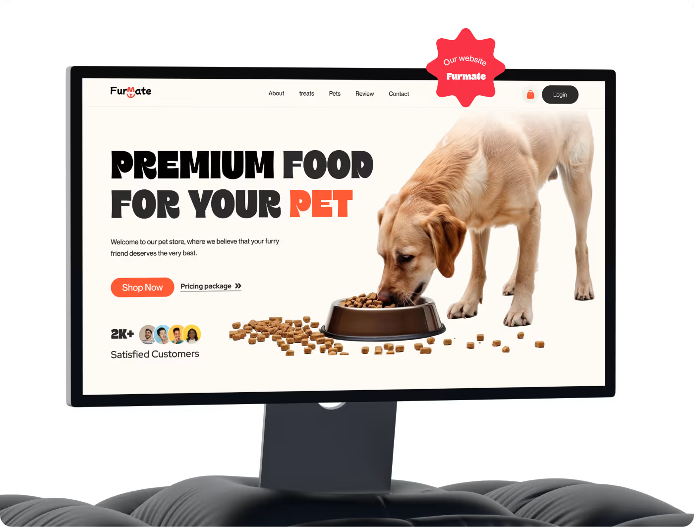
Services
Packaging Design: Bright bags and cans that pop
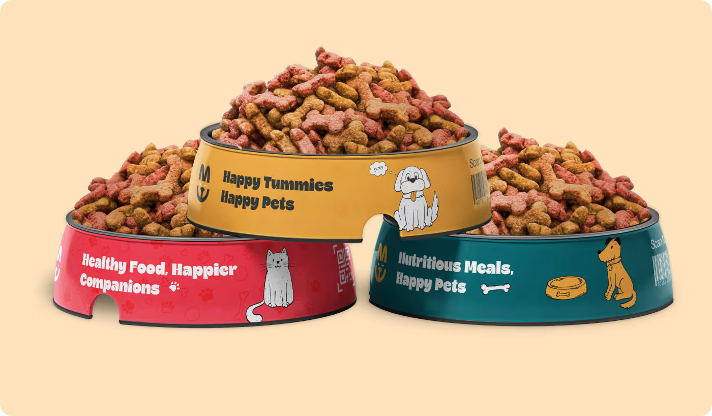
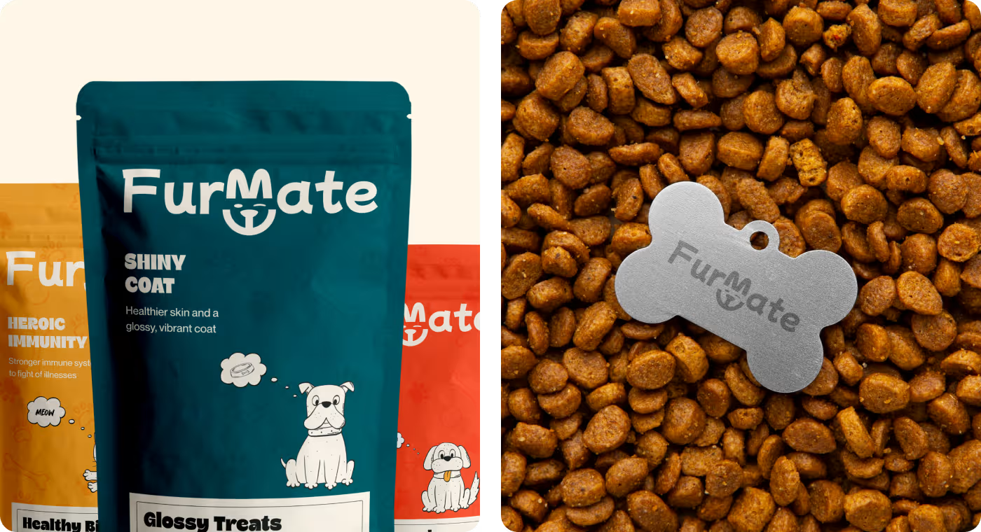
We put our cartoon characters right in the center of the packages so they jump off store shelves. This makes the food look exciting while keeping the important nutrition facts neat and easy to read.
- Bags: We used teal for "Shiny Coat" food and yellow for "Heroic Immunity" food so buyers can pick the right one in one second.
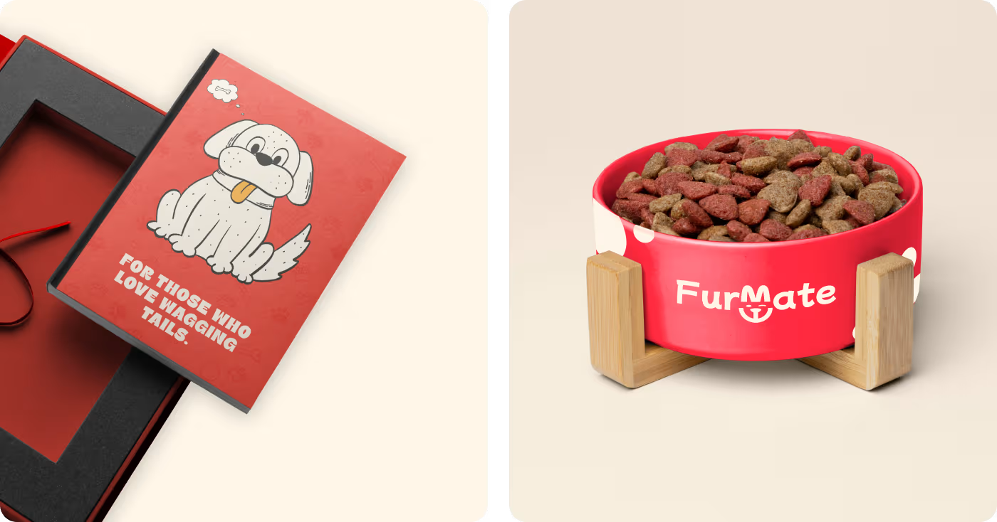
- Cans & Bowls: The bottom of the design shows how the exact same design scales down beautifully onto small tin cans (Chicken, Salmon, and Beef flavors) and matching red food bowls.
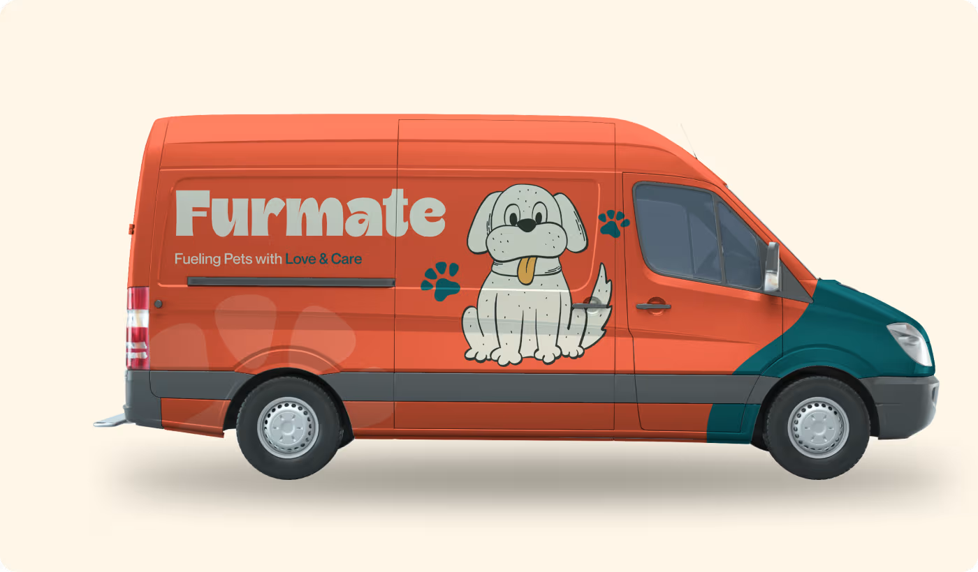
RESULTS & OUTCOMES
A lovable look that wins everywhere
Our final design toolkit gave Furmate a massive advantage for their big launch.
- Perfect Match: The physical food bags and the digital mobile app look exactly the same.
- Shelf Winners: The custom cartoons give the brand a warm, unbeatable presence in crowded stores.
- Street Famous: The giant dog drawing on the delivery van turns heads on the road.
- Easy Trust: Turned a boring "healthy food" message into a joyful look that pet owners love.