Trendly Fashion
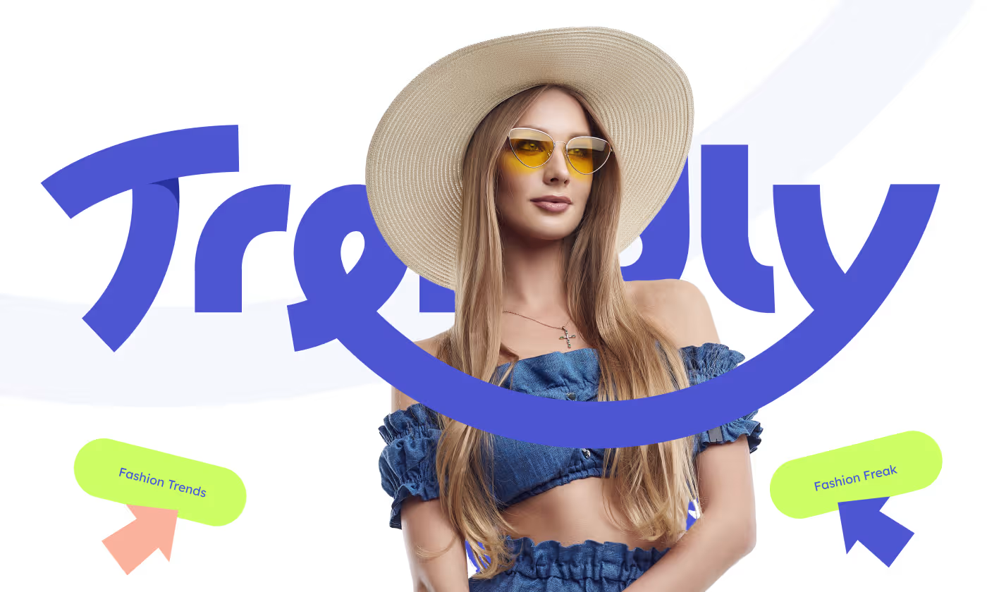
Trendly is a modern fashion brand focused on redefining the essence of style.
The project focused on giving the brand an identity that reflects elegance, creativity, and timeless traits. The visual system needed to work seamlessly across digital platforms, physical clothing tags, and out-of-home advertising.

Our task was to design a complete branding system for Trendly. The brand needed a clear visual language that could be applied to digital campaigns, social media, and physical items like clothing labels and shopping bags.
PROBLEM
Balancing immediate trends with long-term identity
Entering the apparel space requires an instant visual hook, but leaning too far into fleeting aesthetics risks early irrelevance. Trendly needed to establish an authoritative market presence that captures modern energy without losing a premium, enduring foundation.
- The Identity Paradox: Striking a delicate balance between high-energy "trendy" visuals and a "timeless" core to ensure the brand remains relevant across changing seasons.
- Fragmented Touchpoints: The lack of a cohesive, unified visual language bridging the gap between digital screen experiences and physical clothing tags.
- Production Cost Friction: Designing premium-feeling packaging assets and label collateral without triggering high manufacturing and production overheads.
- Saturated Social Channels: Cutting through intense digital noise on highly crowded social media feeds where consumer attention spans are minimal.
SOLUTION
A flexible, high-contrast design ecosystem
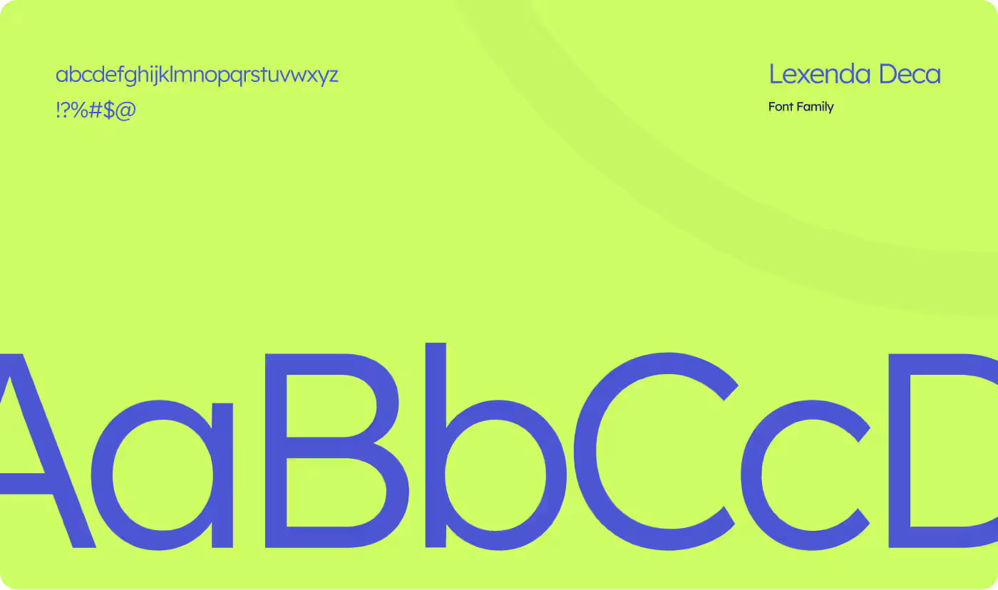
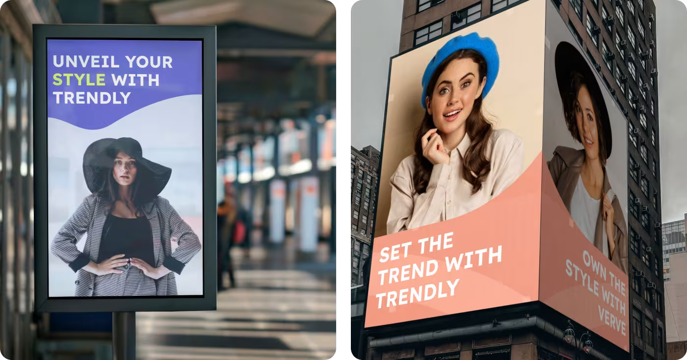
We built a comprehensive, scalable visual identity anchored by striking color combinations and clean, structured typography that adapts effortlessly from mobile screens to physical out-of-home installations.
- Strategic Minimalist Identity: Utilizing bold typography paired with expansive negative space, allowing high-end fashion imagery to remain the central focus.
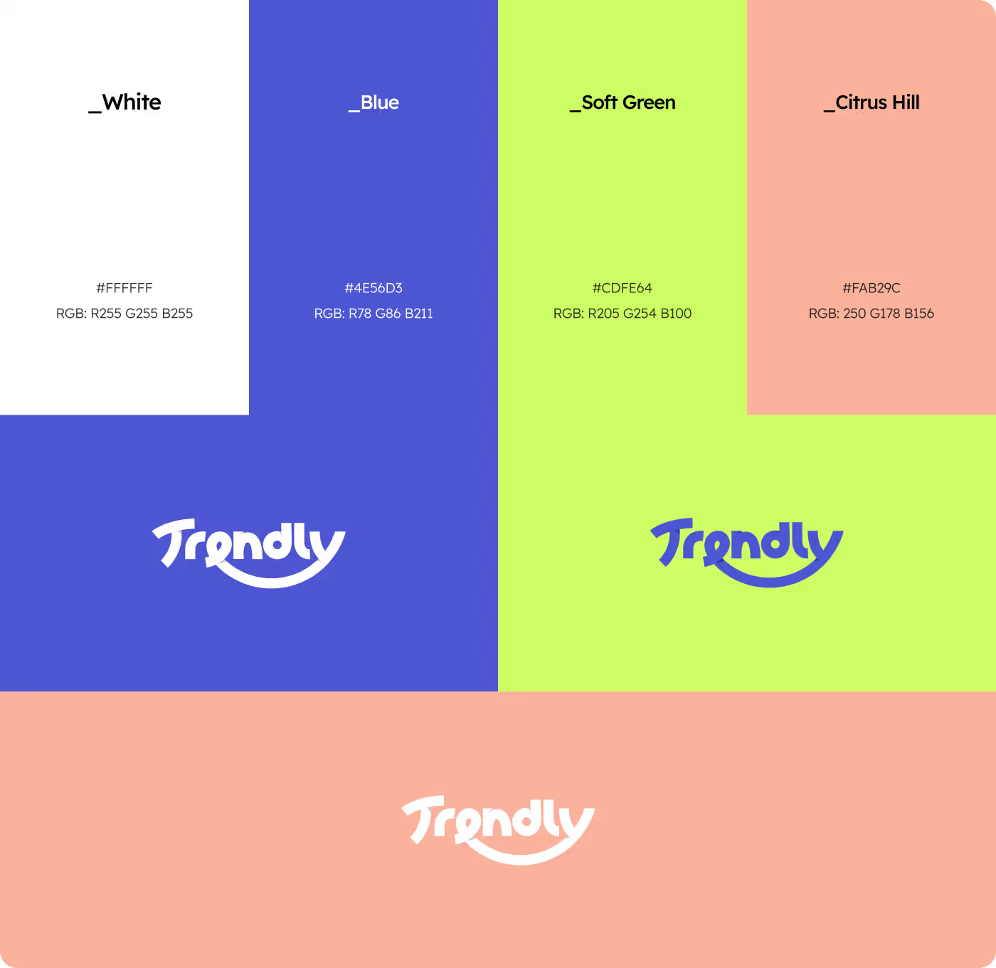
- High-Impact Color Architecture: Establishing an energetic signature palette featuring White, Blue, Soft Green, and Citrus Hill to drive immediate brand recall.
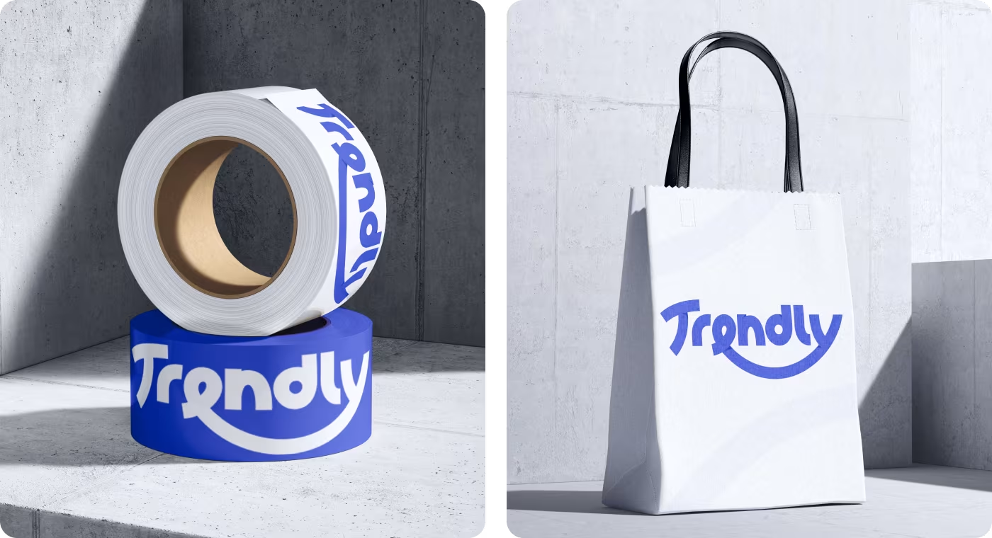
- Value-Driven Packaging: Engineering utility-focused physical touchpoints, such as branded tape rolls and paper bags, converting everyday packaging into passive marketing tools.
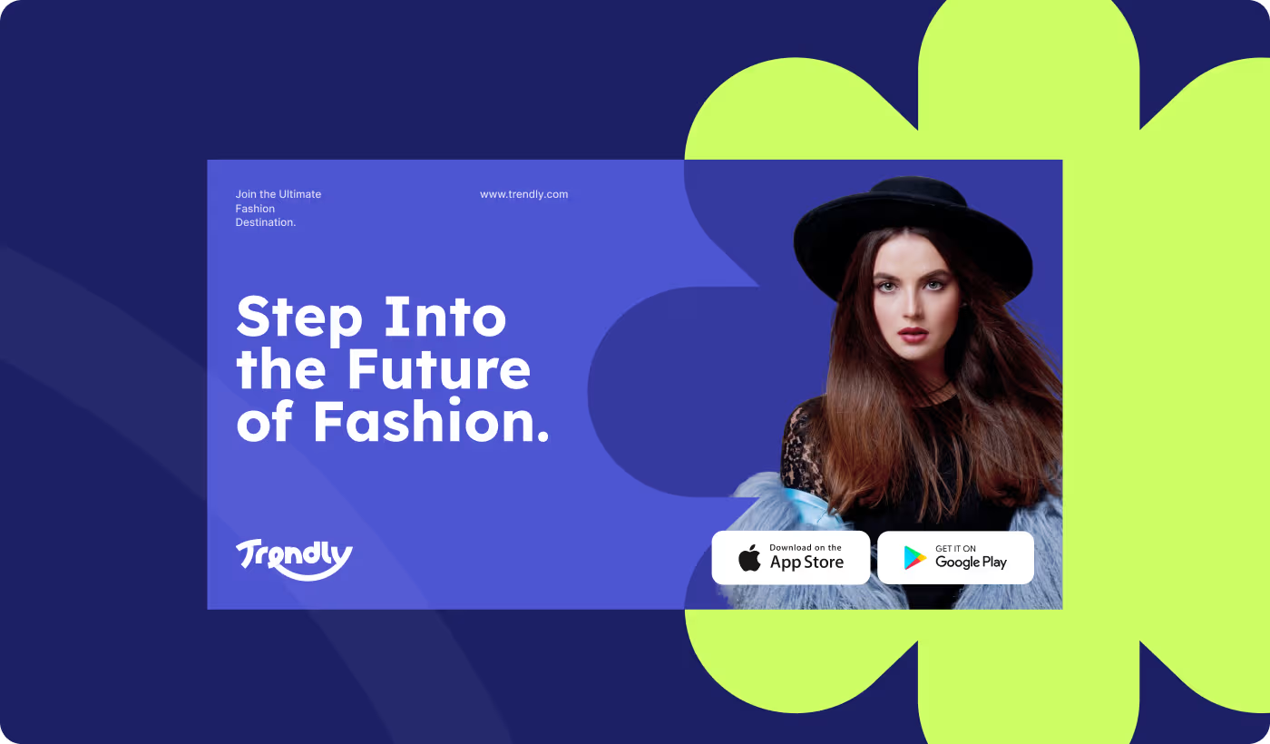
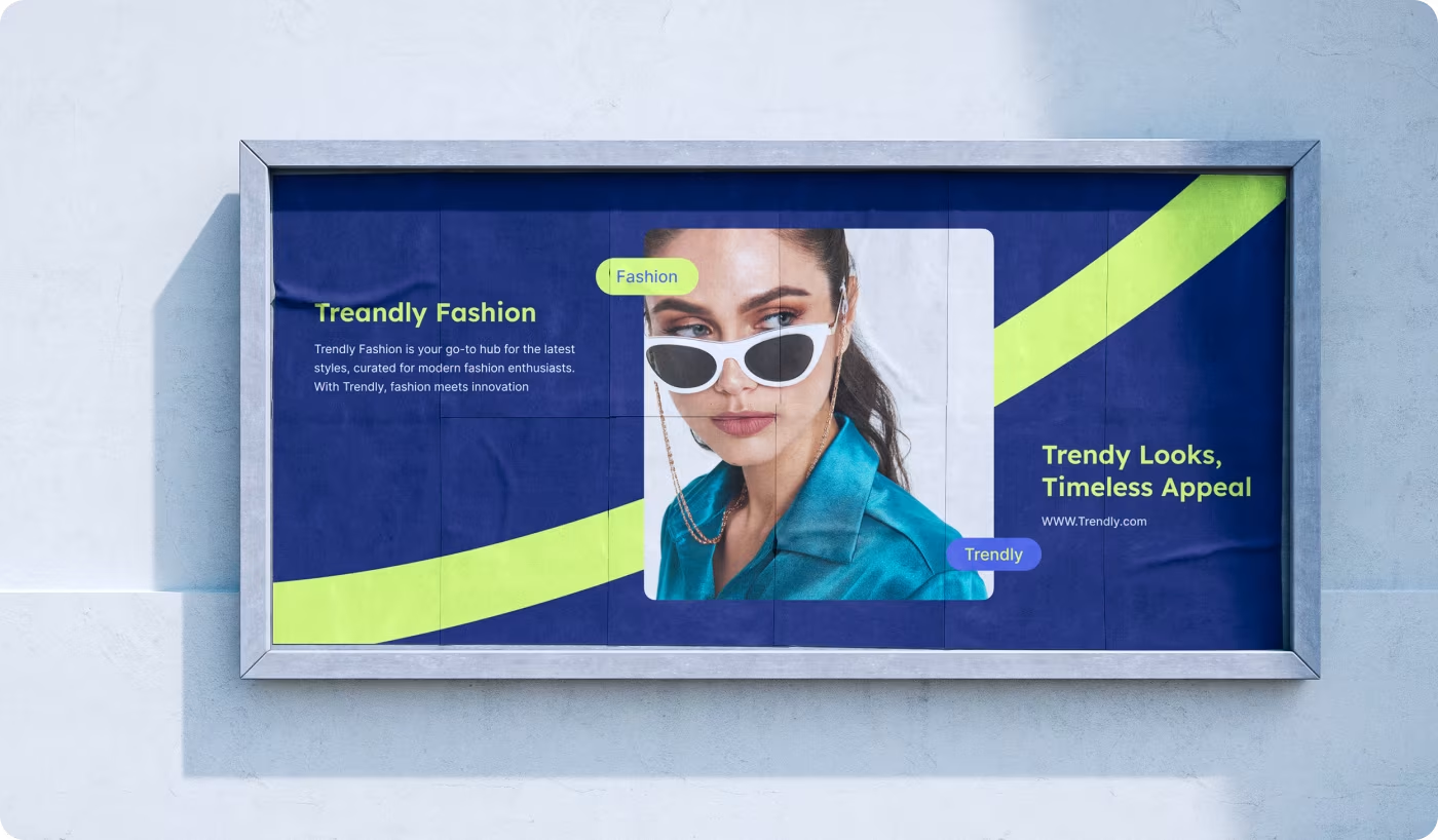
- Conversion-Focused Digital Systems: Structuring clean digital landing pages and bold billboard campaigns that communicate clear brand messaging without visual clutter.
PROCESS
Translating brand vision into a scalable system
Deploying a structured four-stage workflow to build immediate visual authority and ensure seamless execution across all mediums.
01
Research & Discovery
- Consumer behavior analysis
- Market gap identification
- Competitive brand auditing
- Positioning framework
02
Brand Strategy & Core Visuals
- Typography curation
- Color token development
- Wordmark optimization
- Visual hierarchy guidelines
03
Asset & Digital Design
- Interface design
- Digital lookbook curation
- Print-ready asset setup
- Social template engine
04
Production & Validation
- Screen scalability testing
- Asset validation loops
- Print quality inspection
- Final layout optimization
RESEARCH
UX Research & Design Artifacts
The insights gathered from analyzing early consumer interactions and fashion market trends shaped every critical design direction.
By identifying exactly where users felt overwhelmed by visual noise or lost interest during collection browsing, we mapped those behavior patterns into concrete design logic.
Services
Visual identity built for energy and elegance
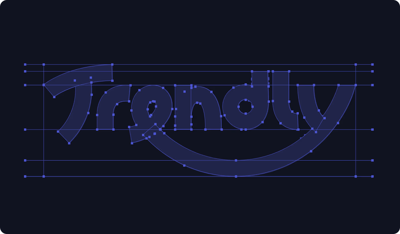
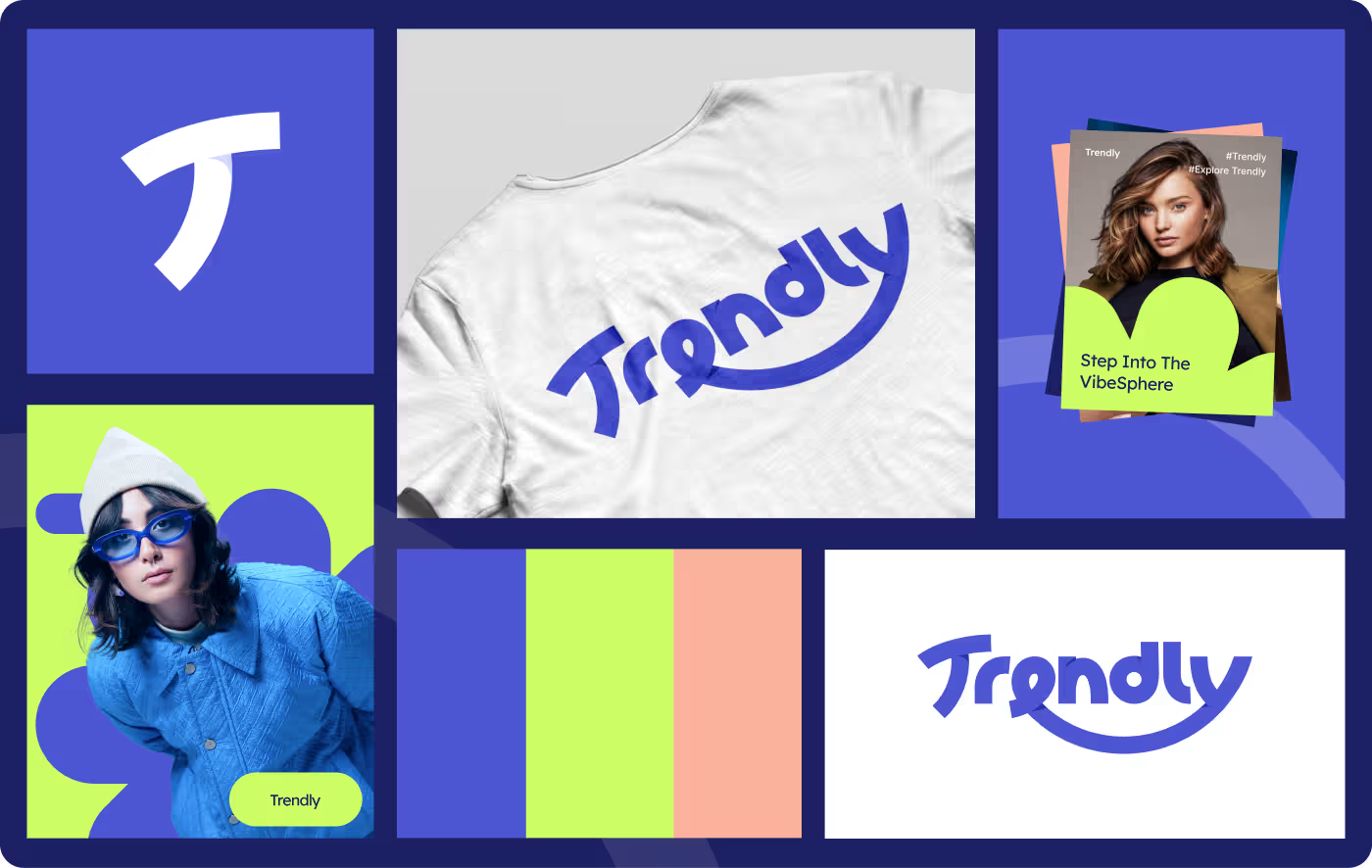
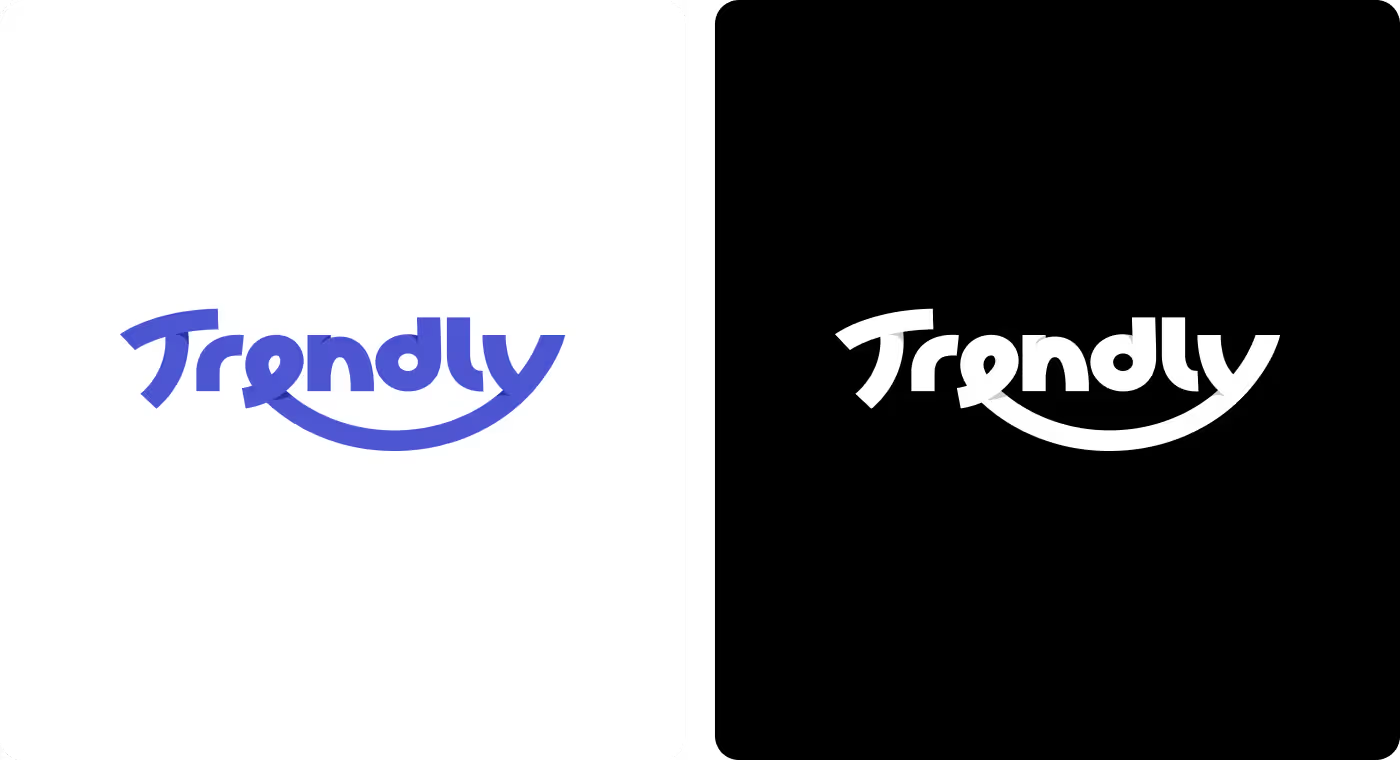
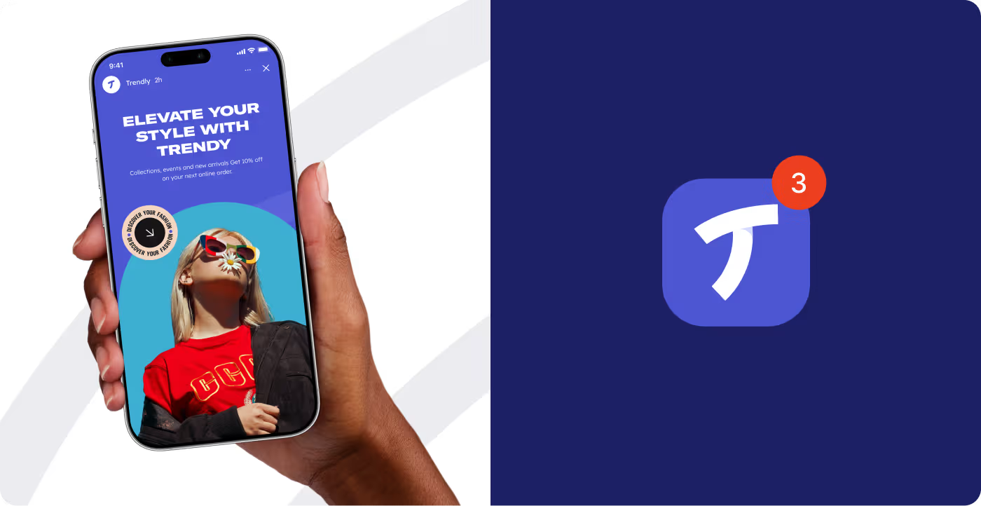
We engineered a comprehensive brand identity that balances fresh modern aesthetics with premium luxury traits. The system pairs a clean, fluid wordmark featuring a distinctive underline sweep with an unconventional, high-contrast color scheme.
The definitive palette combines crisp White (#FFFFFF) and deep, authoritative Blue (#4E56D3) alongside high-visibility accents of Soft Green (#CDFE64) and warm Citrus Hill (#FAB29C). This flexible layout provides an expressive framework for digital campaigns while ensuring flawless, sophisticated reproduction on physical clothing labels and corporate packaging.
Services
Digital interfaces and large-scale OOH systems
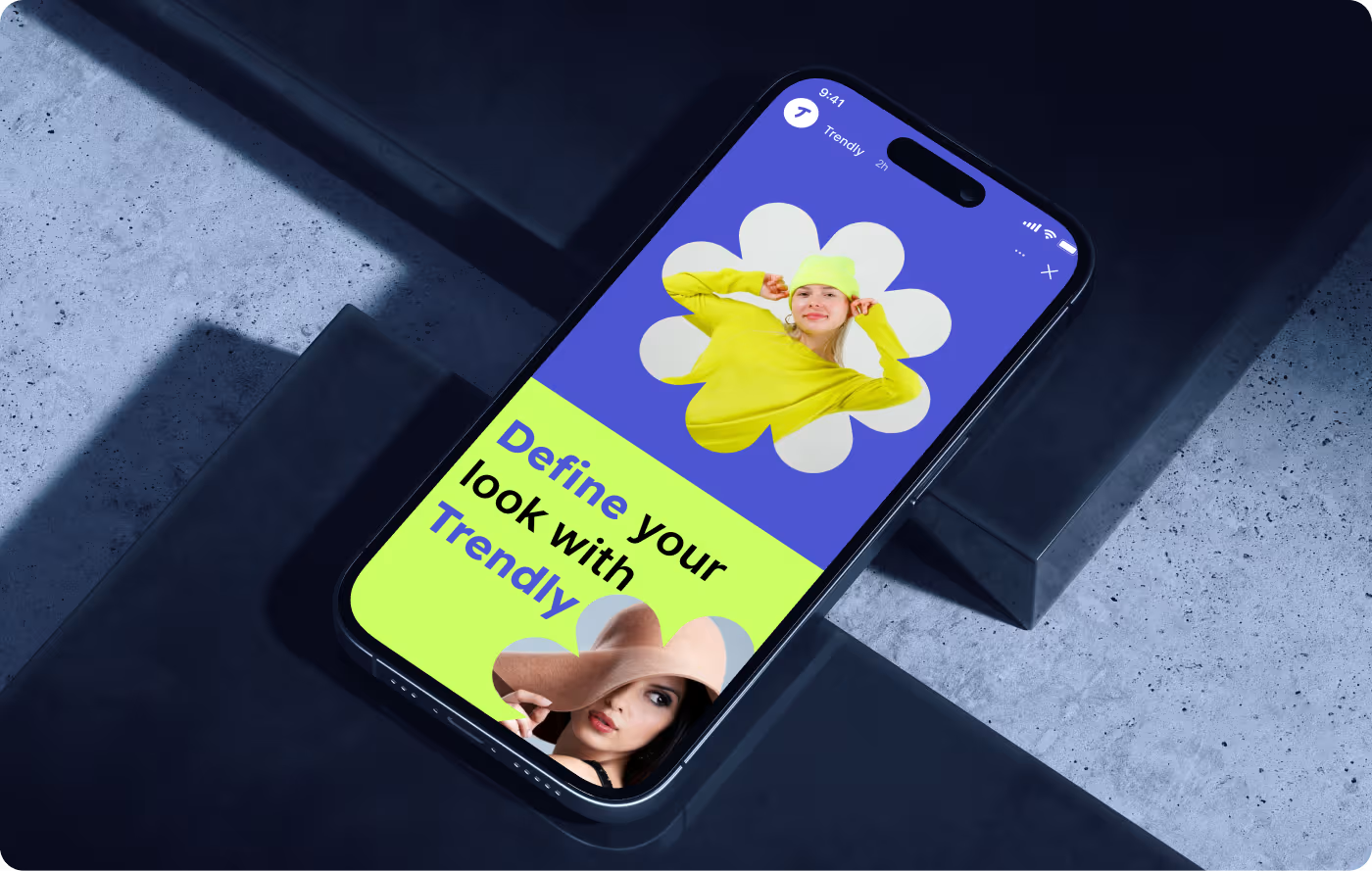
We structured a modern, multi-channel digital and physical presence that transforms promotional campaigns into immersive visual narratives.
This editorial approach translates seamlessly onto digital screens, as displayed in the mobile landing page interface.

RESULTS & OUTCOMES
Seamless cross-platform authority
The complete brand system provided a unified identity that scales fluidly, allowing the internal team to execute high-impact marketing campaigns with full consistency.
- Unified Visual Language: Established a flawless, single-source design framework bridging digital platforms and physical apparel assets seamlessly.
- Elevated Unboxing Experience: Delivered optimized packaging and clothing tag systems that maximize premium perception without increasing production budgets.
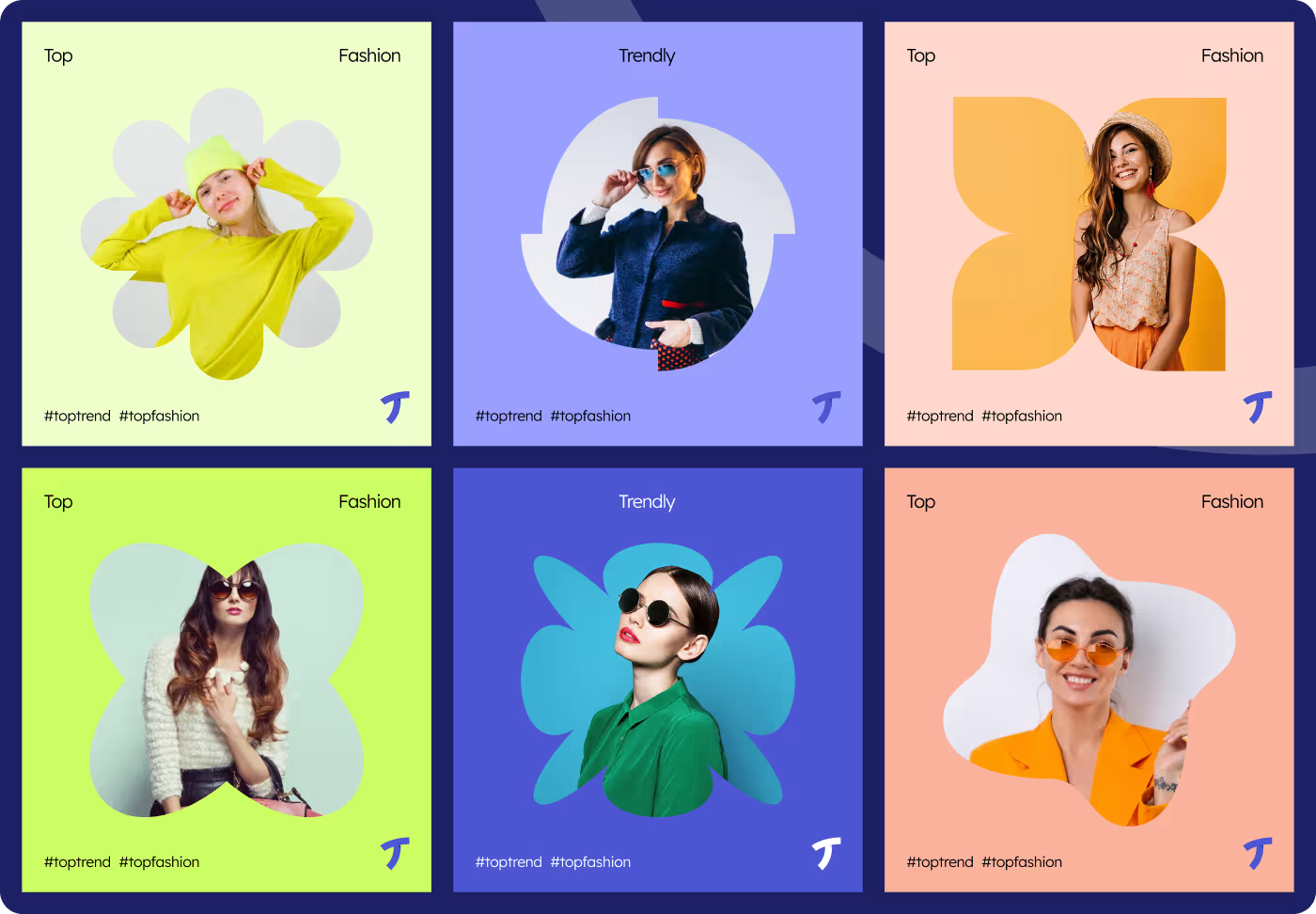
- Turnkey Social Framework: Deployed high-conversion social media templates that guarantee premium, consistent asset creation on crowded digital feeds.
- Scalable Real-World Presence: Prepared durable out-of-home advertising materials engineered to maintain perfect visual proportions at any public scale.