ZuZu Mart
Best of Behance

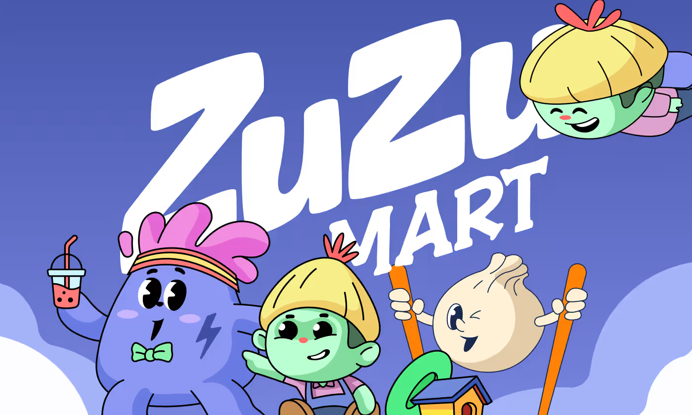
ZuZu Mart is a retail brand designed to transform the shopping experience from a routine chore into an engaging adventure.
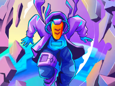
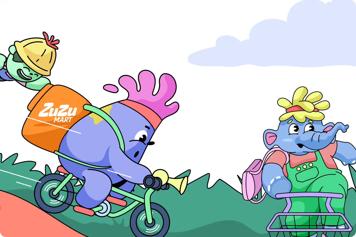
The project focused on developing a complete visual language, including heroic main characters, a cast of relatable food mascots, and immersive environmental scenes. Our goal was to create a "Champions of the Flames" universe that feels lively, welcoming, and memorable for families.
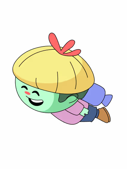
Our task was to build a world for ZuZu Mart. We needed to design central "hero" characters that could lead the brand, create a supporting cast of product-based mascots (food items), and illustrate various scenarios to show how this universe comes to life in a real-world context.
PROBLEM
Retail environments often feel sterile and purely transactional
When people go grocery shopping, it usually feels like a boring, repetitive routine chore. Supermarkets and e-commerce platforms frequently lack a fun visual personality that can truly connect with families and younger shoppers.
- Sterile Experiences: Traditional retail layouts feel cold and purely focused on transactions rather than experiences.
- Hidden Personality: The brand lacked a unique, friendly face to stand out in a heavily crowded market.
- Mismatched Categories: There was no cohesive, playful system to represent different sections like the bakery, fresh produce, and meats.
- Missing Joy: Visual platforms simply displayed items on standard shelves instead of showing the actual joy of sharing a shopping trip.
SOLUTION
vibrant characters and a high-energy storytelling universe
We built a comprehensive, playful character system called the "Champions of the Flames" universe. By introducing friendly hero protagonists and an entire cast of anthropomorphic food mascots, we turned the everyday customer journey into a fun story.
- Memorable Heroes: Designed central brand leaders with clear personalities that work perfectly across digital and print media.
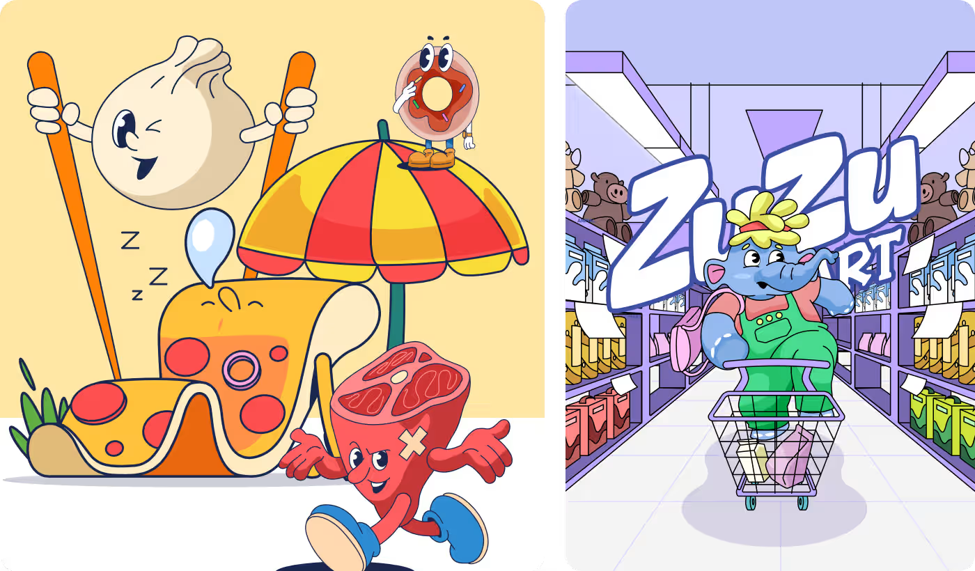
- Anthropomorphic Cast: Replaced generic icons with lively product mascots featuring distinct attitudes and appetizing backstories.
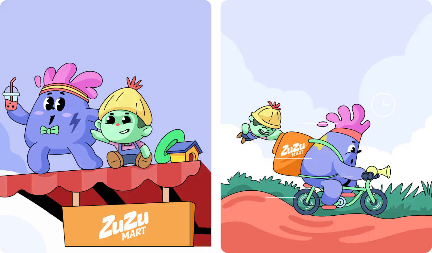
- Slice-of-Life Storytelling: Created custom illustrated scenes showing the characters working, delivering, and shopping together.
- High-Energy Color Rules: Used a core palette of brand blue balanced with soft, rounded shapes and warm accent tones to feel safe and welcoming.
PROCESS
A user-centered character and brand architecture
Following a structured design methodology, we used a clear 4-step framework to remove visual coldness and build an emotional, storytelling retail universe.
01
Hero Character Design
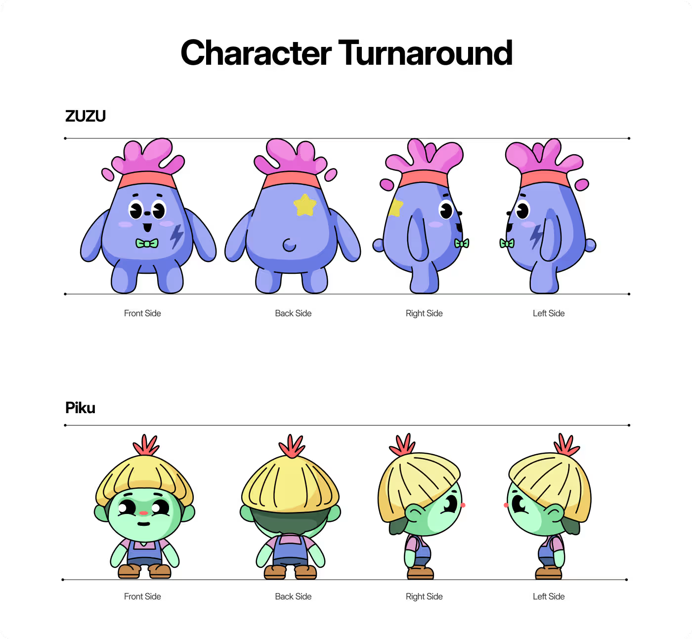
- Defining front, back, and side angles
- Setting soft, rounded body shapes
- Matching specific character hair styles
- Balancing proportions for multi-media use
02
Mascot Cast Development
- Crafting unique mascot slogans
- Styling item properties like donuts and steaks
- Creating appetizing color rules
- Building expressive cartoon faces
03
Scene & Storytelling Illustration
- Sketching delivery bike action paths
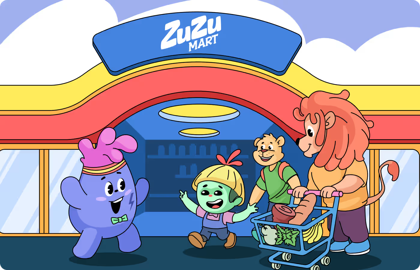
- Designing storefront encounter scenes
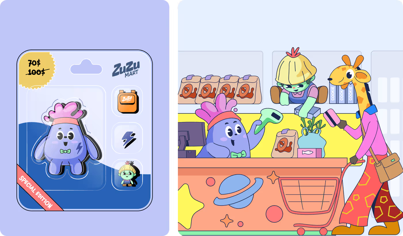
- Detailing happy checkout counter tasks
- Illustrating shared family grocery trips
04
Format & Environmental Scaling
- Formatting small toy blister packaging
- Structuring mobile app interface banners
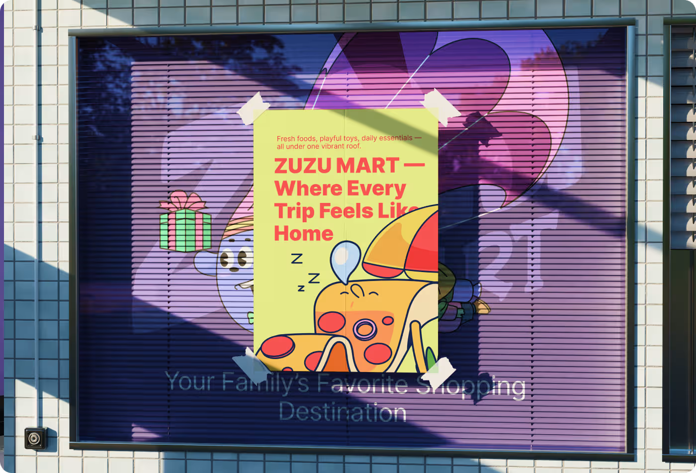
- Testing vertical retail poster displays
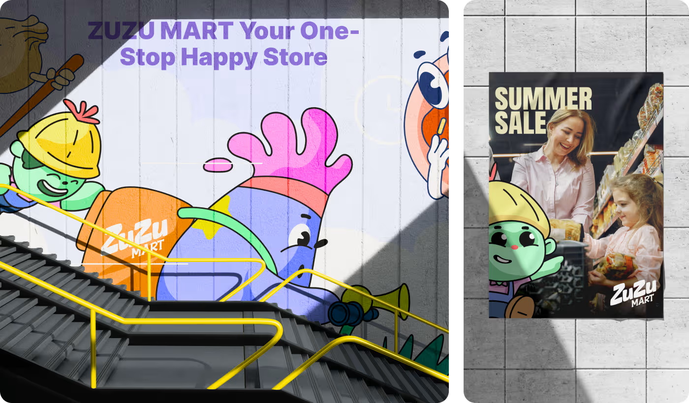
- Validating giant subway wall murals
RESEARCH
Guiding customer focus amidst busy environments
We studied how families process visual information in active retail spaces and e-commerce platforms. When an interface or a store advertisement is flooded with hundreds of competing product details, the human brain gets overwhelmed, turning an experience into a chore.
We realized that viewers need bold, continuous framing devices to instantly locate key messages and character expressions.
Services
Illustration & Character Design
We completely redefined how customers interact with store categories by replacing boring icons with a lively, high-expression mascot universe.
- The Main Protagonists: We designed the central faces of the brand - ZuZu with a purple body and Piku with a green body, to lead all marketing banners and app touchpoints.
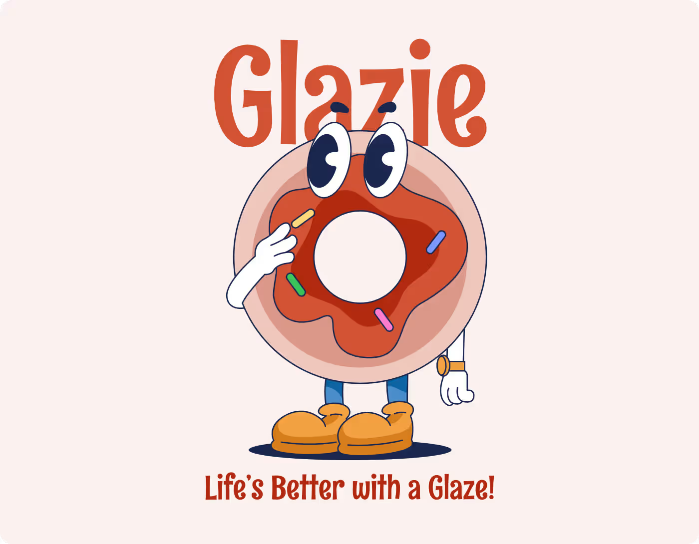
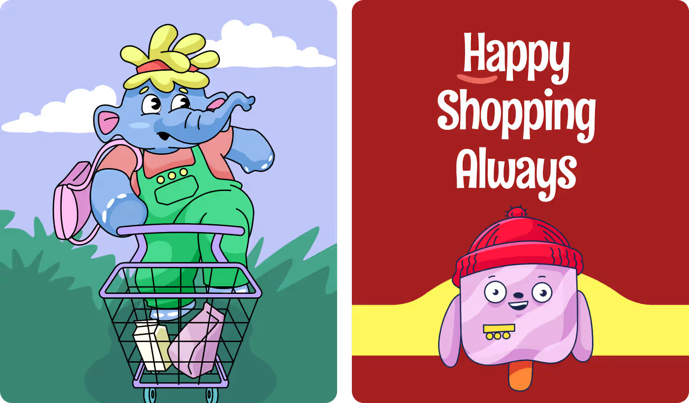
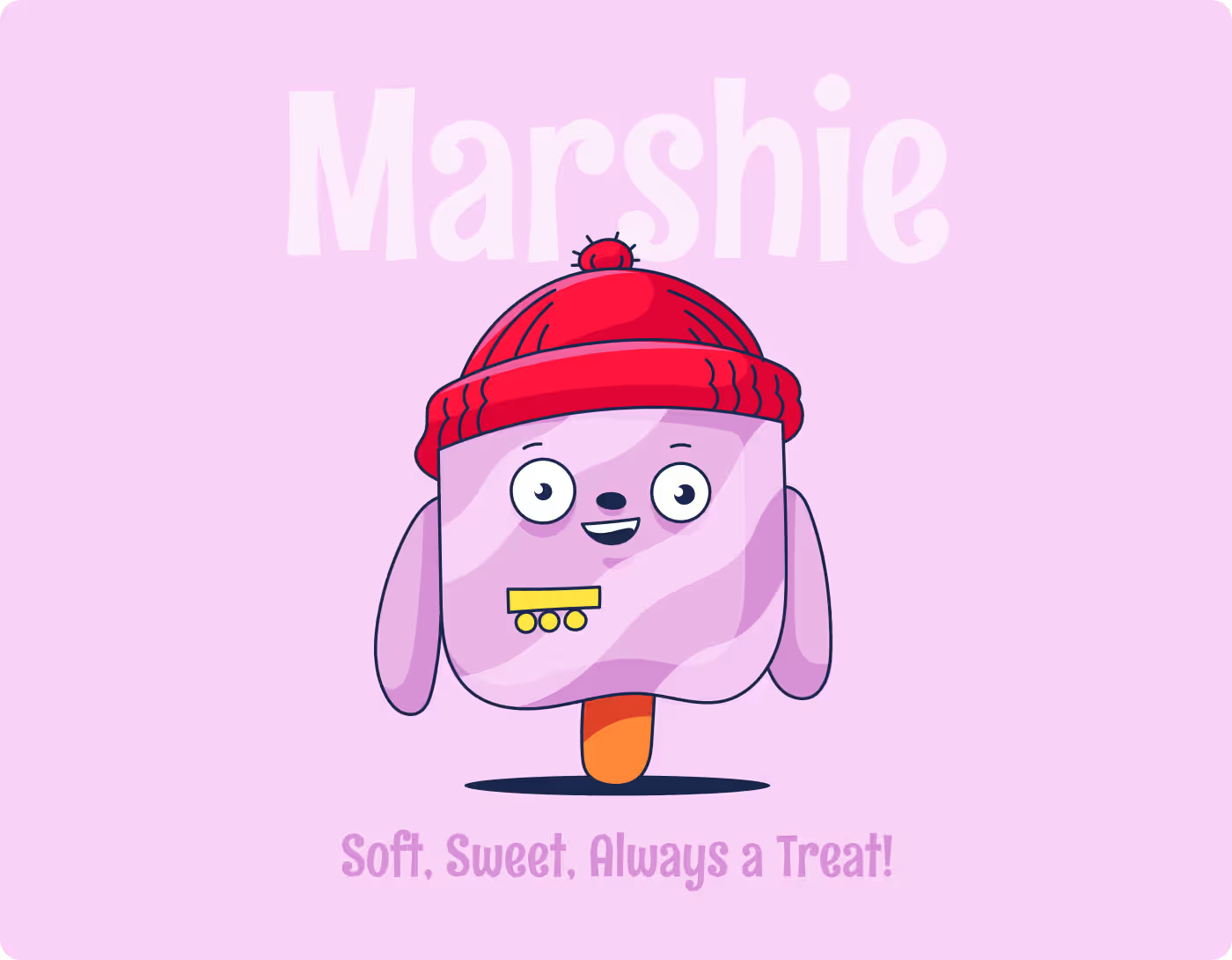
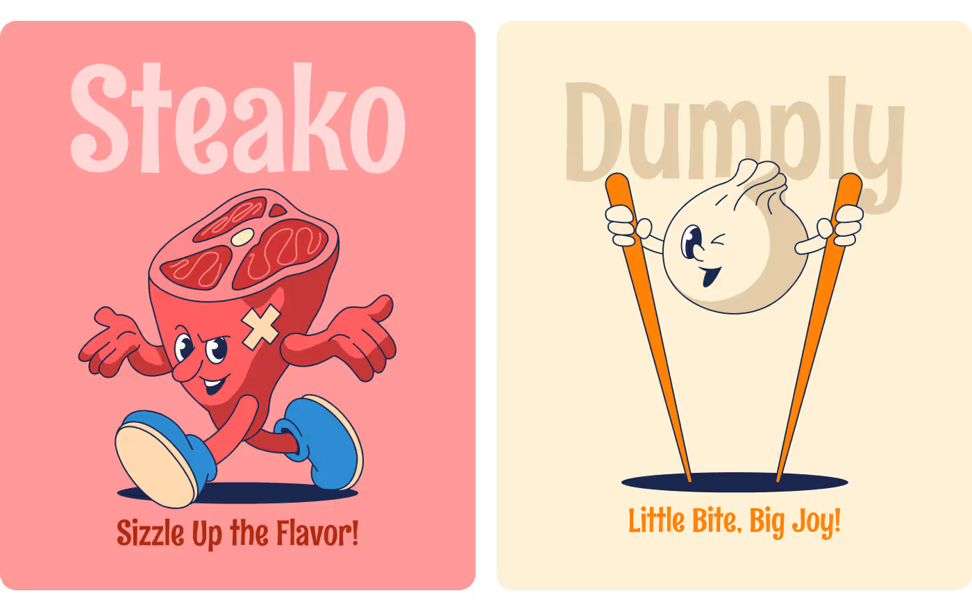
- The Food Cast System: We created an entire grid of anthropomorphic characters like Glazie the donut, Steako the steak, and Dumply the dumpling with individual catchphrases to boost appetite appeal.
Services
Brand Identity & Art Direction:
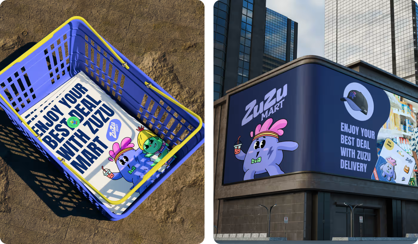
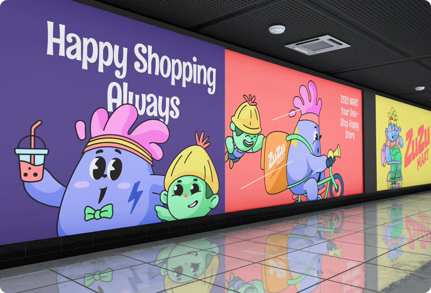
Multi-scale storytelling layouts We scaled and formatted our custom illustration library so it functions fluidly across digital platforms, product packaging, and large physical advertisements.
- Active Retail Scenarios: You can see how our artwork turns into a lively checkout experience with a giraffe customer emphasizing a warm, social atmosphere.
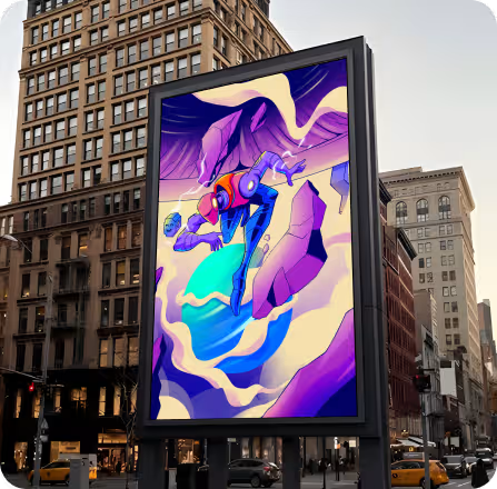
- Real-World Environments: The design mockups highlight how the illustration system scales onto subway station wall murals, transit stairs, and large retail windows without losing its clean, approachable look.
RESULTS & OUTCOMES
Vibrant brand universe featured on Behance
Our soft, high-energy character design system successfully turned a routine supermarket concept into an engaging visual adventure.
- Behance Award Winner: The layout and art direction earned an official "Featured in Best of Behance" ribbon badge.
- Zero Visual Noise: Replaced sterile transactional layouts with supportive, rounded background scenery that keeps the focus entirely on the characters.
- 100% Cohesive Identity: Every single food mascot, delivery scene, and storefront layout shares an identical, scalable visual identity.
- Special Edition Packaging: Created versatile commercial formats, including the "Special Edition" toy blister pack layout.