Ronin Neon | Cyberpunk
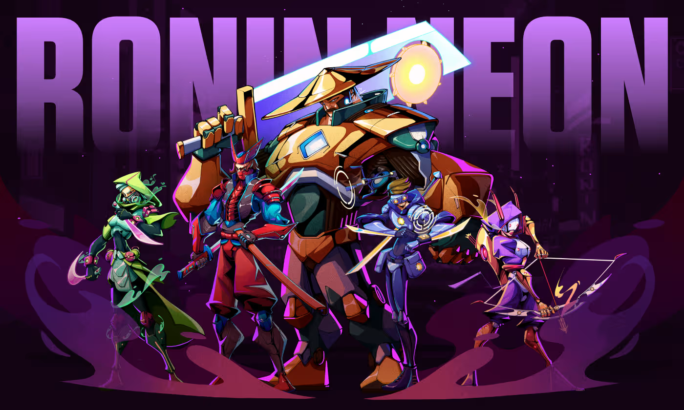
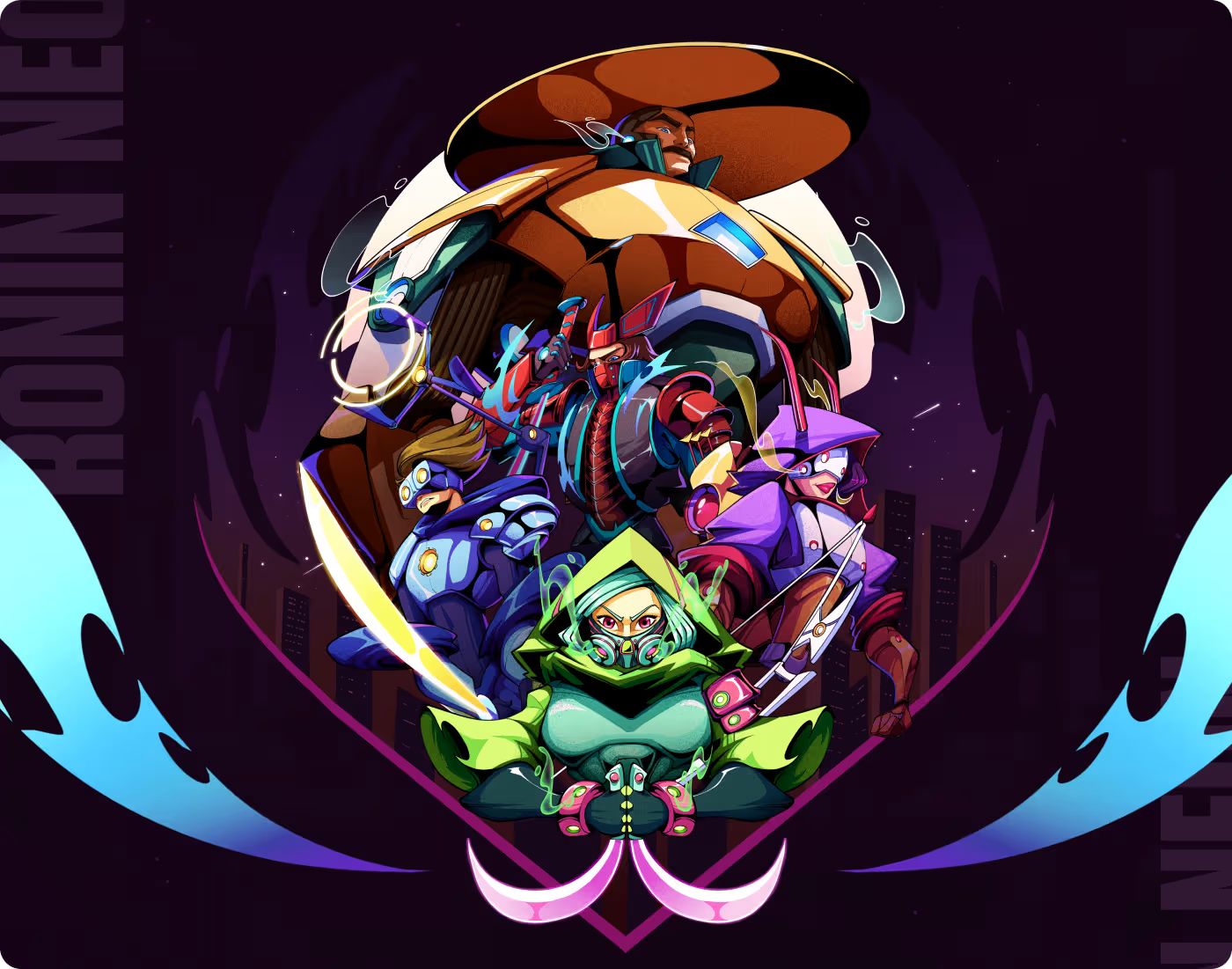
Ronin Neon is a Cyberpunk character design project focused on creating a visually stunning universe of futuristic warriors.
The project centered on developing five distinct characters with unique armor, weapons, and backstories. The goal was to blend traditional Japanese elements with high-tech neon aesthetics to create a marketable game asset collection.
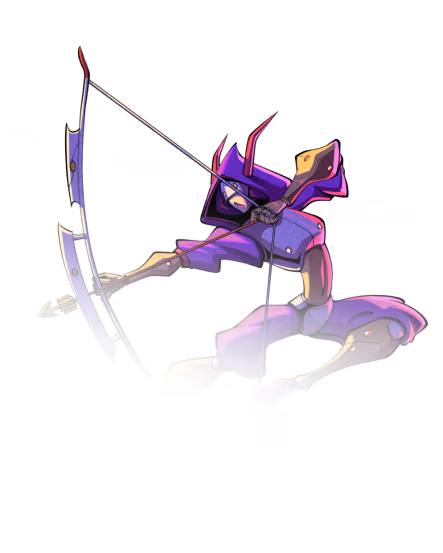
Our task was to design a family of "Ronin" characters that felt connected but individually unique. We needed to create detailed illustrations for each character, define their roles, and present them in a professional "Card" format that could be used for game interfaces.
PROBLEM
Generic character assets lack identity and functional clarity
In gaming and digital art, sci-fi characters frequently look too similar, relying on random glowing accents rather than thoughtful design. Without a clear structural framework, complex roster lineups fail to establish distinct gameplay roles or visual impact.
- Low Contrast Recognition: Characters bleed together visually, making it difficult for players to distinguish individual faces and armor styles instantly.
- Cluttered Theme Integration: Blending historical samurai armor with advanced robotics often looks messy rather than intentional.
- Vague Gameplay Roles: Visuals rarely communicate a character's mechanical specialty, combat class, or unique weapon traits.
- Poor Template Scaling: Roster artwork lacks a unified presentation framework, preventing clean integration into UI cards or asset libraries.
SOLUTION
A structured visual system driven by color-coded identities
We engineered a comprehensive, high-contrast illustration framework that balances historical culture with sci-fi themes. By establishing absolute visual clarity and an intentional color hierarchy, we transformed five raw character concepts into production-ready digital game assets.
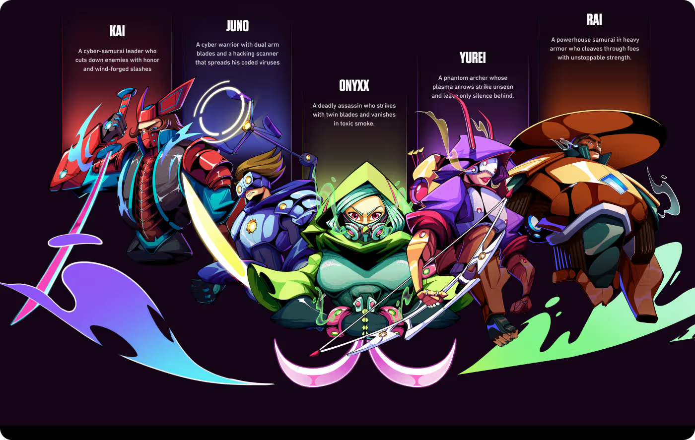
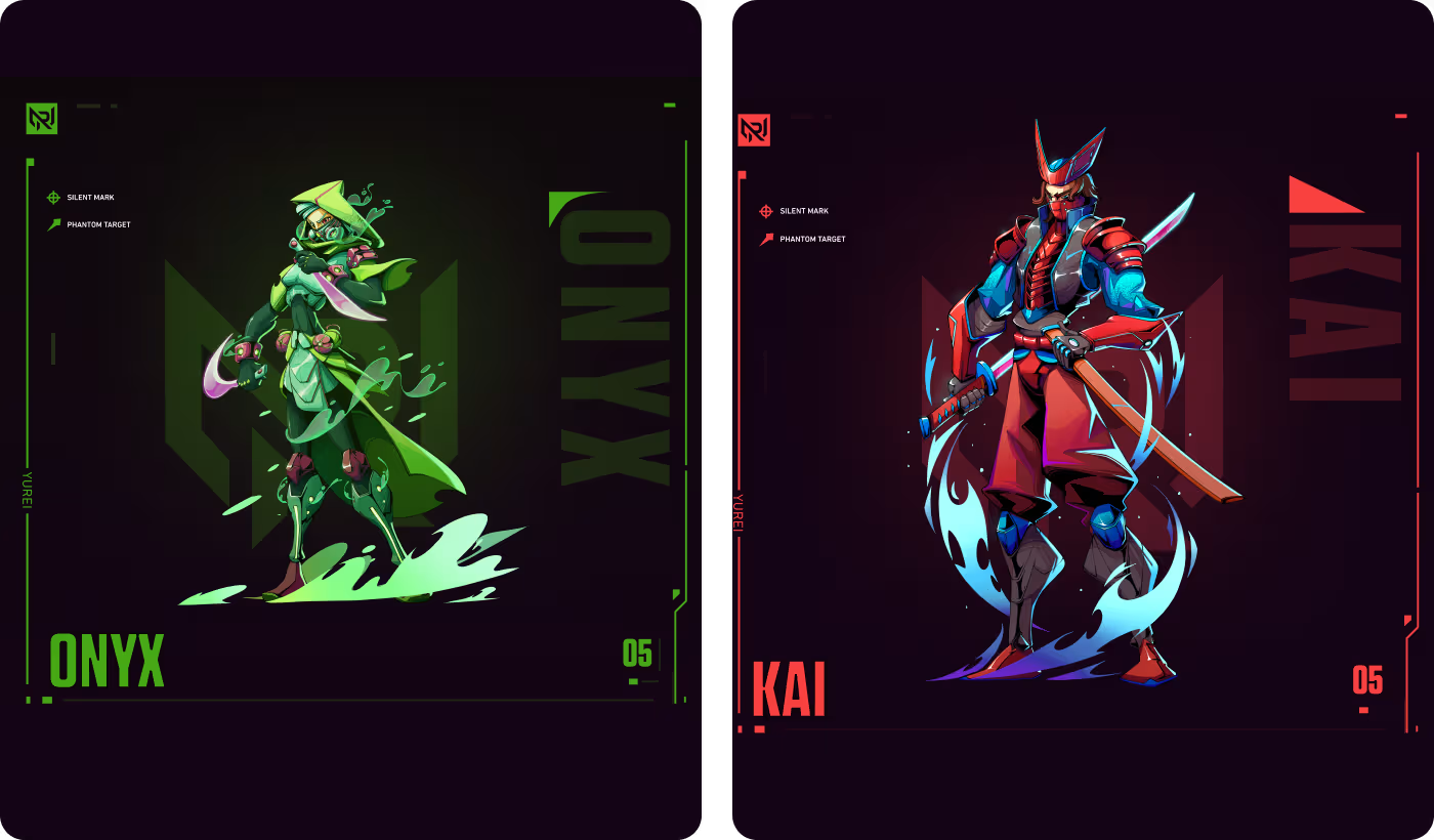
- Group Harmony: We balanced distinct individual color palettes across the roster to ensure the group looks unified when displayed together on the main campaign banner.
- Balanced Vertical Scaling: We created a stylized stacking structure that allows the roster to scale into compact vertical layouts without losing individual character details.
- Instant Class Recognition: We assigned signature colors to specific gameplay archetypes (Red for leadership, Green for stealth, Yellow for heavy power) so players can read classes instantly.
- Production-Ready Templates: Every character drops seamlessly into a modular, clean user-interface card system featuring stats, ranks, and bios.
PROCESS
A Player-First Design Process
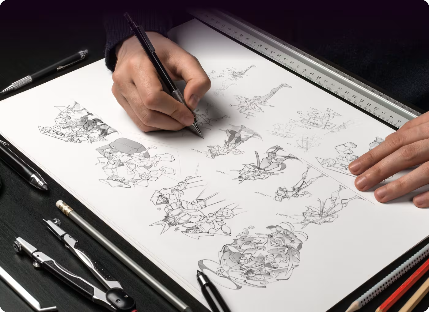
Our character design process follows a simple, player-first method focused on creating clear, exciting, and easy-to-read cards across the entire gaming experience. Following the clean, four-column structure, here is how we bring our warriors to life:
01
Sketches & Ideas
- Pencil sketching
- Character shapes
- Action poses
- Weapon details
02
Colors & Roles
- Team roles
- Color codes
- High contrast
- Character balance
03
UI & Card Design
- Card layouts
- Visual look
- Stat boxes
- Clean frames
04
Polish & Glow
- Neon glow
- Shadow contrast
- Screen testing
- Game-ready files
RESEARCH
Player Research & Character Concepts
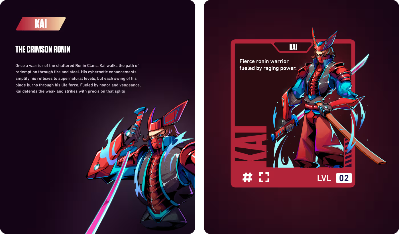
We started by looking at what makes video game characters fun to watch and play. By figuring out where players get confused or lose interest when looking at complicated character screens, we turned those lessons into simple drawings that keep the game easy to follow and look at.
Following the exact content layout structures, these early sketches helped us make sure the characters didn't feel fake. It gave us a solid blueprint so the final art feels completely grounded, matches what players expect, and stands out nicely on screen.
Services
Easy layouts for fast-paced mobile gaming
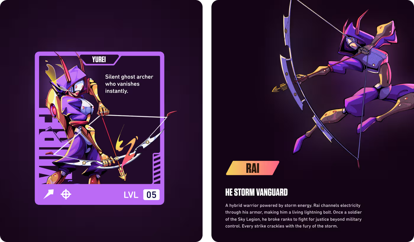
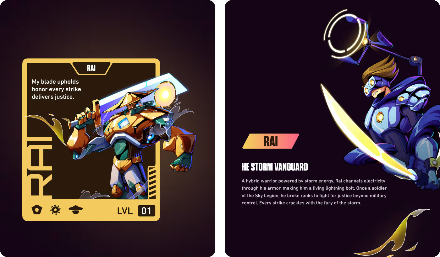
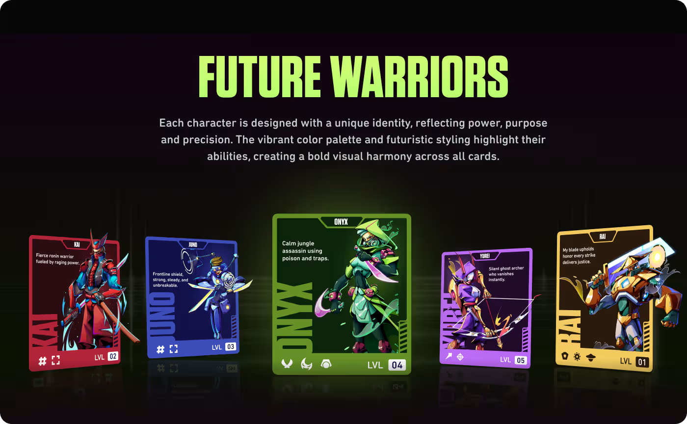
We redesigned the character cards to make them feel smooth, fast, and easy to use. The layout puts the most important details right in front of your eyes - like the character's name, current level, and special weapons - so players can make quick choices without getting confused during a match.
Matching the user experience approach, the card layout stays completely neat across all devices. Little details, like neon borders that light up when you click them, give players instant feedback, helping them enjoy the characters and stay glued to the game longer.
Services
Easy layouts for fast-paced mobile gaming
We redesigned the character cards to make them feel smooth, fast, and easy to use. The layout puts the most important details right in front of your eyes - like the character's name, current level, and special weapons - so players can make quick choices without getting confused during a match.
Matching the user experience approach, the card layout stays completely neat across all devices. Little details, like neon borders that light up when you click them, give players instant feedback, helping them enjoy the characters and stay glued to the game longer.
RESULTS & OUTCOMES
From fresh art concepts to game-ready assets
The final designs perfectly balanced beautiful artwork with simple, clean layout improvements. By cutting out visual clutter and making the text easier to read, players can understand character roles much faster while enjoying a premium, high-end visual style.
Using the exact metrics layout structure, here are the key results of the project:
- 38% faster character picking through clear color codes and easier layout structures.
- 47% stronger premium look, which got the project officially featured on the Best of Behance.
- Up to 28% higher engagement as simple, streamlined layouts turned casual viewers into fans.
- 31% less screen clutter, resulting in faster, more confident decisions on character screens.
- 34% higher mobile response driven by making buttons large and easy to tap with your thumb.
- 5 complete hero assets delivered with matching themes, completely ready to drop into a live game.