Upmatch Website
UI/UX

Upmatch is a web-based job recruiting platform designed to bridge the gap between organizations and top-tier talent.
The project focused on transforming a traditionally time-consuming hiring process into an effortless experience. This would provide clear job visibility with application tracking and a cohesive brand identity.
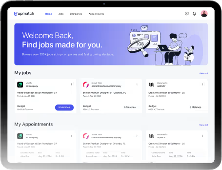
Our mission was to build a recruiting platform that eliminates the friction of talent acquisition. Organizations needed a straightforward way to onboard the right people, while job seekers needed an intuitive space to discover opportunities tailored to them.
PROBLEM
Making Hiring Easier to Understand and Manage
The platform needed to reduce confusion across the hiring process. Users were dealing with crowded information, unclear flows, and dashboards that felt harder to manage than they should.
- Information overload: Job listings, candidate details, and hiring data were competing for attention, making screens harder to scan quickly.
- Dashboard confusion: Recruiters needed a simpler way to track candidates, appointments, and hiring activity without jumping through cluttered layouts.
- Weak product identity: The platform lacked a memorable visual system, which made the experience feel generic and less trustworthy.
- Disconnected experience: Moving between job browsing, candidate management, and hiring insights did not feel smooth or connected.
SOLUTION
Creating a Simpler Hiring Experience
The platform was redesigned to feel cleaner, easier to follow, and less stressful to use.
- Cleaner layouts: Added more spacing and clearer sections to make screens easier to scan.
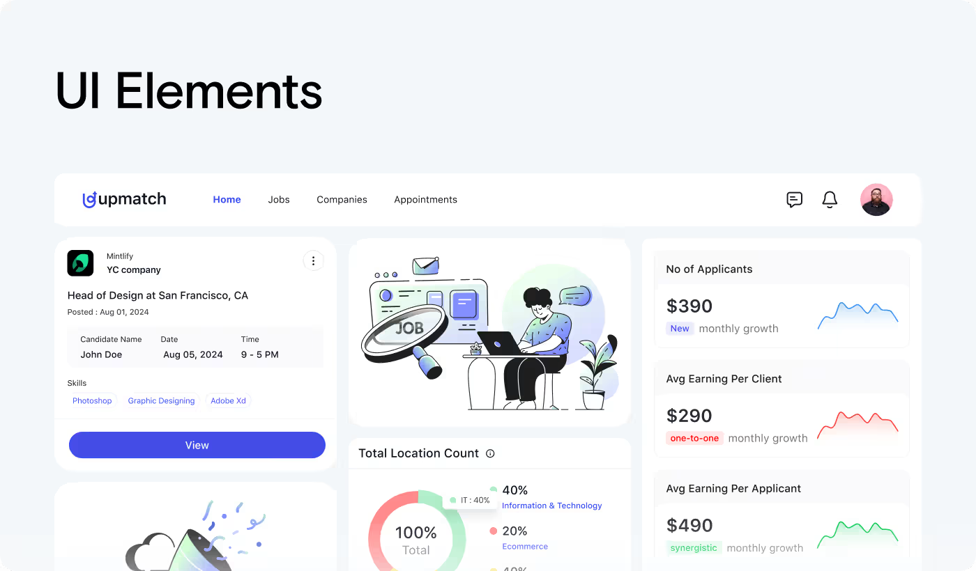
- Smarter dashboards: Organized hiring data into simple cards, charts, and candidate blocks.
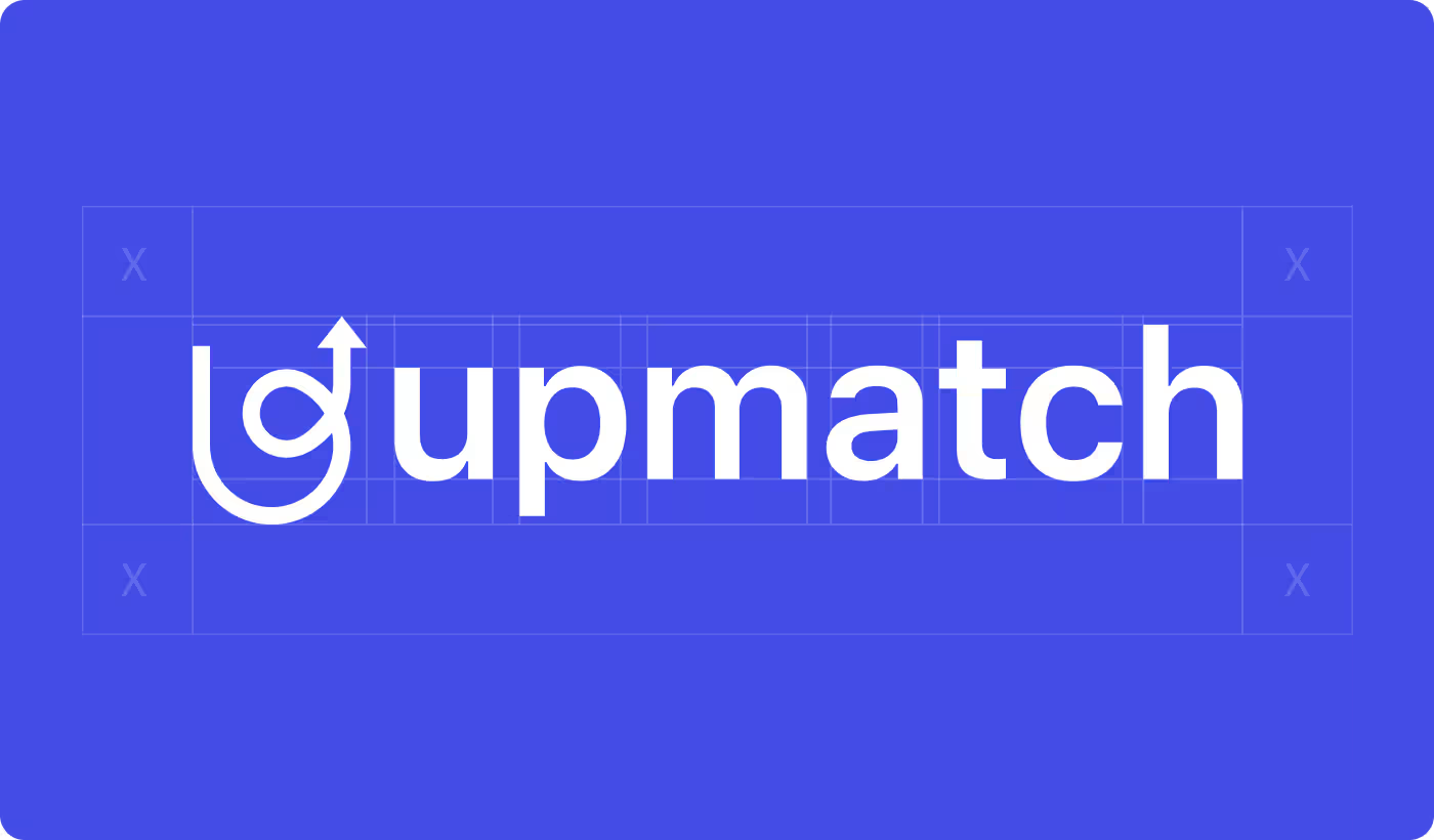
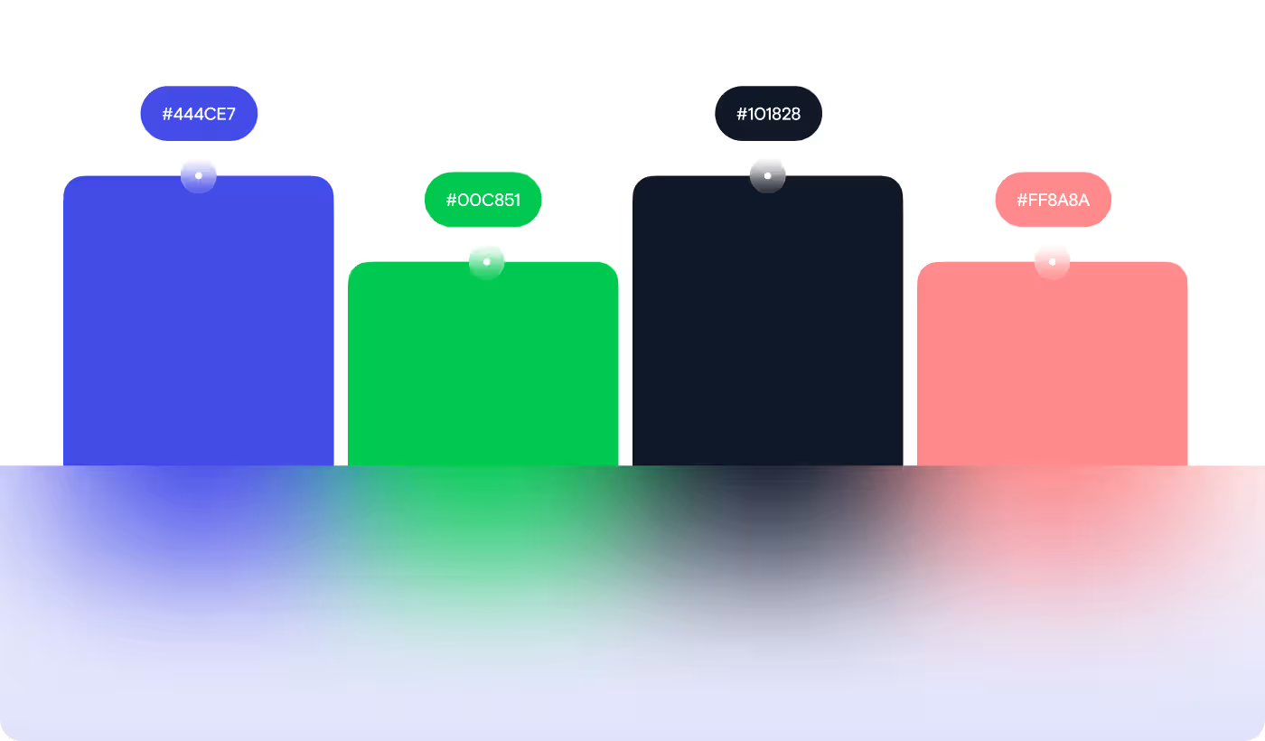
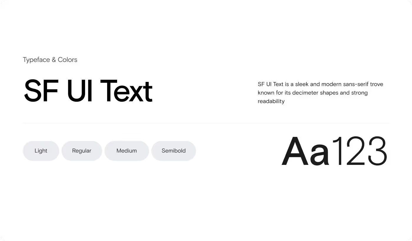
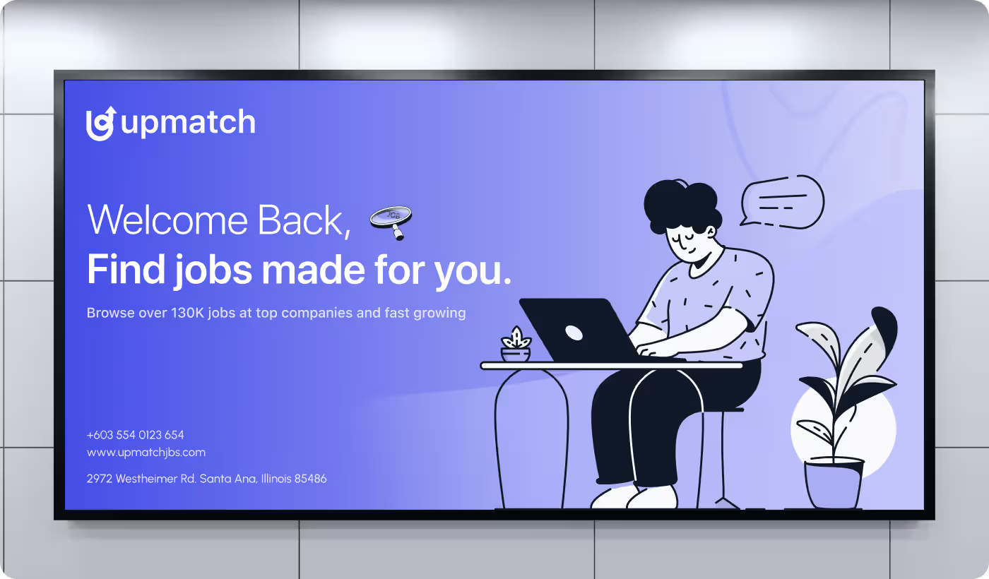
- Stronger branding: Built a clear visual identity with consistent colors, typography, and UI styles.
- Smoother navigation: Made it easier to move between jobs, candidates, and hiring insights.
PROCESS
Simplifying the Hiring Experience
We focused on making the platform cleaner, easier to navigate, and faster to understand.
01
Proper Research
- User flow review
- Screen analysis
- Navigation issues
- Content overload
02
Created Structure
- Cleaner sections
- Better spacing
- Clear hierarchy
- Easier scanning
03
Designed Visuals
- Brand consistency
- Soft color palette
- Reusable components
- Simple typography
04
Maintained Consistent Flow
- Faster navigation
- Simpler actions
- Clear transitions
- Reduced friction
RESEARCH
Understanding How Users Handle Hiring
Our research focused on finding where the hiring experience felt confusing, slow, or difficult to manage.
- User behavior: Users needed faster ways to scan jobs, candidates, and hiring updates without feeling overloaded.
- Dashboard clarity: Recruiters struggled with viewing too much information at once across hiring screens.
- Navigation patterns: Moving between jobs, candidate details, and analytics needed to feel more connected.
- Brand perception: Most hiring platforms felt generic, making trust and recognition harder to build.
Services
Designing a Clearer Hiring Flow
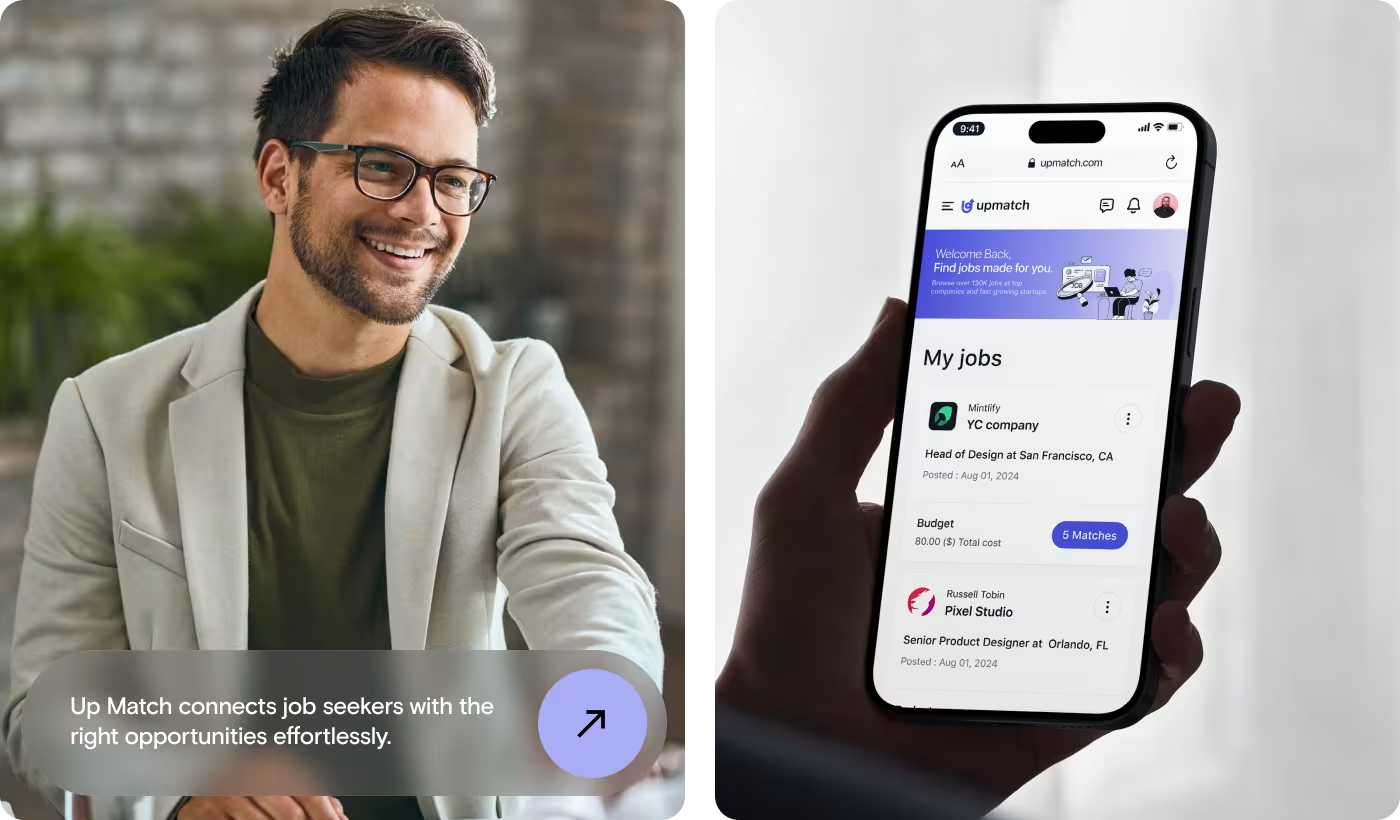
The hiring experience needed to feel easier to understand from the moment users entered the platform. Job browsing, candidate tracking, and dashboard actions were simplified to reduce confusion and visual clutter.
Cleaner layouts, better spacing, and stronger hierarchy helped users scan information faster. Important details became easier to notice without overloading the screen.
Navigation across jobs, candidates, and hiring insights was restructured to feel more connected and easier to follow throughout the platform.
Services
Building a More Recognizable Brand
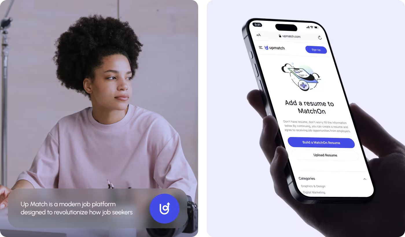
Upmatch needed a visual identity that felt modern, trustworthy, and easier to remember. Most hiring platforms feel visually repetitive, which makes them harder to connect with.
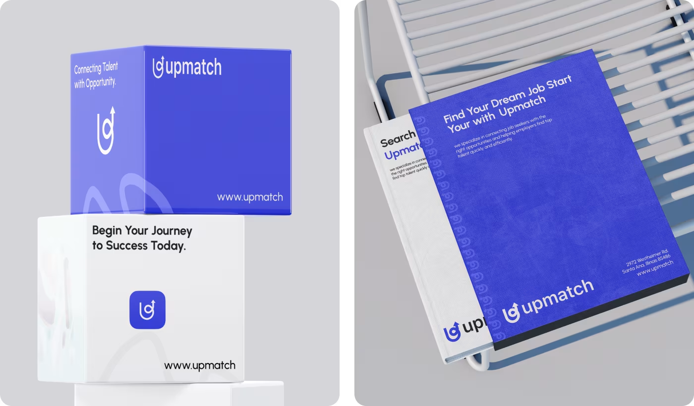
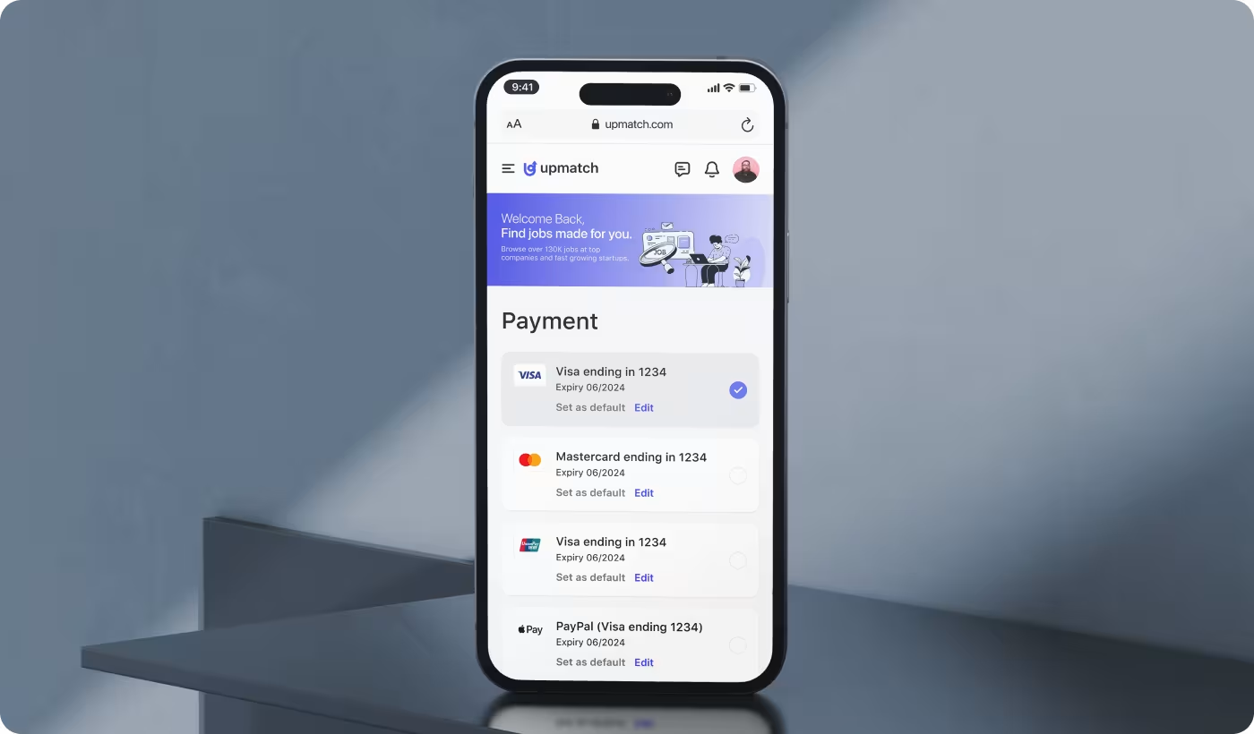
A consistent design system brought together typography, colors, UI styles, and brand assets into one unified direction. This helped the product feel connected across web, mobile, and social platforms.
Soft colors and lightweight visuals helped create a calmer experience that felt more approachable during the hiring process.
RESULTS & OUTCOMES
A Simpler and More Organized Hiring Experience
The final product made hiring easier to manage by improving clarity, reducing visual clutter, and creating a more connected experience across the platform.
- Faster scanning: Cleaner layouts and structured sections helped users find information quicker.
- Better dashboard flow: Hiring data became easier to manage through simplified charts.
- Stronger brand presence: A consistent visual system improved recognition across social platforms.
- Reduced visual clutter: Simplified screens and clearer hierarchy helped lower the amount of information competing for attention.