9Events
UI/UX - XD

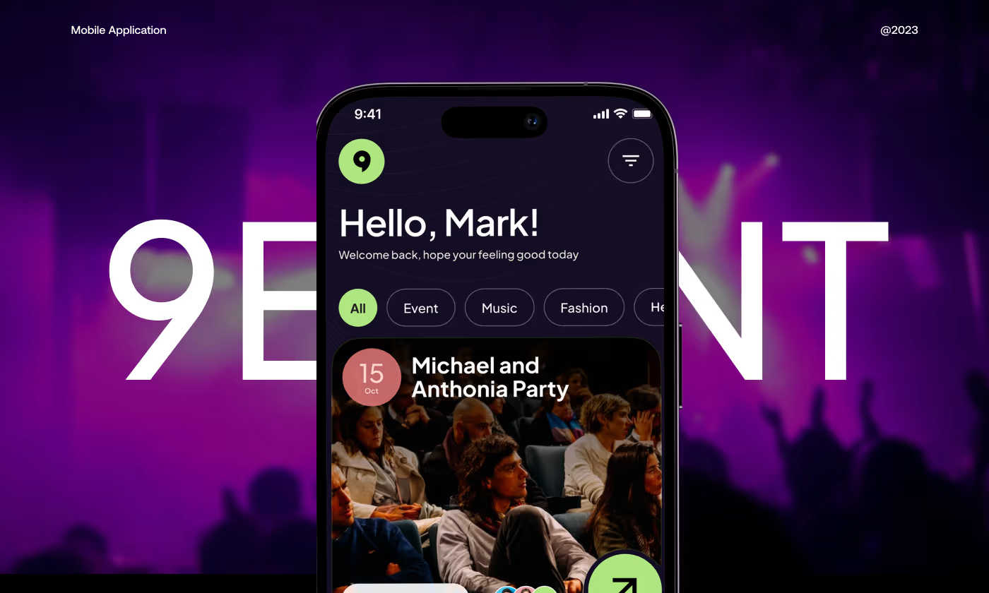
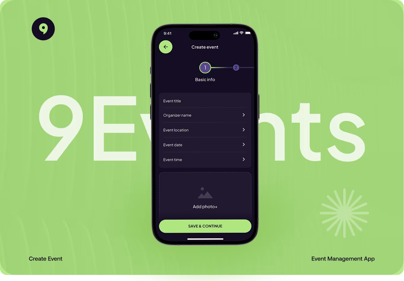
The Event Booking App is a mobile platform designed to help people discover local events and buy tickets.
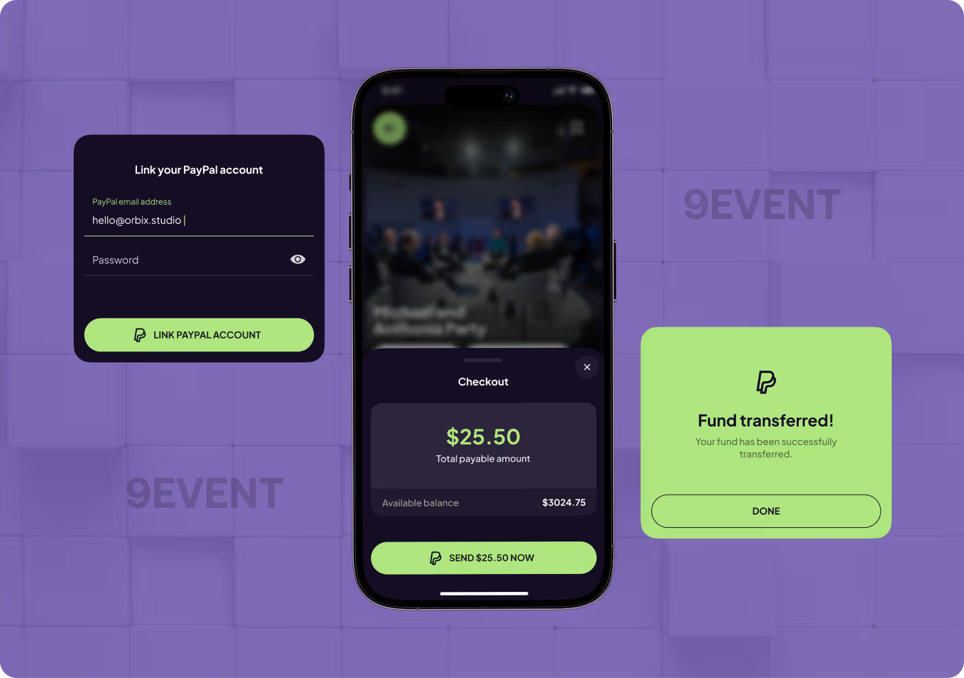
The project focused on making the browsing experience feel visual and fast, while ensuring the actual booking process - from selecting a ticket to final payment made clear and stress-free.
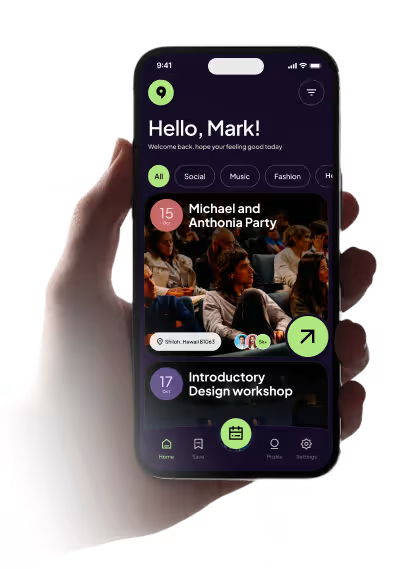
Our task was to design an app that makes discovering events feel exciting, but more importantly, makes buying a ticket feel like a safe and obvious choice. Users needed an easy way to search for things to do, while event organizers needed a flow that reliably turned casual browsers into paid attendees.
PROBLEM
People Could Browse, but Not Always Decide
The app had a strong visual start, but it still didn’t give people enough reason to trust an event or move forward with booking. Users could browse, but the experience needed more clarity, context, and confidence.
- Not enough event context: people could see the event, but not always enough detail to judge if it was worth their time.
- Low trust before booking: the app needed stronger signs that the event was real, active, and worth attending.
- Unclear path to purchase: the flow from browsing to buying still felt a little too open-ended.
- Too much hesitation at key steps: users needed clearer pricing, timing, and event details before they felt ready to act.
SOLUTION
Made the Path From Browse to Book Feel Clearer
We focused on giving people the right details at the right moment, so the app felt easier to trust and easier to use when it was time to choose an event or move toward checkout.
- Added stronger event context: event cards and detail screens showed more useful information upfront.
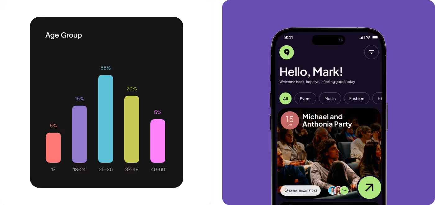
- Made browsing feel easier: categories, filters, and event layouts helped people scan the app faster.
- Built more trust into the flow: social proof, visual hierarchy, and cleaner detail pages made events feel more believable.
- Clarified the booking step: the path to payment was laid out more clearly so people knew what to expect before buying.

PROCESS
How We Designed the Experience
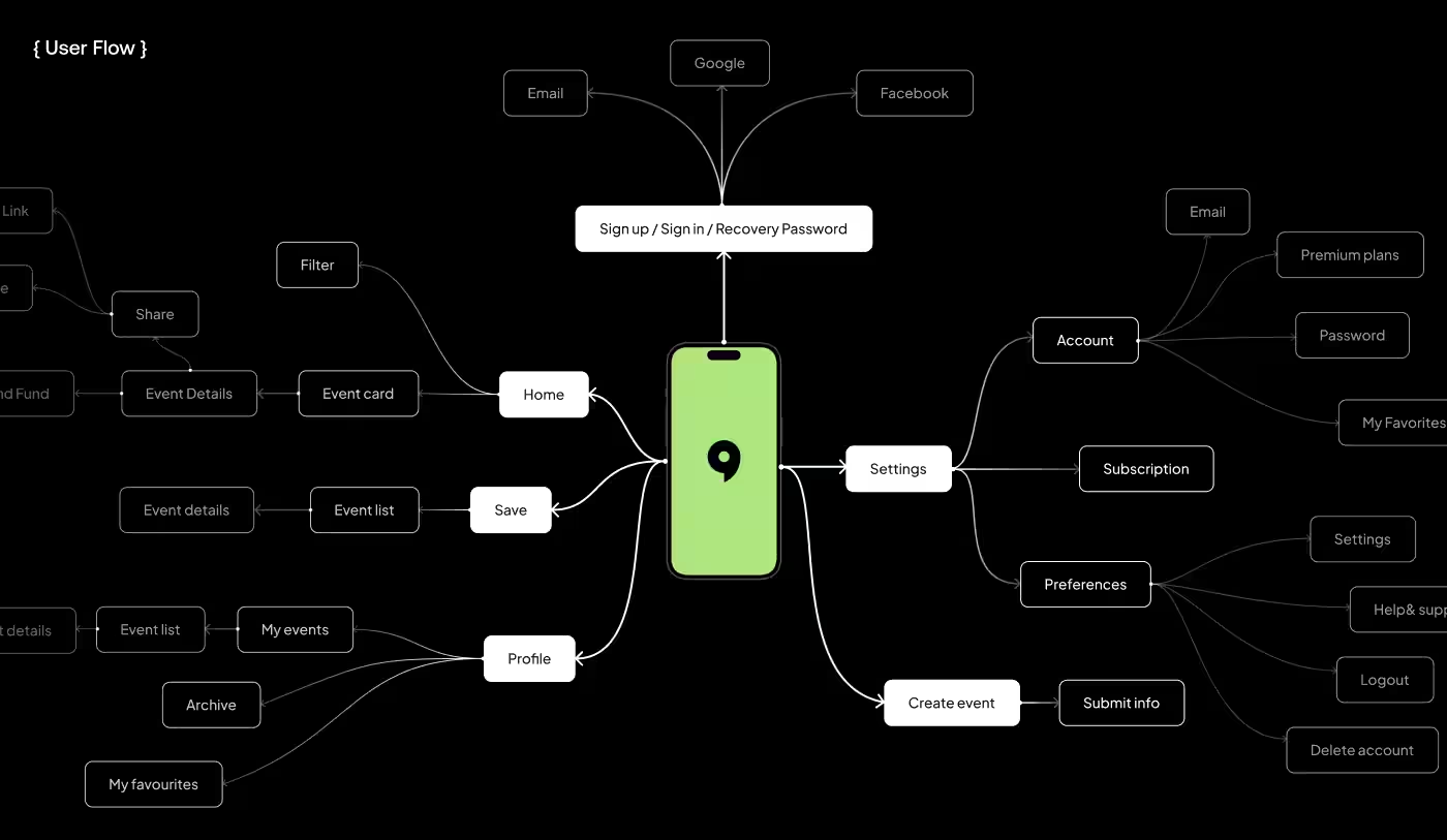
We started by looking at where people were losing clarity, then reworked the flow so browsing, choosing, and booking felt more natural.
01
Explore the Flow
- Found friction points
- Traced user hesitation
- Noted missing details
02
Shape the Structure
- Rearranged key content
- Kept details easier to scan
- Reduced visual noise
03
Build Confidence
- Strengthened hierarchy
- Brought forward context
- Improved screen clarity
04
Tighten the Flow
- Simplified the booking path
- Removed extra friction
- Kept the focus clear
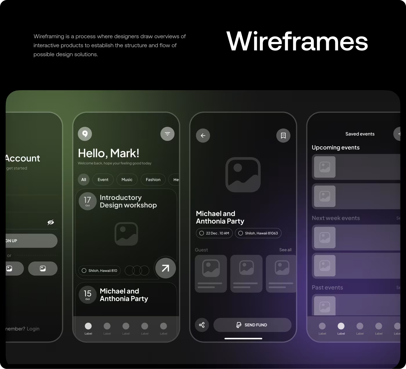
RESEARCH
Looking at what people needed before they booked
The research focused on how people discover events, what makes them trust an event listing, and what usually gets in the way before they decide to buy a ticket.
- Event details were too thin
People needed more than a photo and title to feel sure about an event. - Trust signals mattered
Things like attendance, activity, and context helped events feel more believable. - Booking needed less uncertainty
The closer people got to checkout, the more important clear pricing and next steps became. - Browsing had to stay quickPeople wanted to scan, filter, and compare events without slowing down.
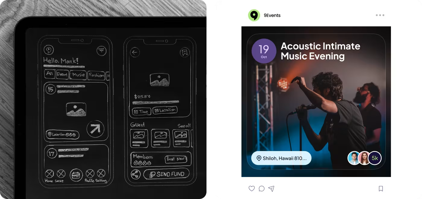
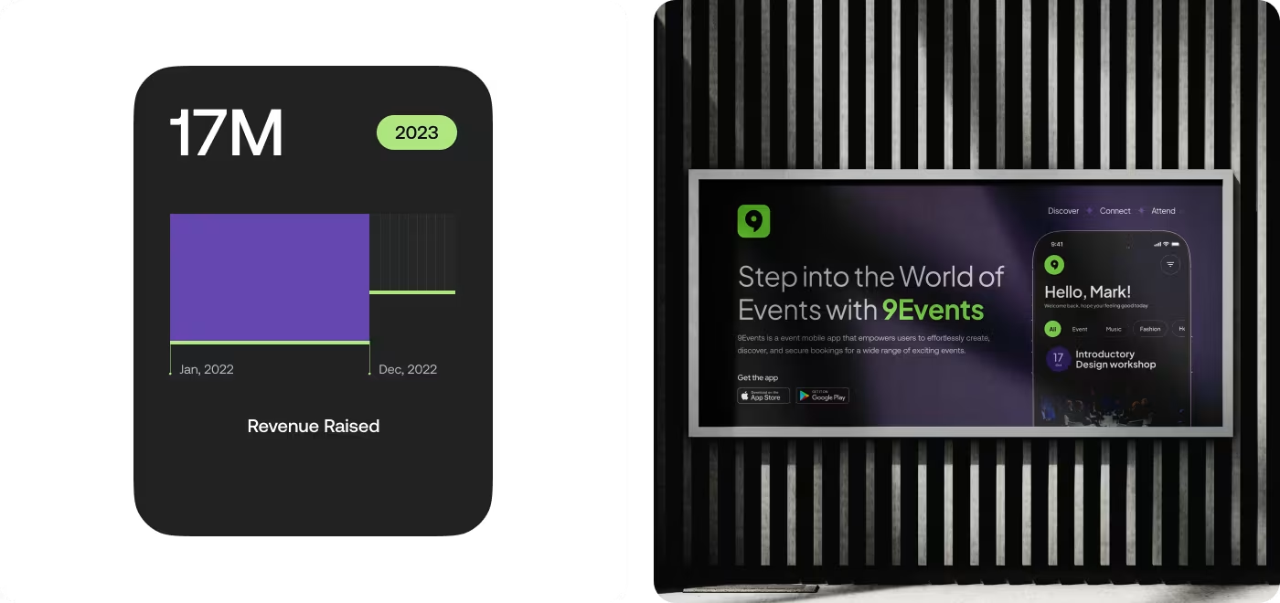
Services
Making the flow easier to follow
The main focus here was the flow. People needed a simpler way to move from finding an event to understanding it and booking it without feeling lost along the way.
So the screens were reorganized around the details that matter most. Event info, timing, pricing, and next steps were placed where they could be seen fast, which made the whole experience feel easier to follow.
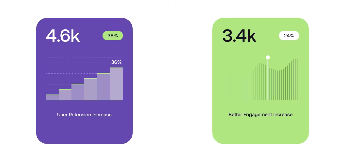
Services
Shaping the visual style
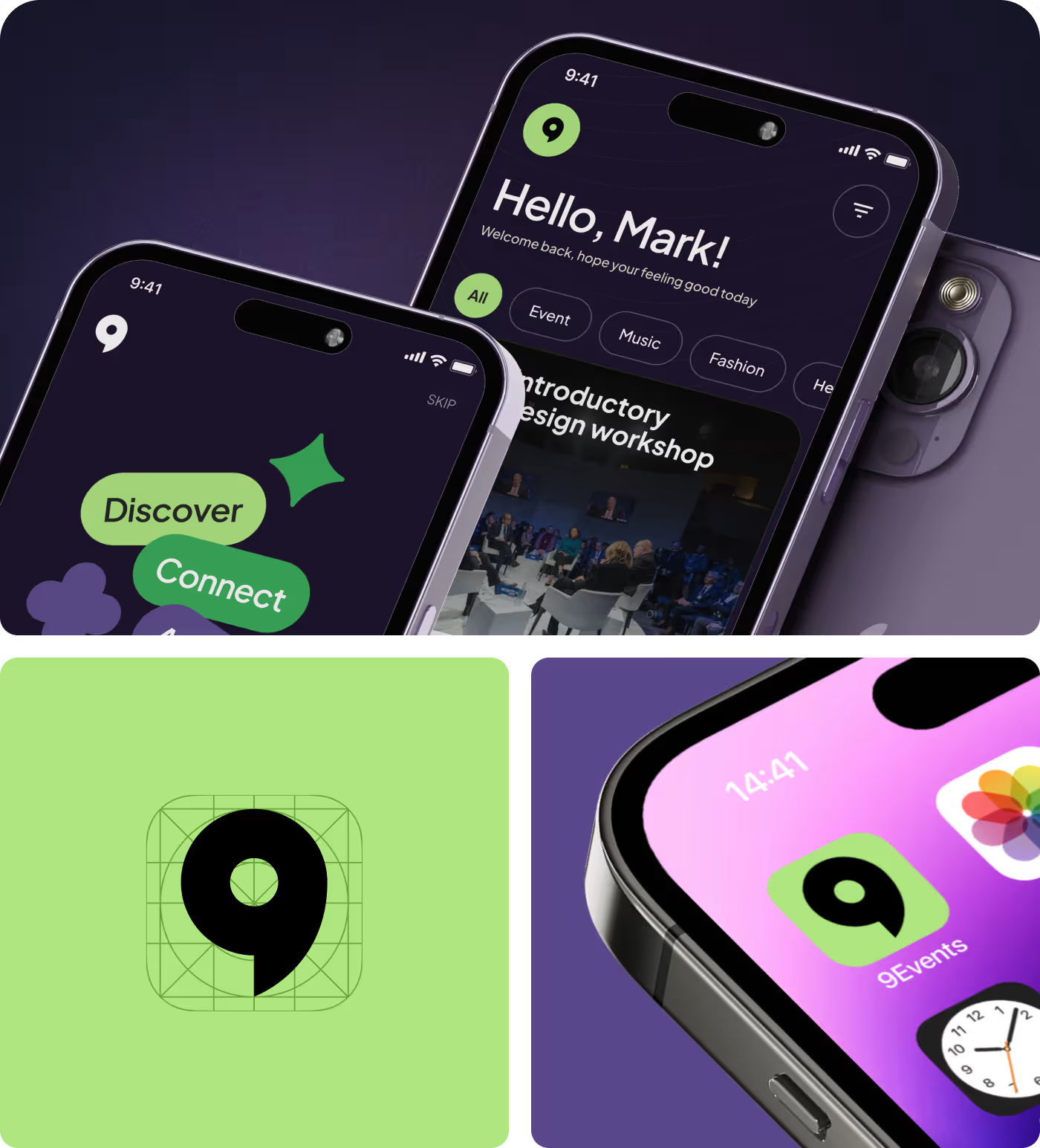
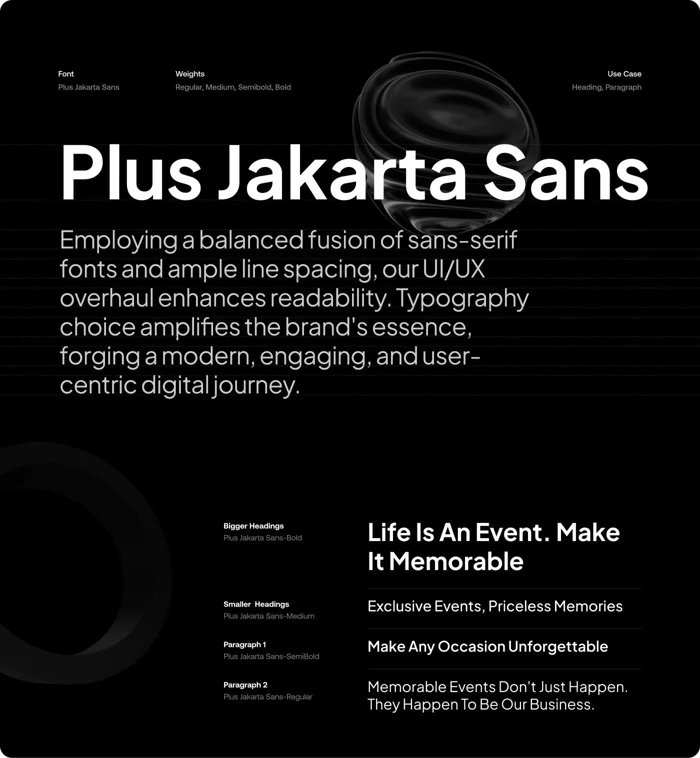
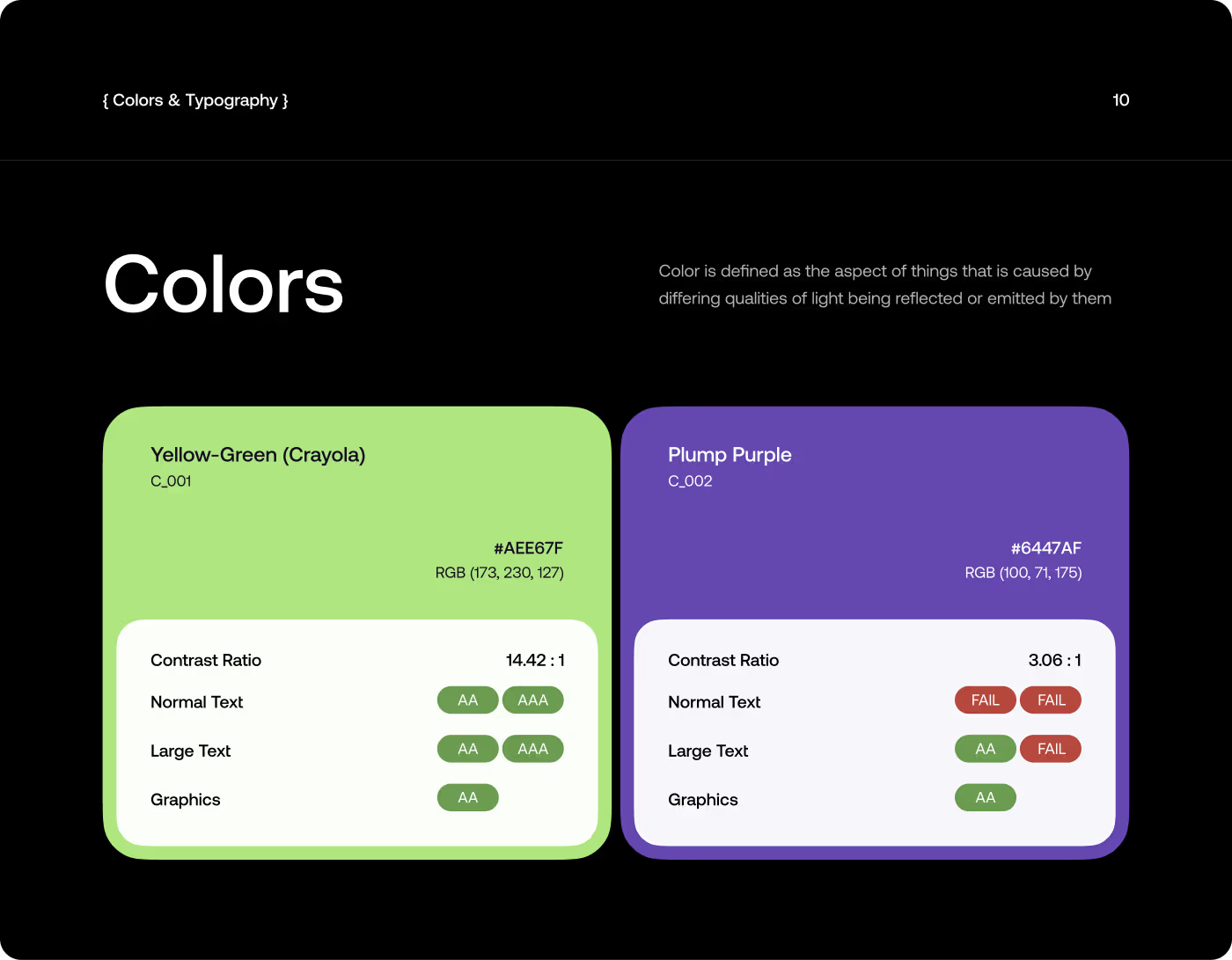
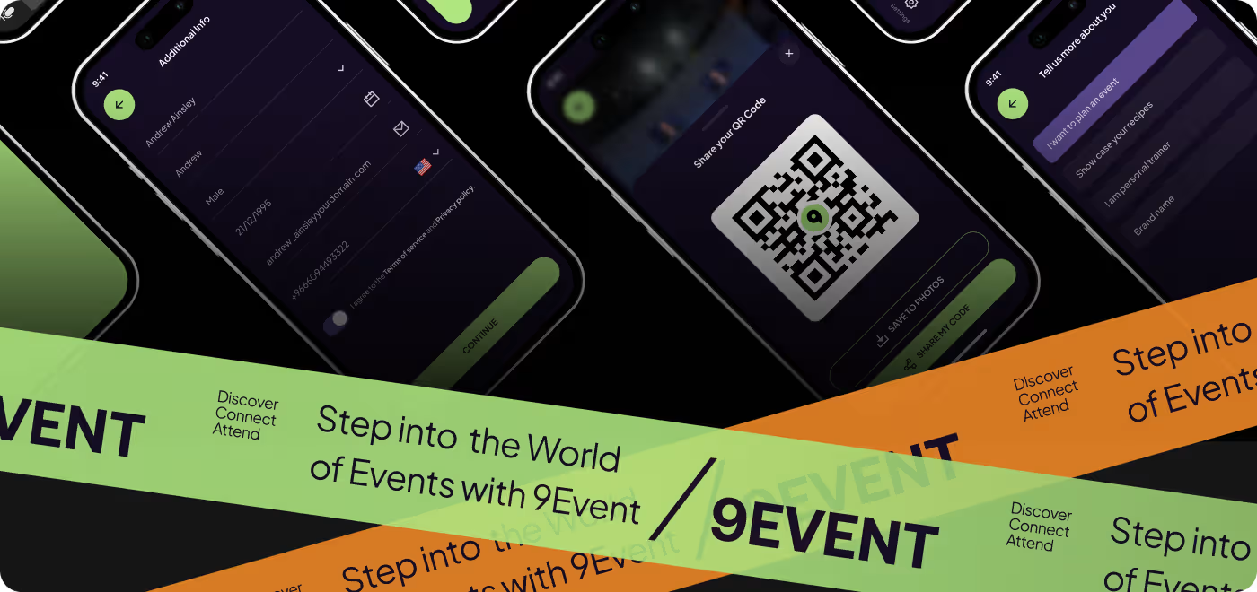
The visual style was built to match the energy of the app. A dark theme, bright accents, and bold event imagery helped give 9Events a strong identity right away.
At the same time, the layout stayed clean enough to keep things readable. The goal was to make each screen feel polished and memorable without getting in the way of the content.
RESULTS & OUTCOMES
The app felt easier to trust and move through
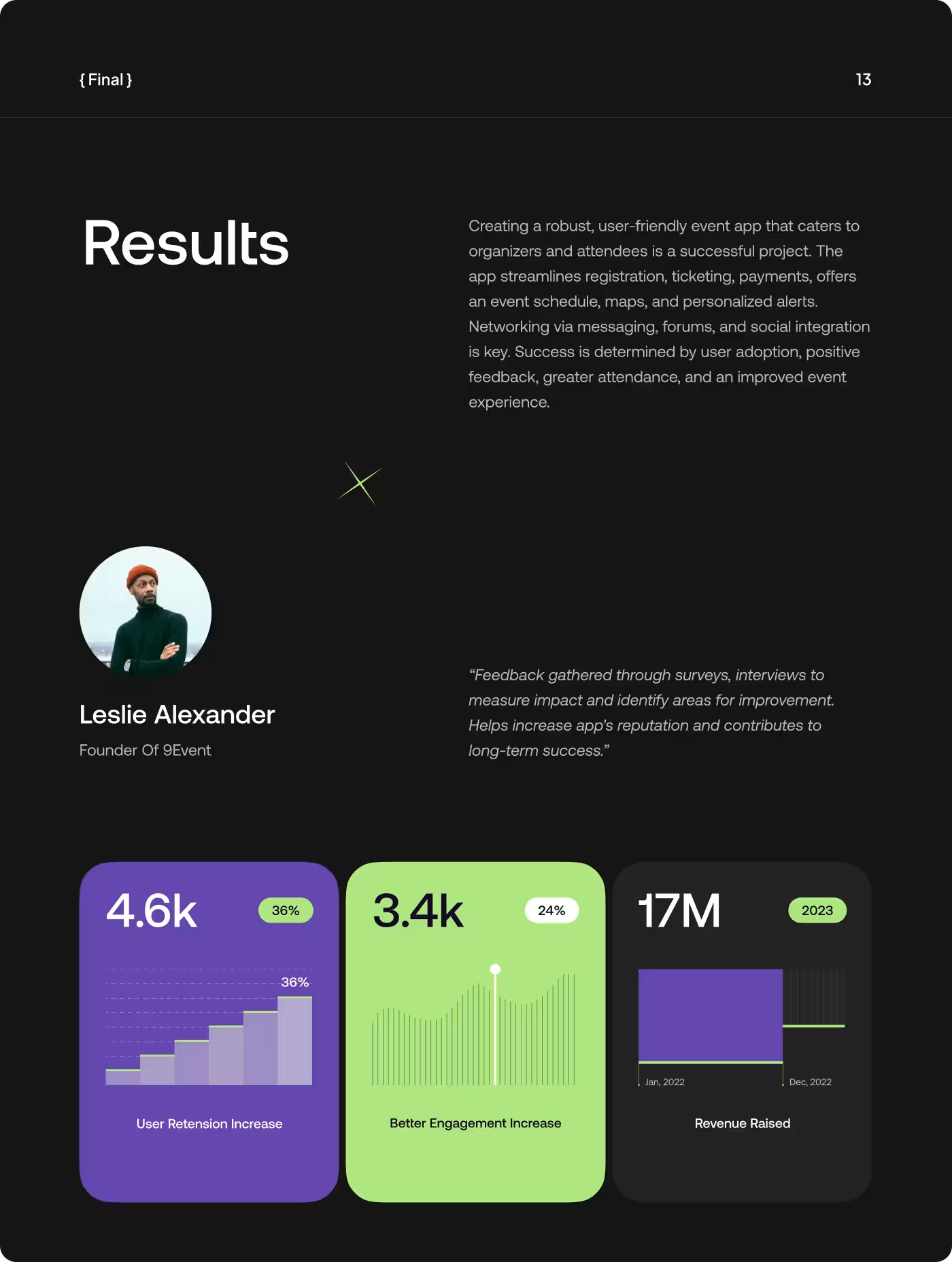
After the updates, the experience felt more complete. People could understand what an event was about more quickly, and the path from browsing to booking felt less uncertain.
- Clearer event browsing: people could scan events faster and understand the important details sooner.
- Less hesitation: the stronger layout and added context helped the experience feel more trustworthy.
- Smoother booking flow: the path to checkout felt more direct and easier to follow.
- Better engagement: the app kept attention better by making the screens cleaner, sharper, and easier to use.