Gourmeat Food
Best of Behance

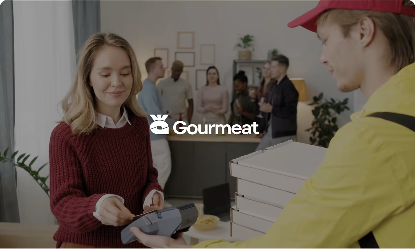
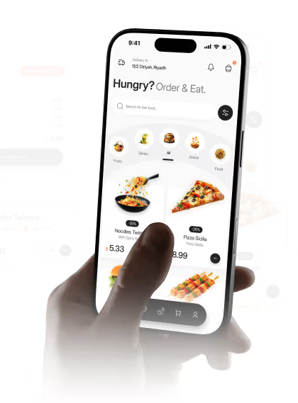
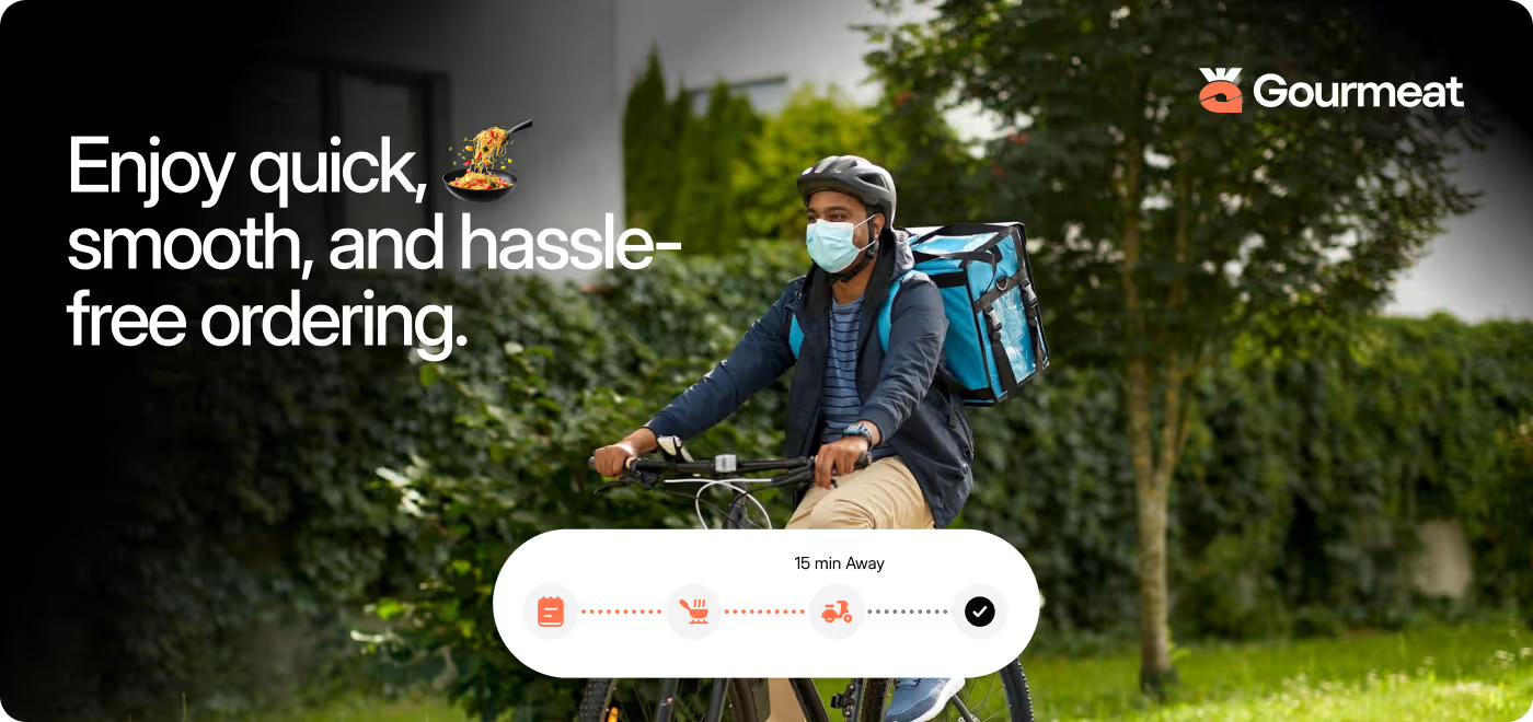
Gourmeat is a modern food delivery app that simplifies (ordering) (tracking) & (enjoying meals)
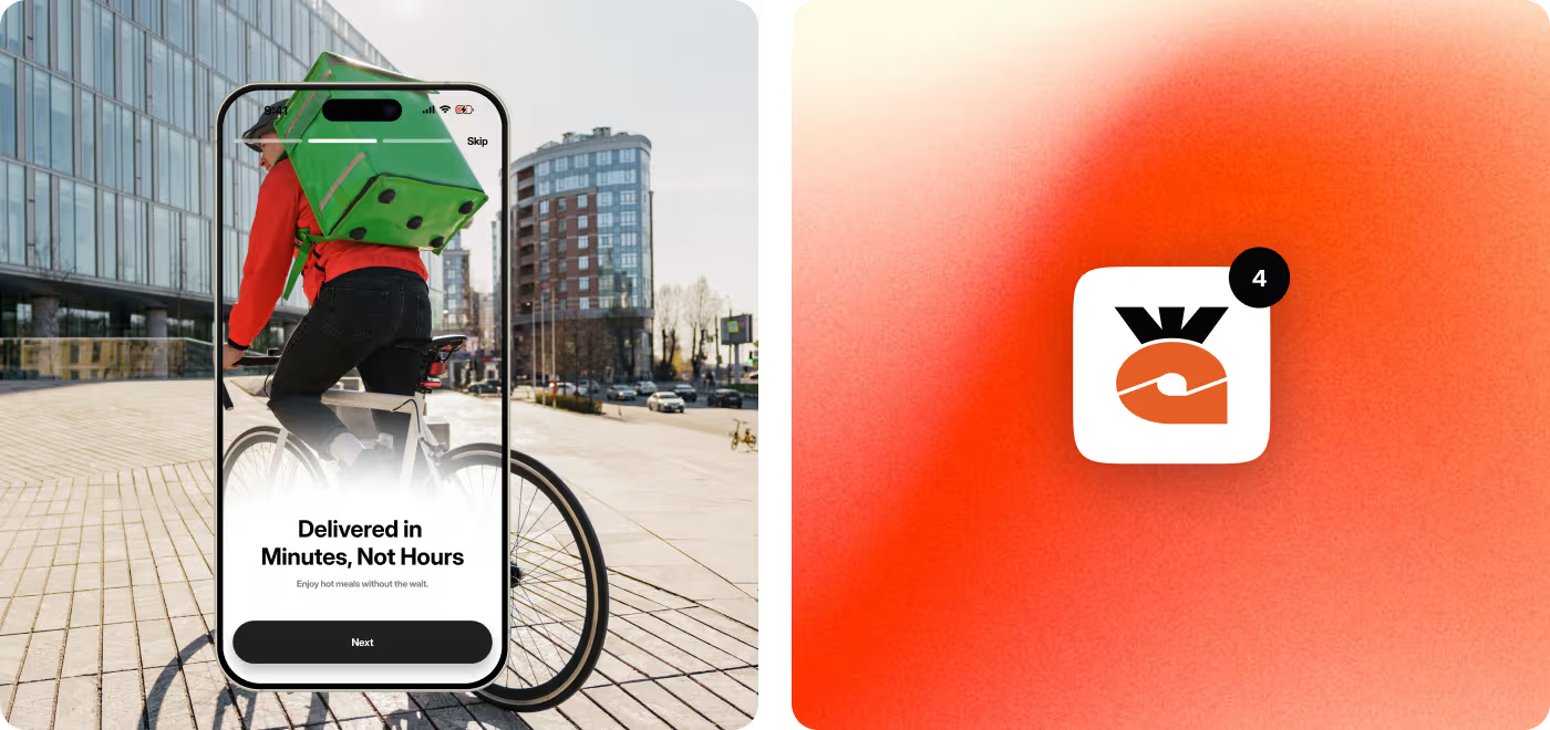
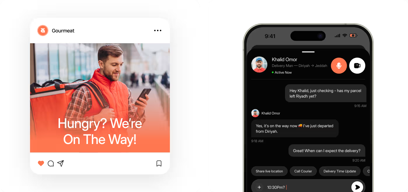
Offering fast delivery, real-time updates, and a seamless user experience.
Our task was to add longevity to two of Roland's lead gen campaigns, 'Sounds like me' and 'Find your rhythm'. To keep audiences engaged and click-through rates high, they needed new creative assets for performance testing but had limited resources.
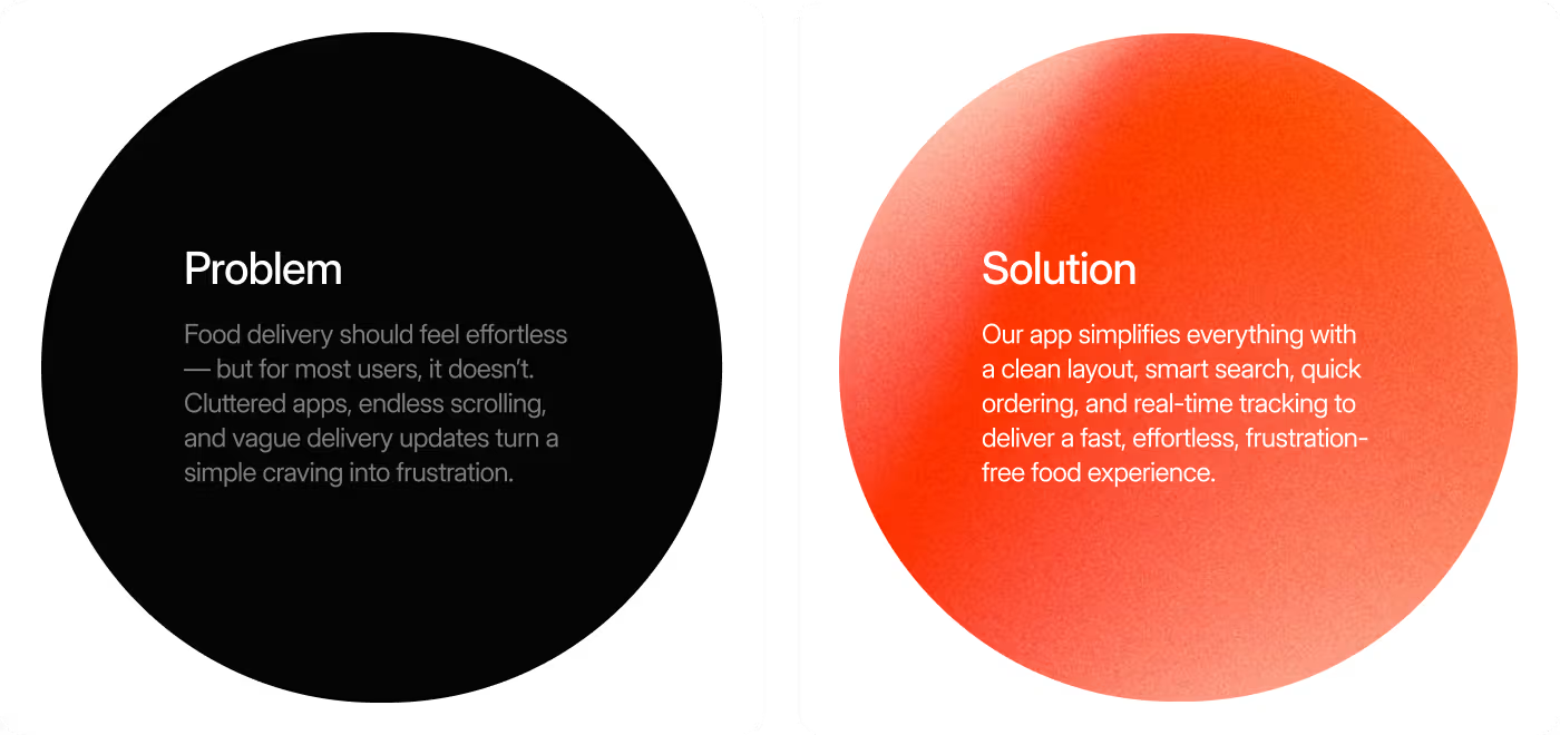
PROBLEM
The problem with food ordering that felt slower than it should
Gourmeat had the right features, but the experience made quick ordering feel harder than it needed to be. Users faced too many choices, unclear next steps, and extra friction before checkout.
- Unclear starting point: Users didn’t know where to begin when they opened the app.
- Late key information: Delivery time and other useful details appeared too late.
- Too many similar options: Choosing a meal took longer than it should.
- Friction in checkout: Extra steps slowed users before completing the order.
- Low confidence through the flow: The journey felt less clear and predictable than expected.
SOLUTION
Making food ordering faster and easier
We redesigned Gourmeat to help users make quicker decisions and move through the ordering flow with less friction. The experience was reworked to feel clearer, more guided, and easier to complete.
- Clearer entry points: We made it easier for users to know where to start and what to do next.
- Earlier key information: Delivery time and useful details surfaced sooner to support faster decisions.
- Simplified meal selection: We reduced choice overload and made options easier to compare.
- Smoother checkout flow: We removed extra friction so users could complete orders faster
PROCESS
The design process behind Gourmeat
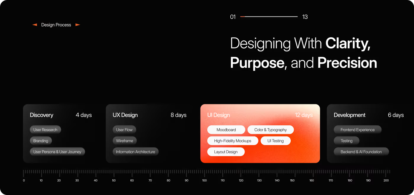
We followed a clear, design-focused process to understand where users slowed down and how to make ordering feel faster, simpler, and more predictable.
01
Discovery & research
- User journey review
- Pain point mapping
- Decision-making friction
- Checkout drop-off analysis
02
Structure & user flow
- Core flow planning
- Navigation structure
- Information hierarchy
- Wireframing key screens
03
UX & UI design
- Meal browsing flow
- Product page design
- Checkout experience
- Visual hierarchy and consistency
04
Refinement & delivery
- Interface refinements
- Component consistency
- Final mockups
- Handoff-ready screens
RESEARCH
UX Research & Design Artifacts
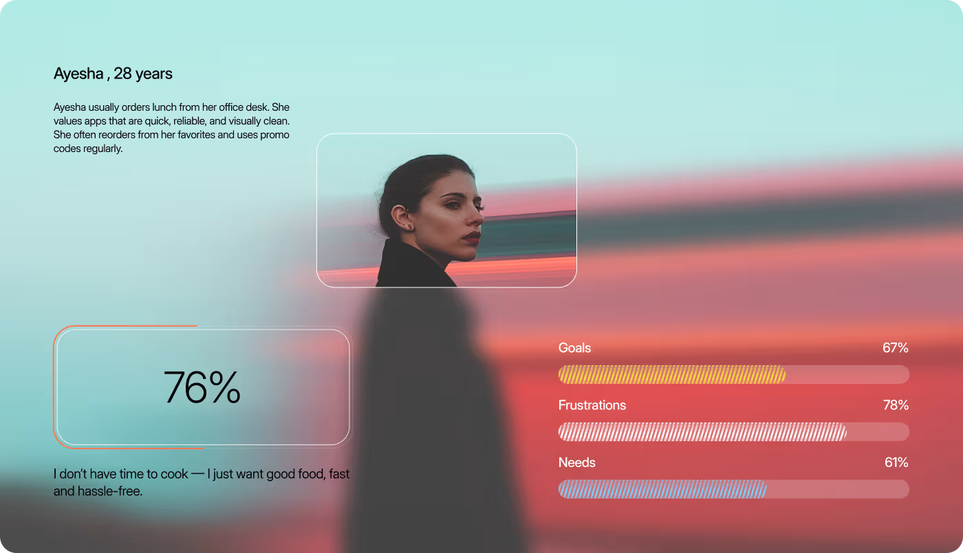
We grounded the Gourmeat redesign in how people actually order food: quickly, with low patience, and usually while multitasking. The research focused on where users slowed down, what information they needed earlier, and how the flow could better support faster decisions.
- User behavior patterns: Users came to the app with a simple goal: find food fast, make a quick decision, and check out without extra effort.
- Journey mapping insights: The biggest slowdowns appeared between browsing, comparing options, and moving into checkout.
- Decision-making friction: Too many similar choices and late visibility of delivery details made ordering feel less clear than it should.
Persona direction: The core user was a busy, repeat-ordering customer who values a smooth experience over exploration.
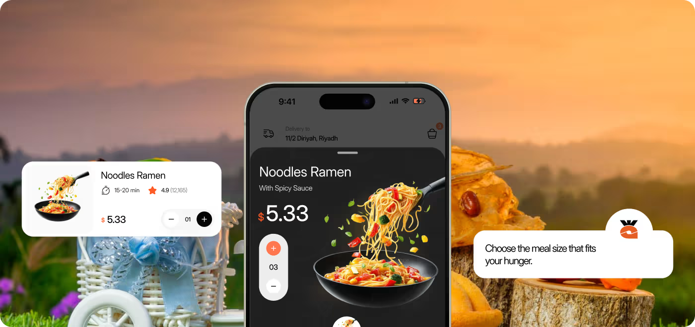
Services
Designing a faster food ordering experience
Gourmeat was redesigned to make ordering feel quicker, clearer, and easier to complete. The focus was on reducing hesitation across the journey, from finding food to finishing checkout.
We looked at how users move through the app, where they slow down, and what information they need to make faster decisions. That helped shape a flow that feels more direct and easier to follow.
By simplifying key steps, improving hierarchy, and surfacing important details earlier, the experience became more predictable and less frustrating for everyday use.
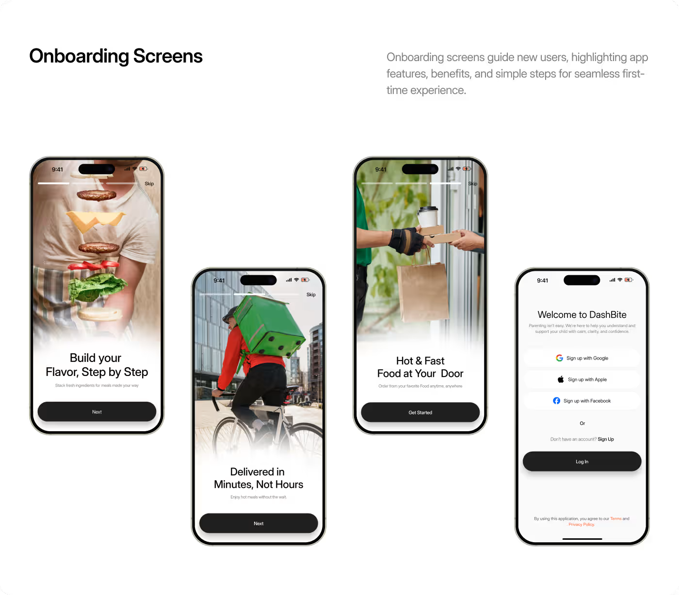
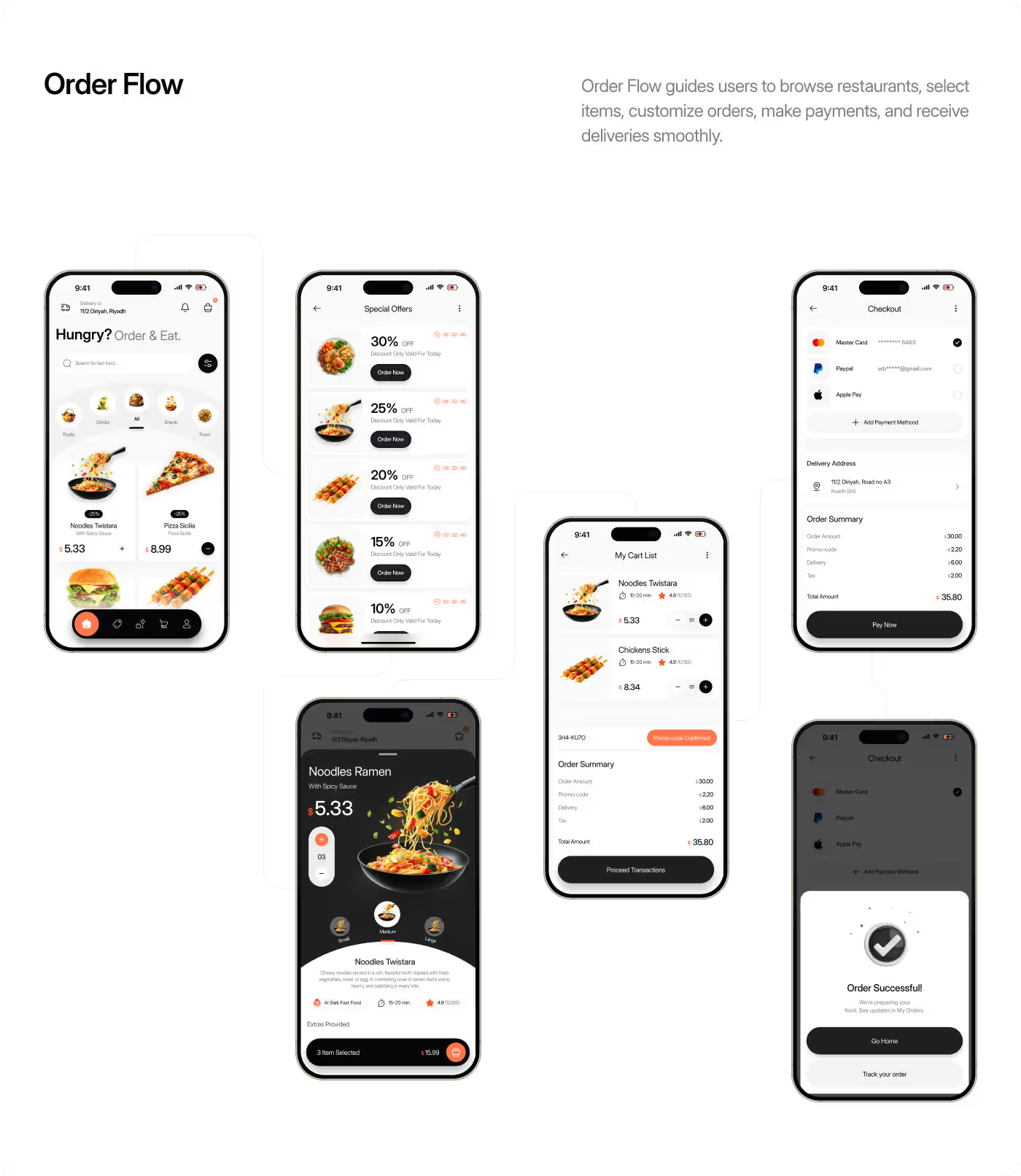
Services
Clear interface, built for quick decisions
The UI design of Gourmeat focused on making the app feel easy to scan, simple to use, and visually consistent across the full ordering flow. We used strong hierarchy, clean layouts, and a focused visual system to help users notice the right information at the right time.
From browsing meals to tracking an order, each screen was designed to reduce noise and support faster actions. The result is an interface that feels more organized, more predictable, and better suited to everyday food ordering.
RESULTS & OUTCOMES
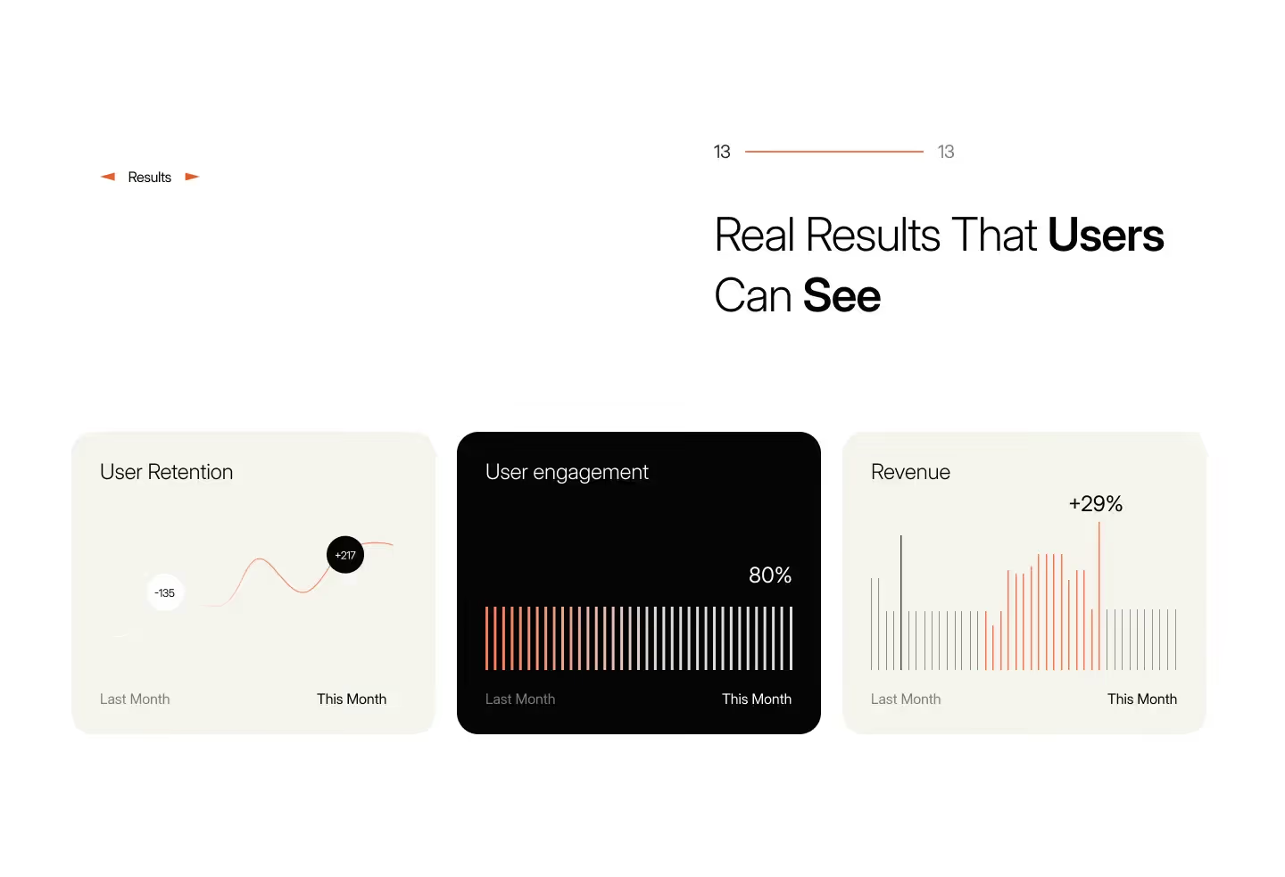
Better ordering flow, stronger user completion
The Gourmeat redesign improved how users move through the food ordering experience. By making choices clearer, surfacing useful information earlier, and reducing friction in checkout, the product became easier to use from start to finish.
- 32% higher checkout completion: A clearer flow helped more users finish their orders.
- 21% lower checkout abandonment: Fewer users dropped off before completing payment.
- Faster decision-making: Earlier delivery details helped users choose with less hesitation.
- Smoother ordering experience: Simplified steps made the journey feel quicker and easier.
- More confident post-order tracking: Clearer updates improved the experience after checkout.