Couriq Parcel
UI/UX - XD


Simplifying Parcel Shipping by Reducing Booking Friction and Making Actions Obvious
Couriq is a courier delivery app designed to make parcel shipping easier to manage.
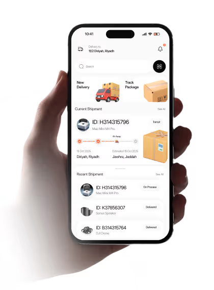
Our task was to reduce complexity in parcel booking while keeping users informed throughout the delivery process. Every step needed to feel clear and predictable, especially in tracking where users rely on accurate, real-time updates.
PROBLEM
The parcel experience felt harder to follow than it should have
Couriq had the right pieces for a delivery app, but the experience likely didn’t feel clear enough in the moments that matter most. Users needed to send parcels, track shipments, and complete payment without second-guessing the interface.
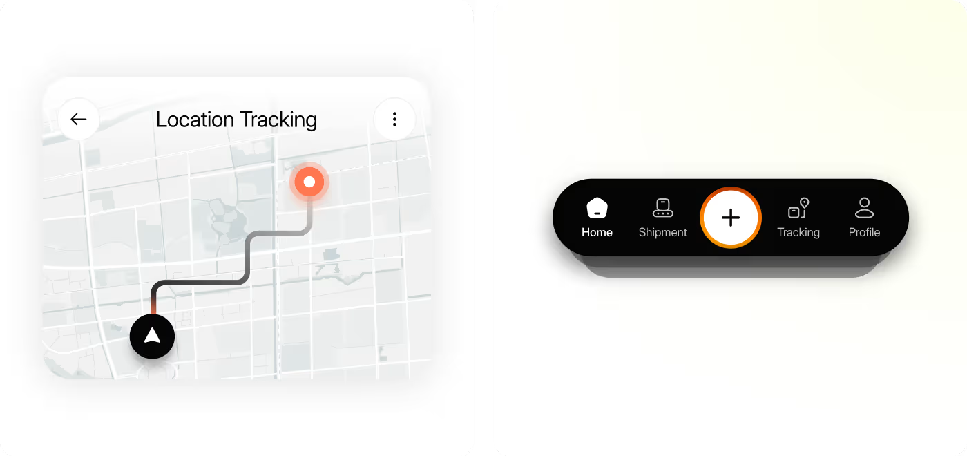
- Unclear shipment visibility: Users needed a faster way to understand where a package was and what stage it had reached.
- Scattered key actions: Important tasks like tracking, delivery setup, payment, and shipment details needed to feel more connected.
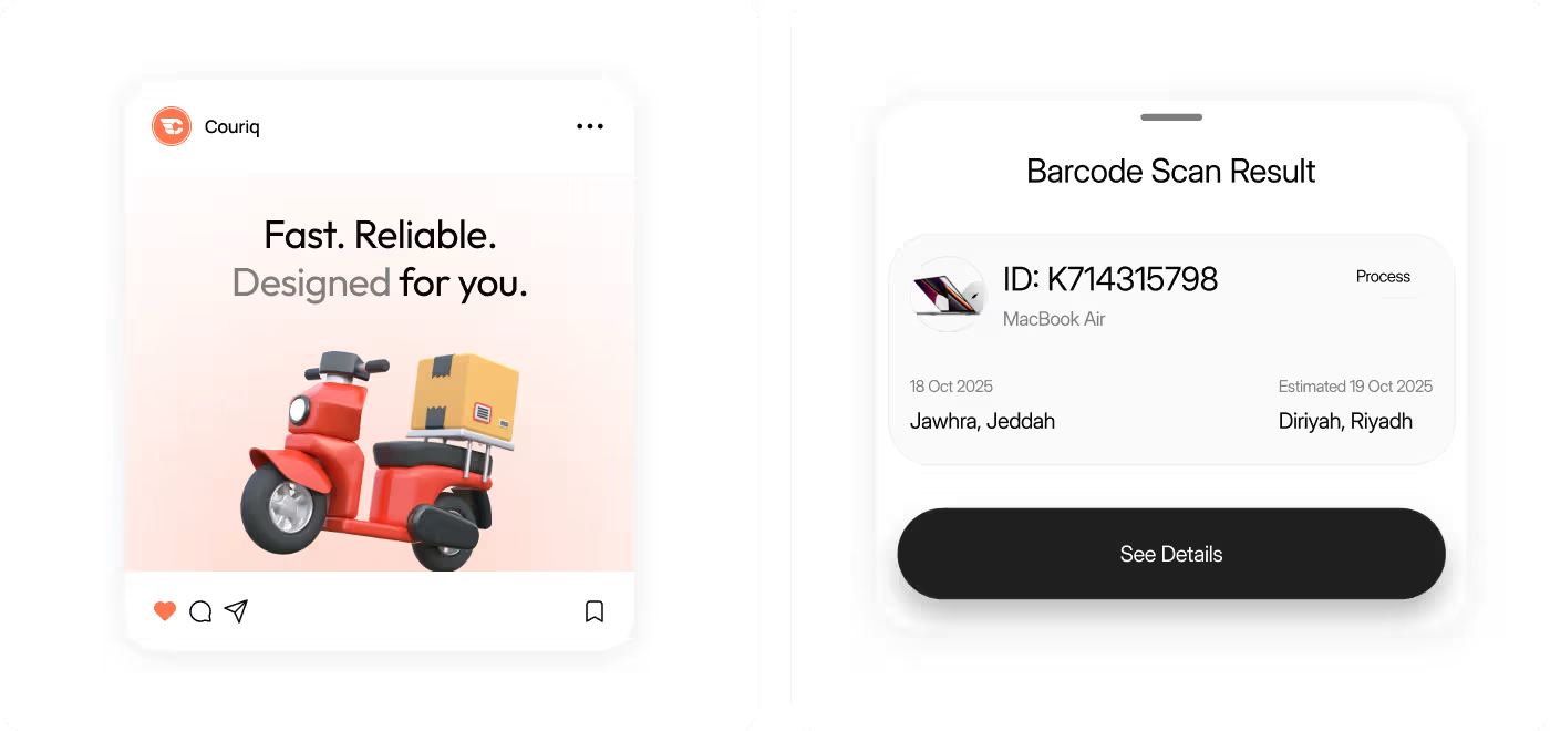
- Weak information hierarchy: Status, timing, destination, and parcel details had to be easier to scan at a glance.
- Too much mental effort: Users should not have to pause and interpret what the app is trying to tell them.
SOLUTION
Making delivery management feel clearer and easier to use
The design direction focused on reducing confusion and making the app feel more straightforward from the first screen onward. Rather than adding more features, the work centered on organizing the experience better using the right information sooner.
- Clearer tracking views: Shipment status was presented in a more visual and readable way so users could understand progress faster.
- Stronger main actions: Core tasks like new delivery, track package, payment, and shipment review were made easier to find.
- Better screen structure: Important delivery details were grouped more clearly to reduce clutter and improve scanning.
- More guided flow: The app was shaped to feel more direct, so users always had a clearer sense of what to do next.
PROCESS
The design process focused on clarity, structure, and confidence
The Couriq process can be framed as a practical redesign effort centered on how people actually use a parcel app: quickly, with a specific goal, and usually with low patience for confusion.
01
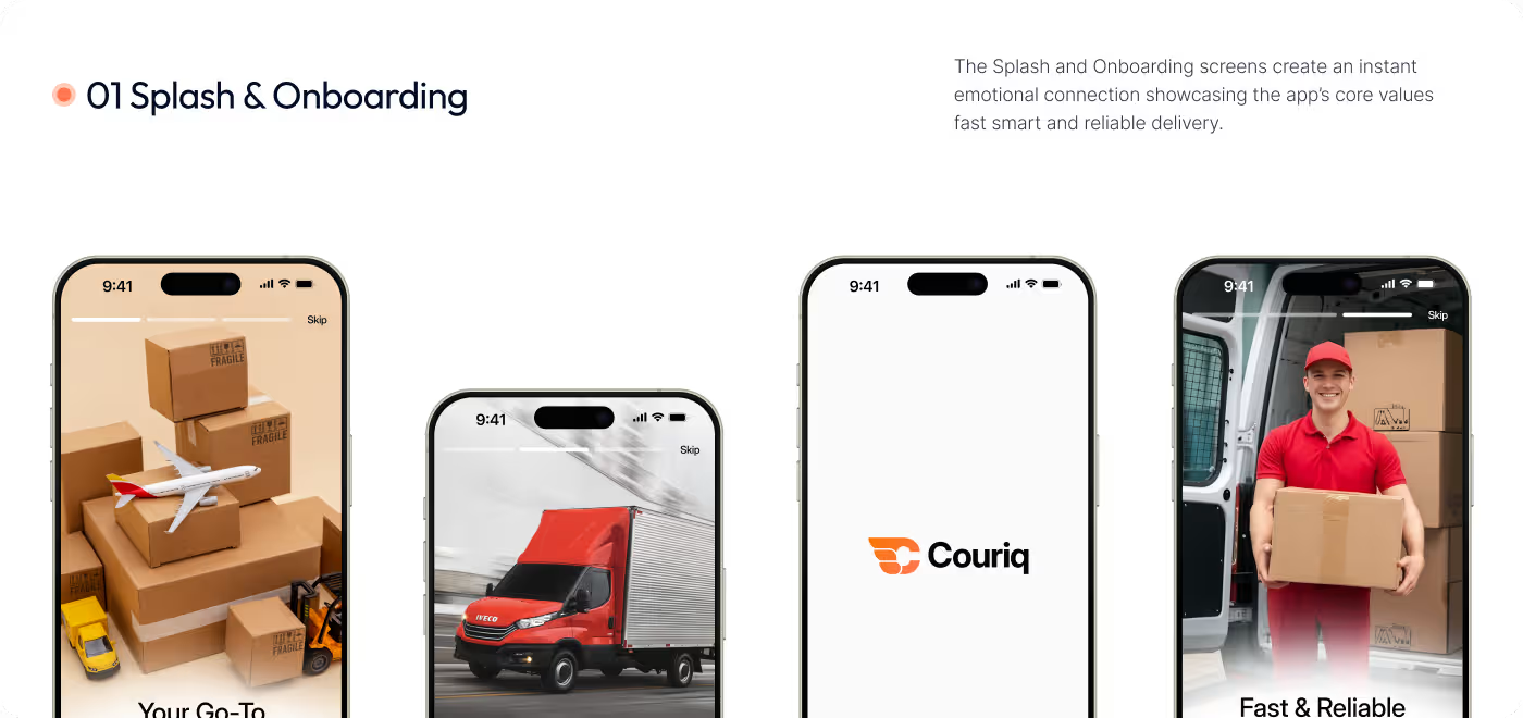
Product review & problem framing
- Reviewing the main delivery tasks
- Identifying high-friction moments
- Looking at tracking, payment, and shipment flows
- Defining the areas that needed stronger clarity
02
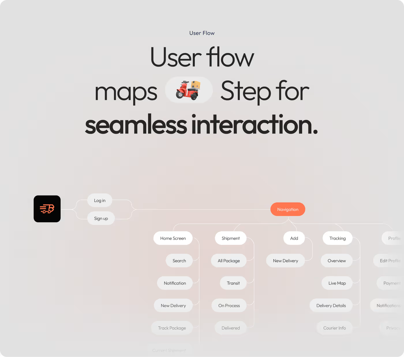
Flow structure & navigation
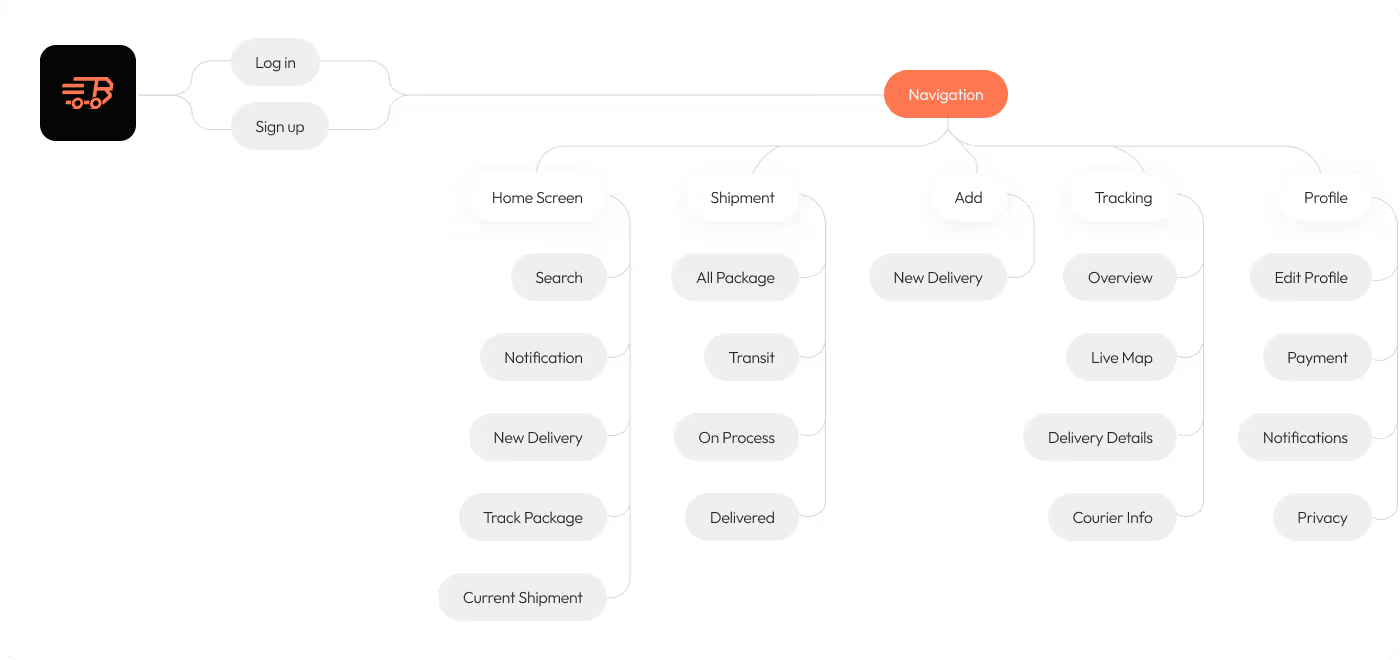
- Mapping the core screens
- Organizing the navigation flow
- Connecting related actions more clearly
- Improving how users move between tasks
03
UX & interface design
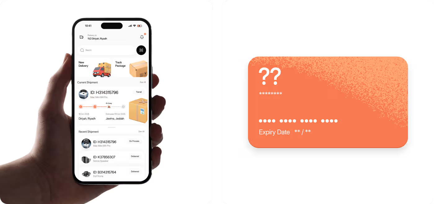
- Home screen direction
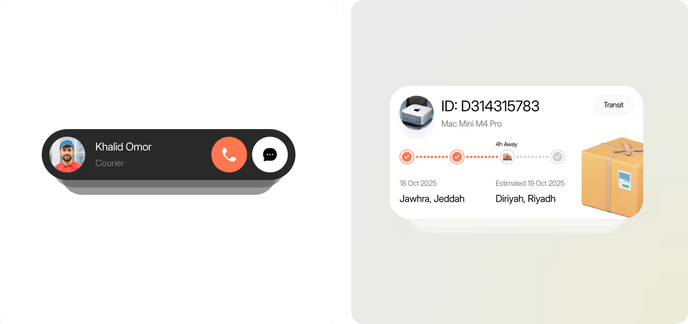
- Tracking and shipment cards
- Barcode and delivery detail views
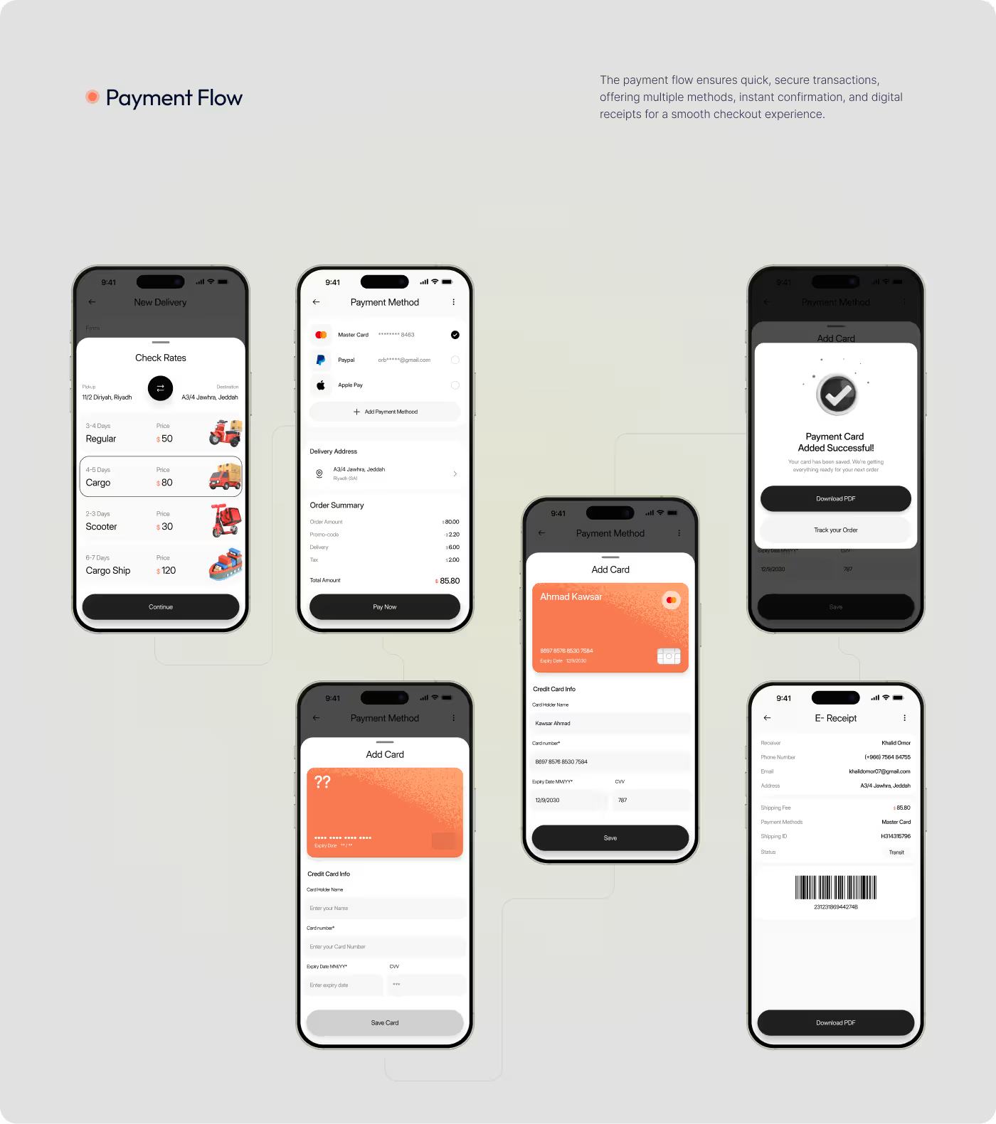
- Payment and confirmation screens
04
Refinement & system consistency
- Aligning components and spacing
- Strengthening consistency across screens
- Refining status presentation
- Finalizing polished mockups
RESEARCH
Grounding the work in how users check and manage deliveries
The most believable research direction for Couriq is simple: people open delivery apps because they want quick answers. They are not there to browse for long. They want to know where a package is, what changed, and what they need to do next.
That makes clarity more important than complexity.
- Behavior insight: Users likely come into the app with a task-first mindset, usually to track, confirm, or manage something quickly.
- Status matters most: Shipment progress, delivery timing, and parcel location need to be easy to understand right away.
- Clarity builds trust: When updates are readable and actions are obvious, the app feels more reliable.
- Low-effort navigation is key: Users should be able to move between tracking, details, payment, and support without getting lost.

Services
Built around clearer delivery flow
The main UX work was about making the parcel experience feel easier to understand in motion. Instead of treating the app like a set of separate screens, we focused on how users move through delivery-related tasks when they need quick answers.
That meant shaping a flow where tracking, shipment details, new delivery actions, and payment all felt connected instead of scattered. The result was a more structured experience that helps users stay oriented and spend less time figuring out what to do next.
Services
Designed to make shipment status easy to read
The UI direction centered on visibility. In a parcel app, users need to scan updates fast, notice status changes quickly, and understand details without digging through the interface. We designed the screens to support that behavior through cleaner layout decisions, stronger grouping of information, and a more consistent visual system.
This system was used across tracking, payment, and support moments. The interface was shaped to feel simple and dependable, with the goal of making delivery management feel lighter and more under control.
RESULTS & OUTCOMES
A clearer delivery experience, built around easier tracking
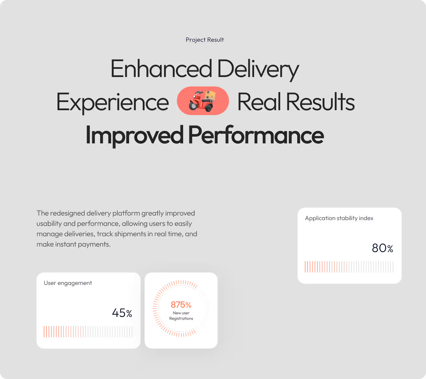
We redesigned Couriq to improve how users move through parcel-related tasks by making shipment updates easier to understand and key actions easier to reach.
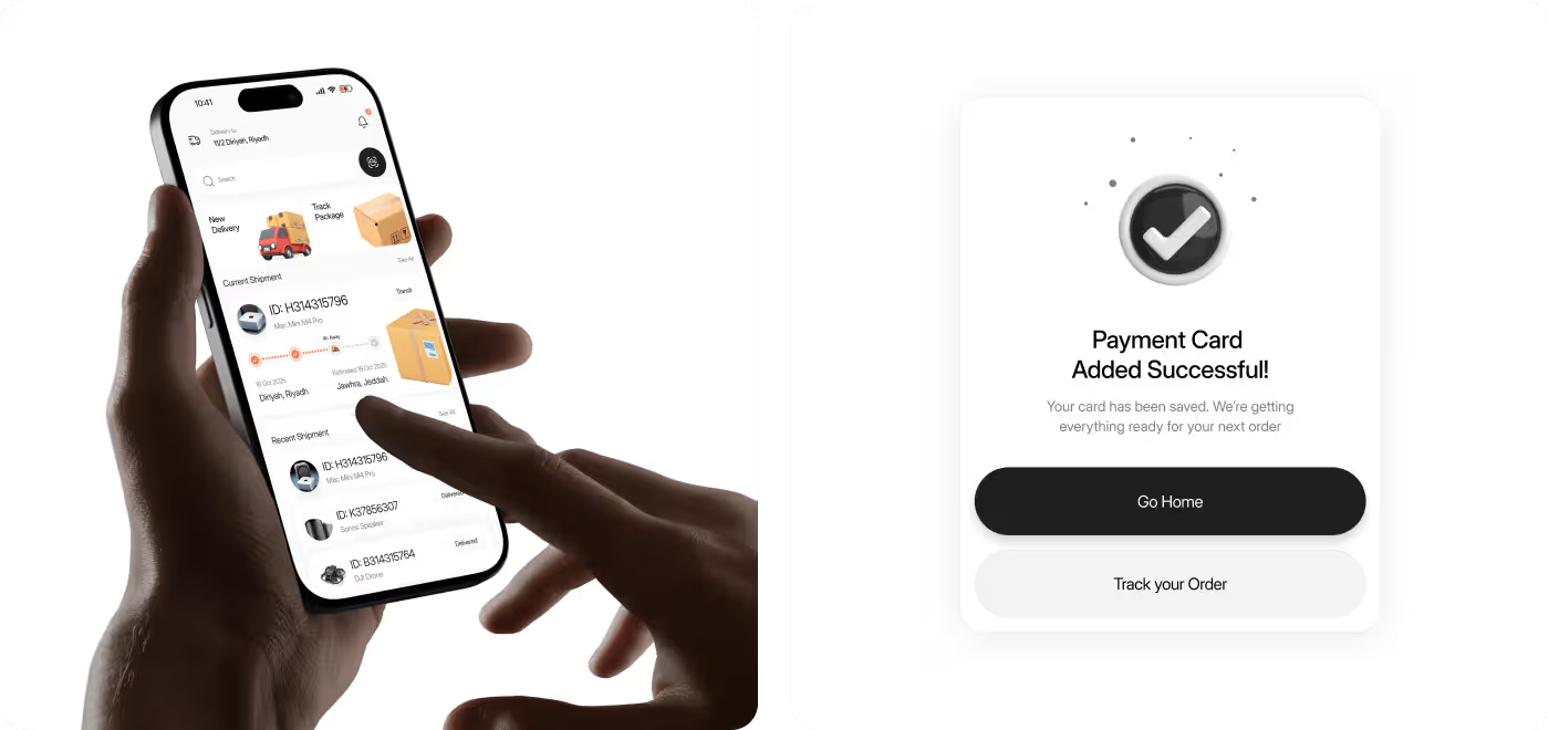
- Clearer shipment tracking: Delivery progress was presented in a way that made status updates easier to read and understand quickly.
- Better access to key actions: Core tasks like tracking a package, starting a delivery, checking details, and handling payment felt easier to find and use.
- Stronger information clarity: Shipment IDs, destinations, timing, and progress details were arranged more clearly so users could scan them with less effort.
- More connected user flow: The app felt less scattered by bringing tracking, support actions, and delivery management into one smoother experience.