NexCard
UI/UX - XD

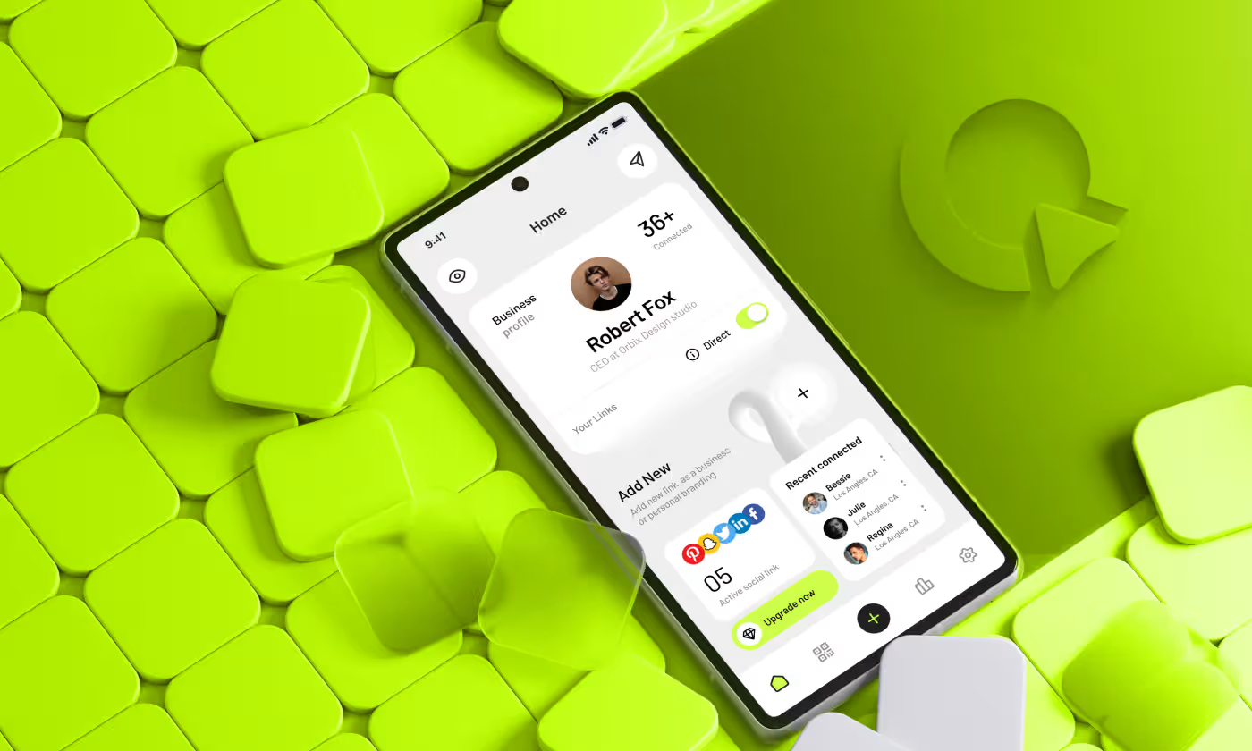
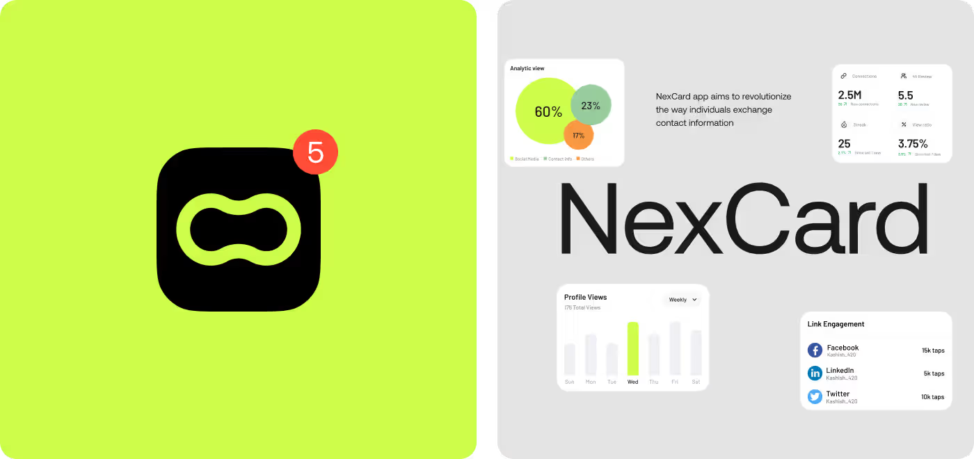
NexCard was created to simplify how users manage digital payments through virtual cards.
The focus was to design a product experience that clearly communicates control, visibility, and trust across every transaction.
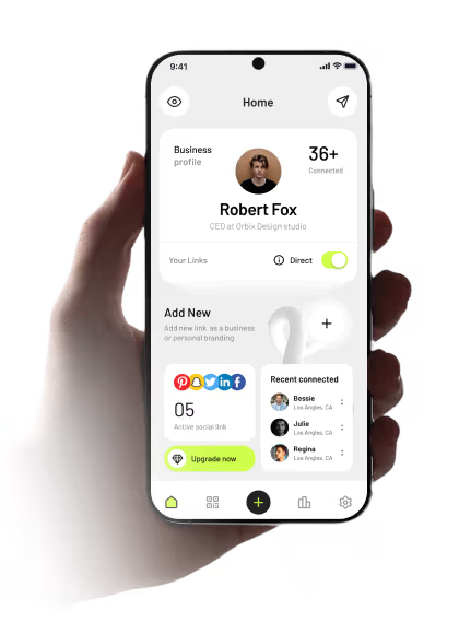
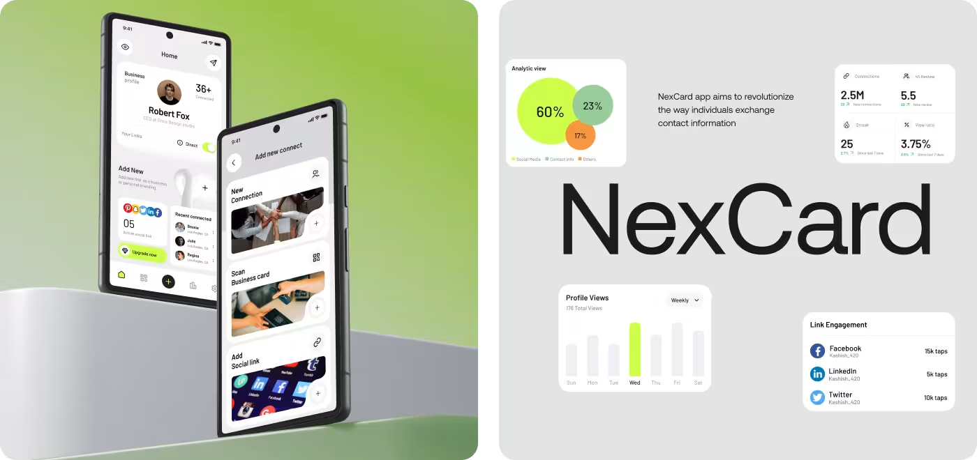
Our task was to design NexCard in a way that makes contact sharing simple and immediate. Since most users were not familiar with this kind of product, the experience had to clearly show what the app is for, how to set up a profile, and how to share it without confusion.

PROBLEM
Users Struggled to Understand How NexCard Worked
Most users had never used a digital contact-sharing product before, so the experience felt unclear during setup and sharing actions.
- Profile Setup Issue: Users did not know how to create and complete their profile during first-time use.
- Sharing Clarity Issue: People were unsure how NFC, QR, and social sharing actually worked inside the app.
- Information Visibility Issue: Important sharing actions and connected links were difficult to notice quickly.
- Product Understanding Issue: Users could not immediately understand what NexCard helps them do after opening the app
SOLUTION
We Simplified Profile Setup and Made Sharing Easier
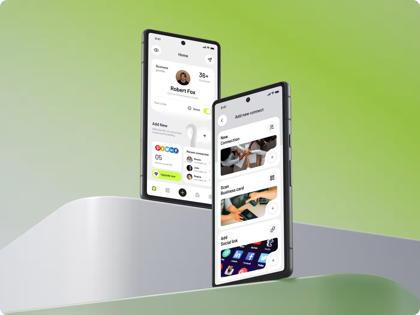
The experience was redesigned to help users understand NexCard faster, complete setup more easily, and share profiles without confusion.
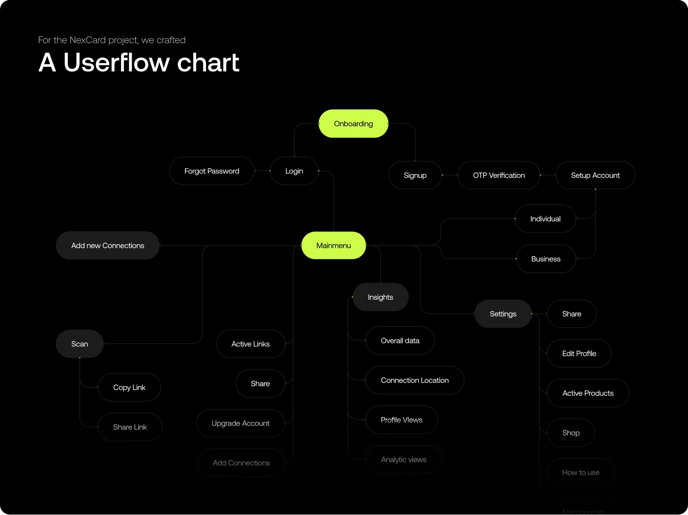
- Setup Flow Improvement: Profile creation was simplified into clearer step-by-step actions for first-time users.
- Sharing Experience Improvement: NFC, QR, and social sharing actions were made easier to find and use quickly.
- Information Structure Improvement: Contact details and social links were reorganized to improve readability and scanning.
- Experience Consistency Improvement: Navigation, layouts, and interactions were aligned to make the app feel more predictable across screens.
PROCESS
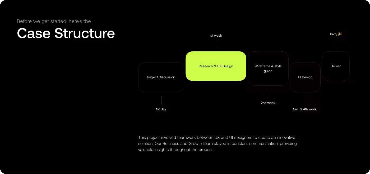
4-Step Research Process to Understand User Confusion and Sharing Behavior
The process focused on reducing confusion during setup and making profile sharing feel faster, clearer, and easier to use.
01
Studying First-Time Behavior
- Reviewed first impressions
- Identified learning gaps
- Measured user familiarity
- Found onboarding confusion
02
Analyzing Setup Friction
- Tracked setup issues
- Found unclear actions
- Reviewed user hesitation
- Simplified setup journey
03
Testing Sharing Actions
- Tested sharing behavior
- Improved action visibility
- Clarified shared content
- Reduced sharing friction
04
Refining Navigation Patterns
- Improved screen structure
- Simplified navigation flow
- Refined interaction patterns
- Reduced visual friction

RESEARCH
Understanding Why Users Felt Confused During Setup and Sharing
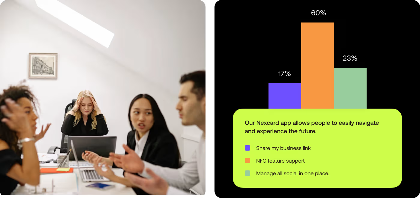
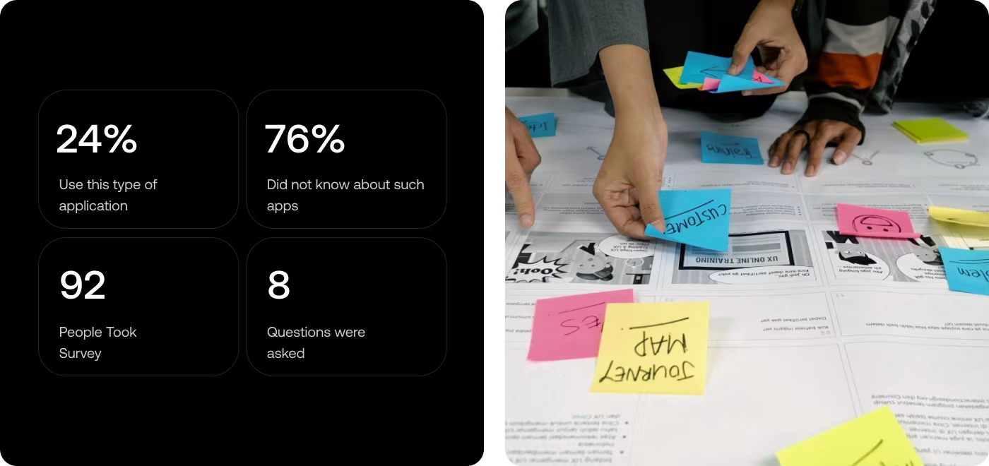
The research focused on how first-time users understood NexCard, what confused them during setup, and how they reacted to profile sharing actions.
- 76% of users had never used a digital sharing app before.
- Most users didn't understand how profile sharing worked.
- Users needed clearer guidance during onboarding.
- Sharing actions like NFC and QR felt unfamiliar without stronger visual direction.
Services
Simplifying the Profile Setup and Sharing Flow
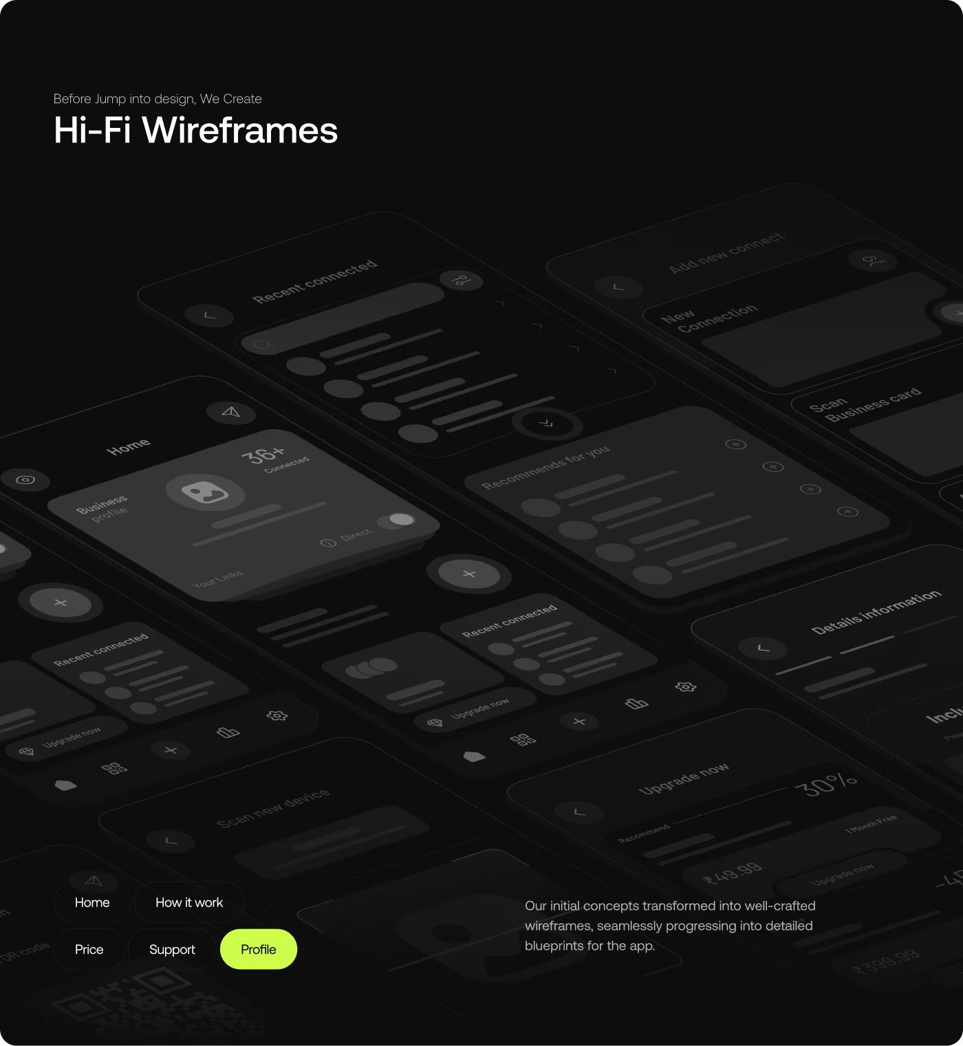
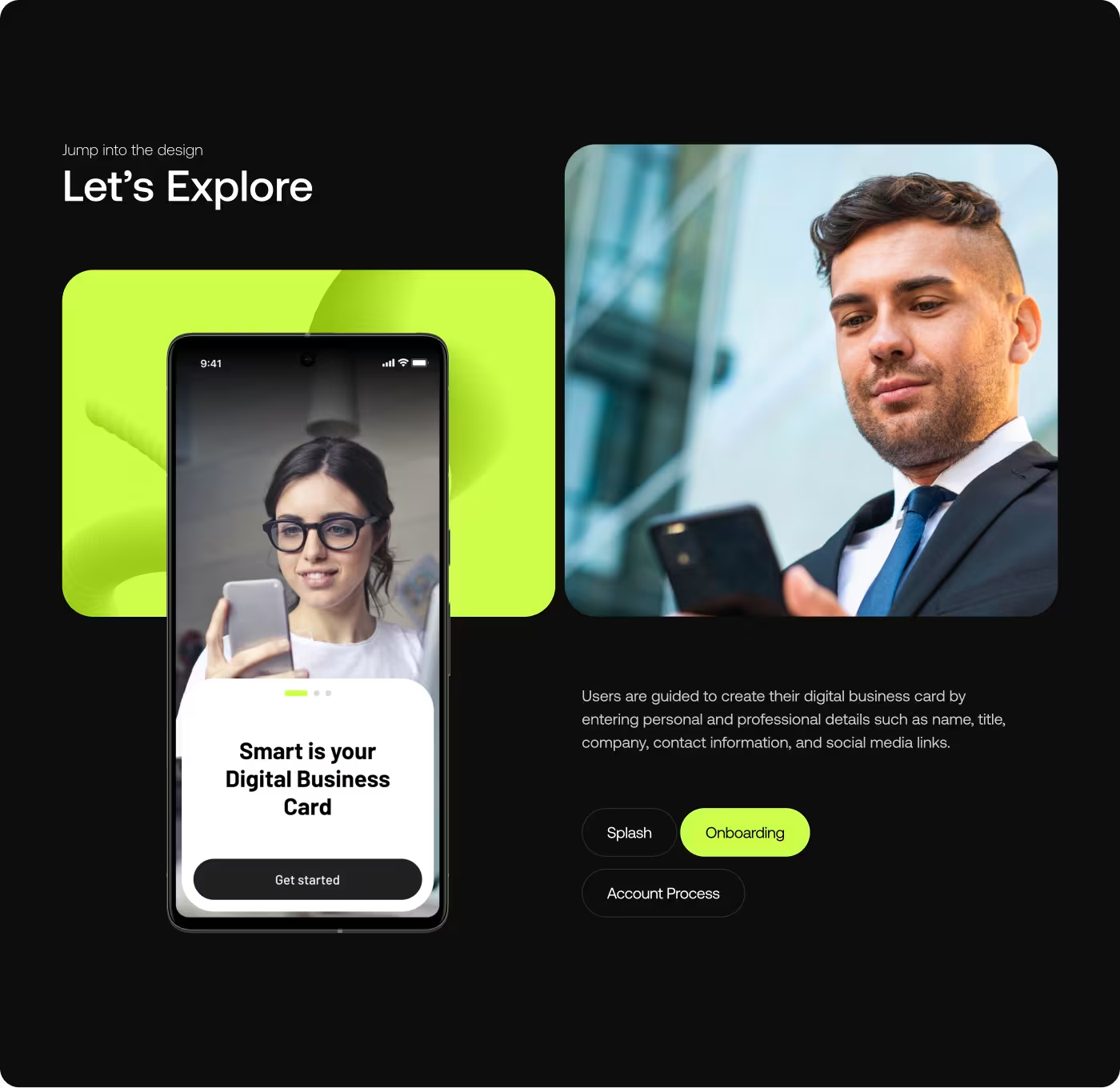
The UX work focused on helping users understand NexCard faster during first-time use. Since most people were unfamiliar with digital profile-sharing apps, the experience needed to guide users more clearly through setup, profile creation, and sharing actions.
Important actions like NFC sharing, QR sharing, and profile management were placed closer to where users expected them. This reduced hesitation and made the experience feel easier to learn.
Services
Creating a Cleaner and More Understandable Interface
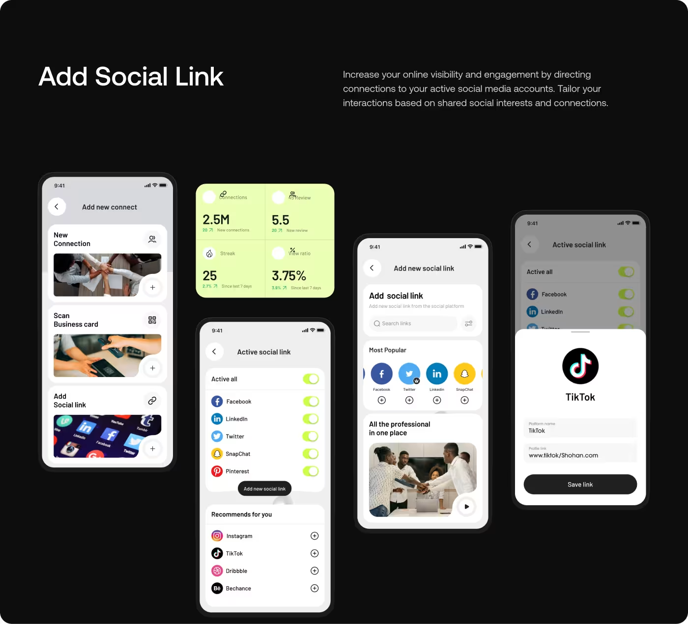
The interface was redesigned to improve clarity across profile screens, sharing interactions, and navigation patterns. Information needed to feel easier to scan so users could quickly understand what they were sharing and how the app worked.
Layouts were cleaned up to reduce visual clutter and improve focus during setup and sharing. Typography, cards, spacing, and content hierarchy were refined to make profile information more readable across the experience.
RESULTS & OUTCOMES
Users Could Set Up and Share Profiles More Easily
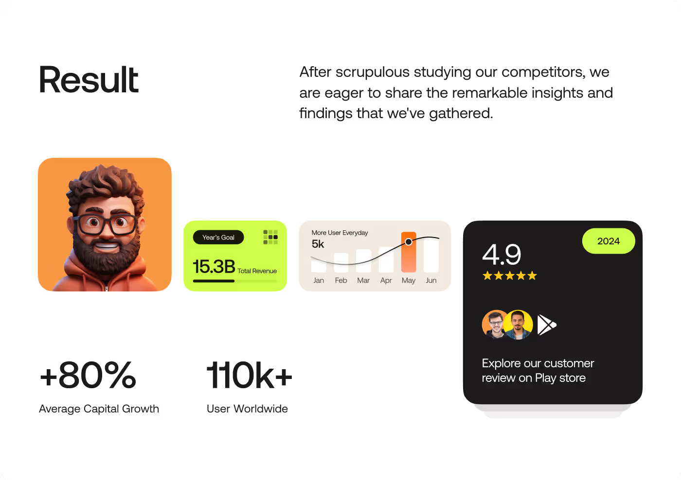
After the redesign, users understood NexCard faster and completed setup and sharing actions with less confusion. The experience became easier to learn, easier to navigate, and more comfortable during first-time use.
- Profile verification became 41% faster during important sharing and setup actions.
- Support queries related to payment and sharing confusion dropped by 32%.
- More users started using profile tracking features after the experience became easier to understand (+28%).
- Users completed profile setup and sharing actions more successfully on the first try.