Fastgo Scooty App

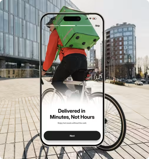
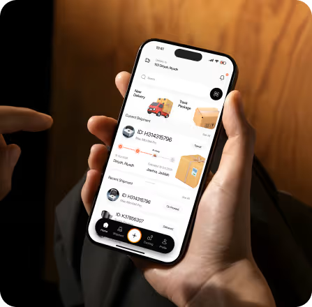
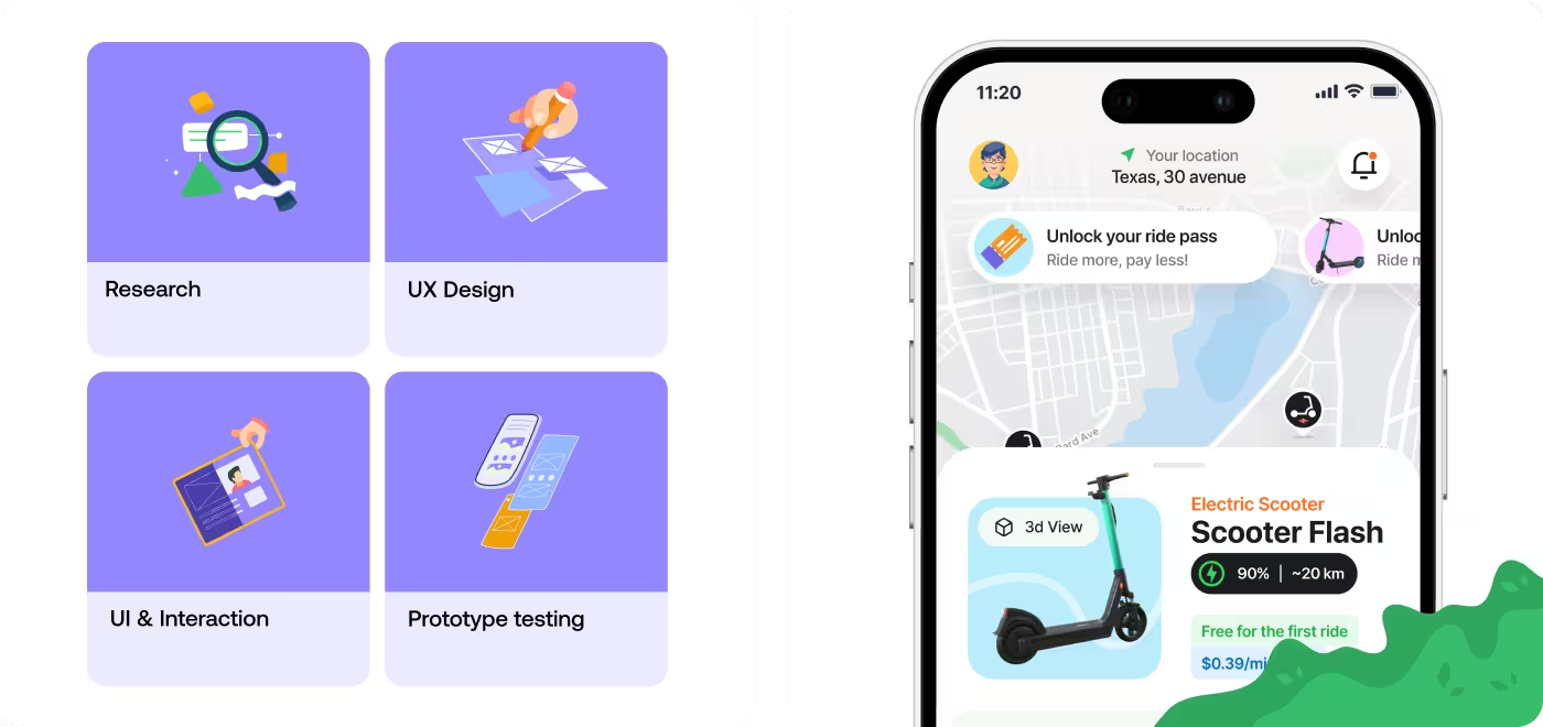
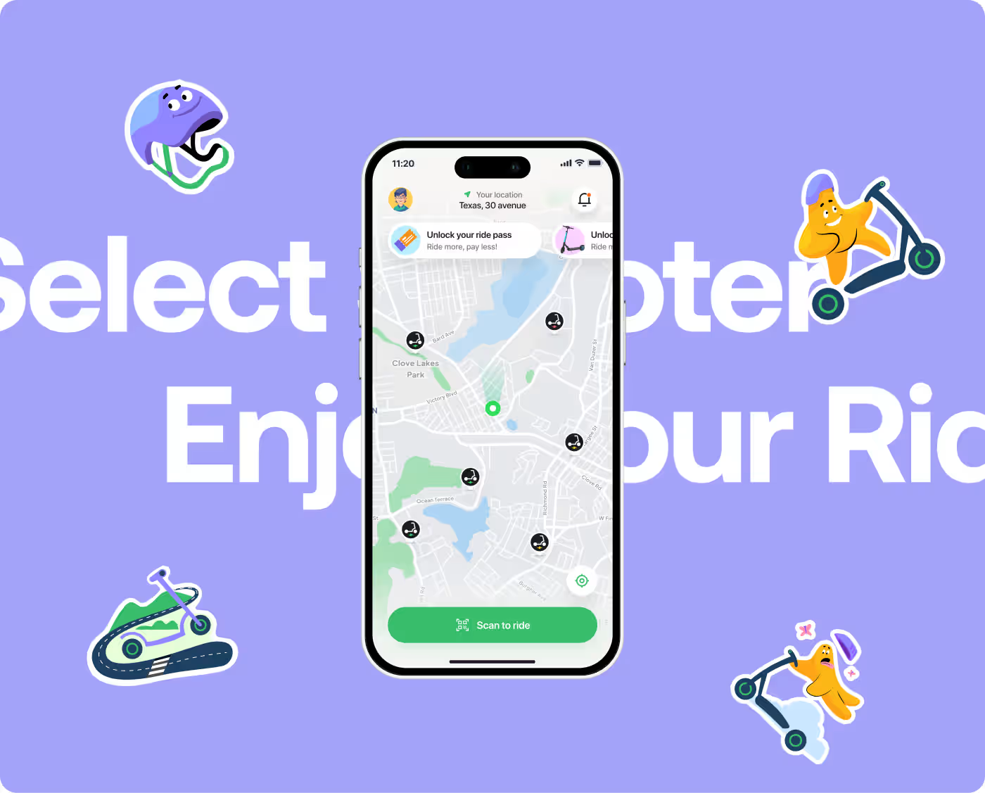
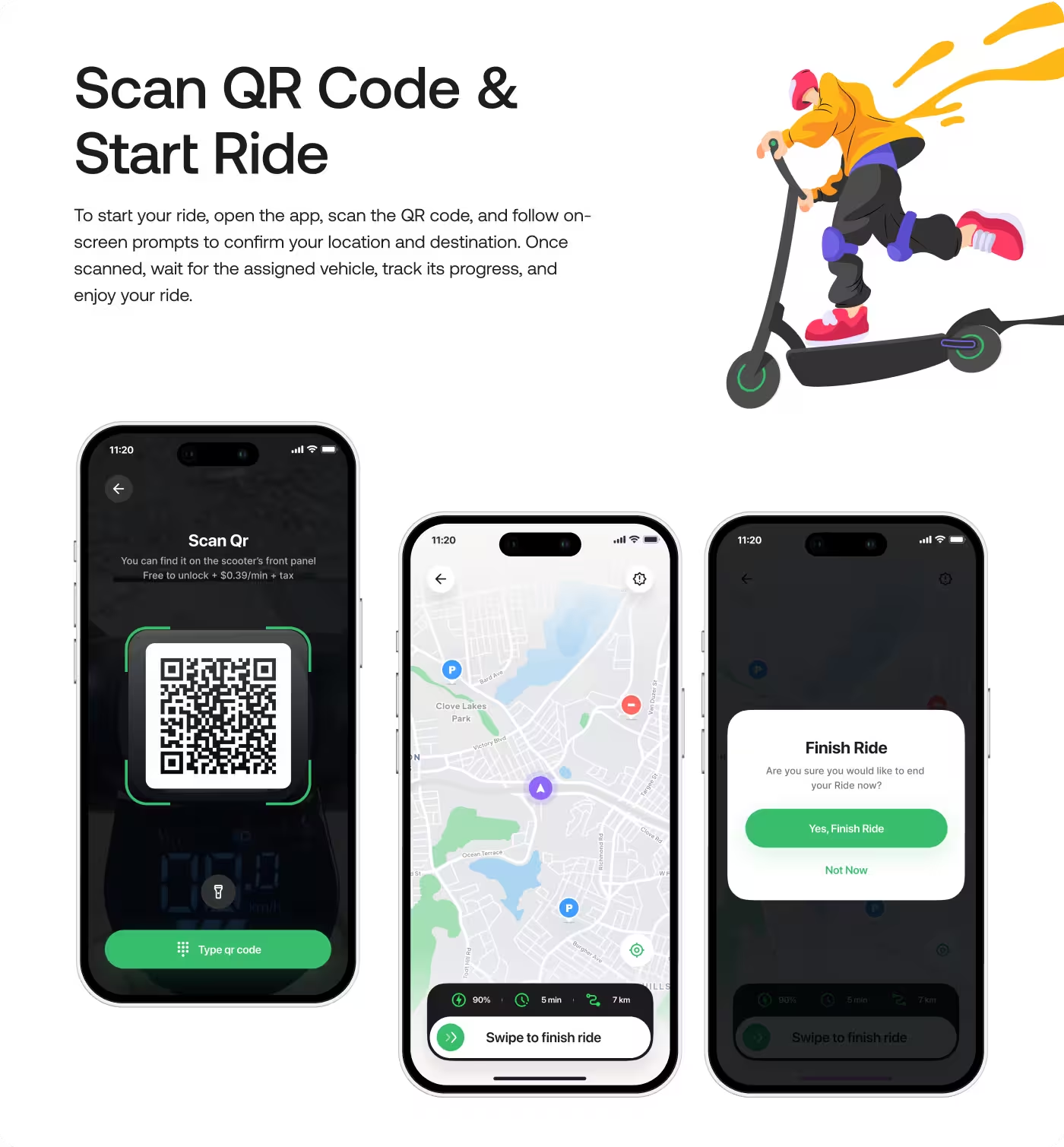
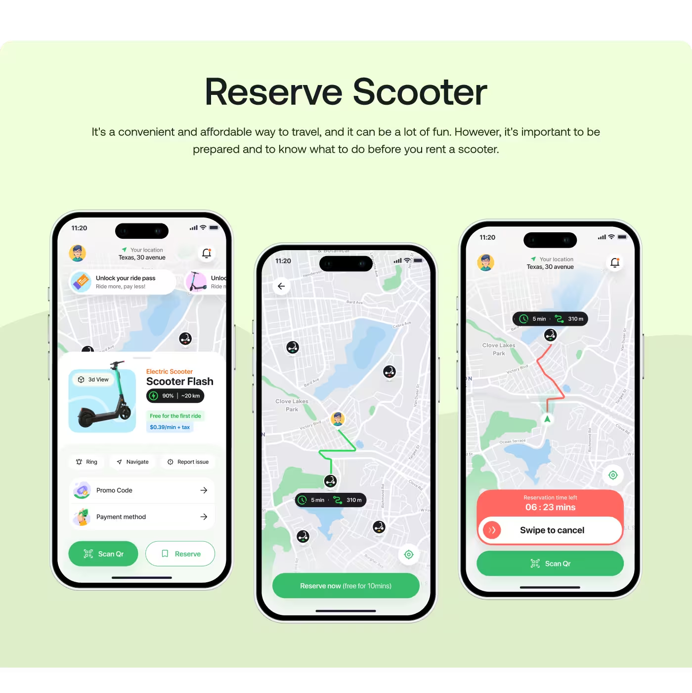
Fastgo Scooty is a shared e-scooter app built for one thing: getting urban commuters from point A to point B without the wait.
The project focused on making the entire process - from finding a nearby scooter to paying for the ride completely frictionless. Because the product is entirely time-sensitive, the design had to match the speed of the real world.

Design for speed. People using Fastgo are not opening the app to explore features; they are standing on a sidewalk, in a hurry, and trying to get somewhere. Our job was to design an interface that gets them on a scooter as fast as humanly possible, while still making sure they have enough information to choose the right scooter and stay safe.
PROBLEM
The App Was Too Hard to Follow
People needed help keeping up with daily medication and health details, but the app was making that feel more complicated than it should.
- Too much information: The screen showed a lot at once, so it was easy to miss what mattered most.
- No clear next step: Users could see data, but they could not quickly tell what they should do next.
- Hard for older users: The app felt too busy and too complex for seniors to use with confidence.
- Caregivers had to dig for answers: It was not easy for caregivers to check how someone was doing at a glance.

SOLUTION
We Turned the App Into a Clear Daily Guide
Instead of showing users too much at once, we designed Wellnest to show the next step clearly and make daily health tracking feel easier.
Bullets:
- Clear daily tasks: We made the app show what the user should do next, not just a wall of data.
- Simpler health info: We used large cards, progress bars, and plain labels so the important details were easy to scan.
- Calm visual style: We chose soft colors and a gentle layout so the app felt supportive, not stressful.
- Caregiver view: We also gave caregivers a quick way to check progress, adherence, and patient status without digging around.
PROCESS
We Kept Things Simple on Purpose
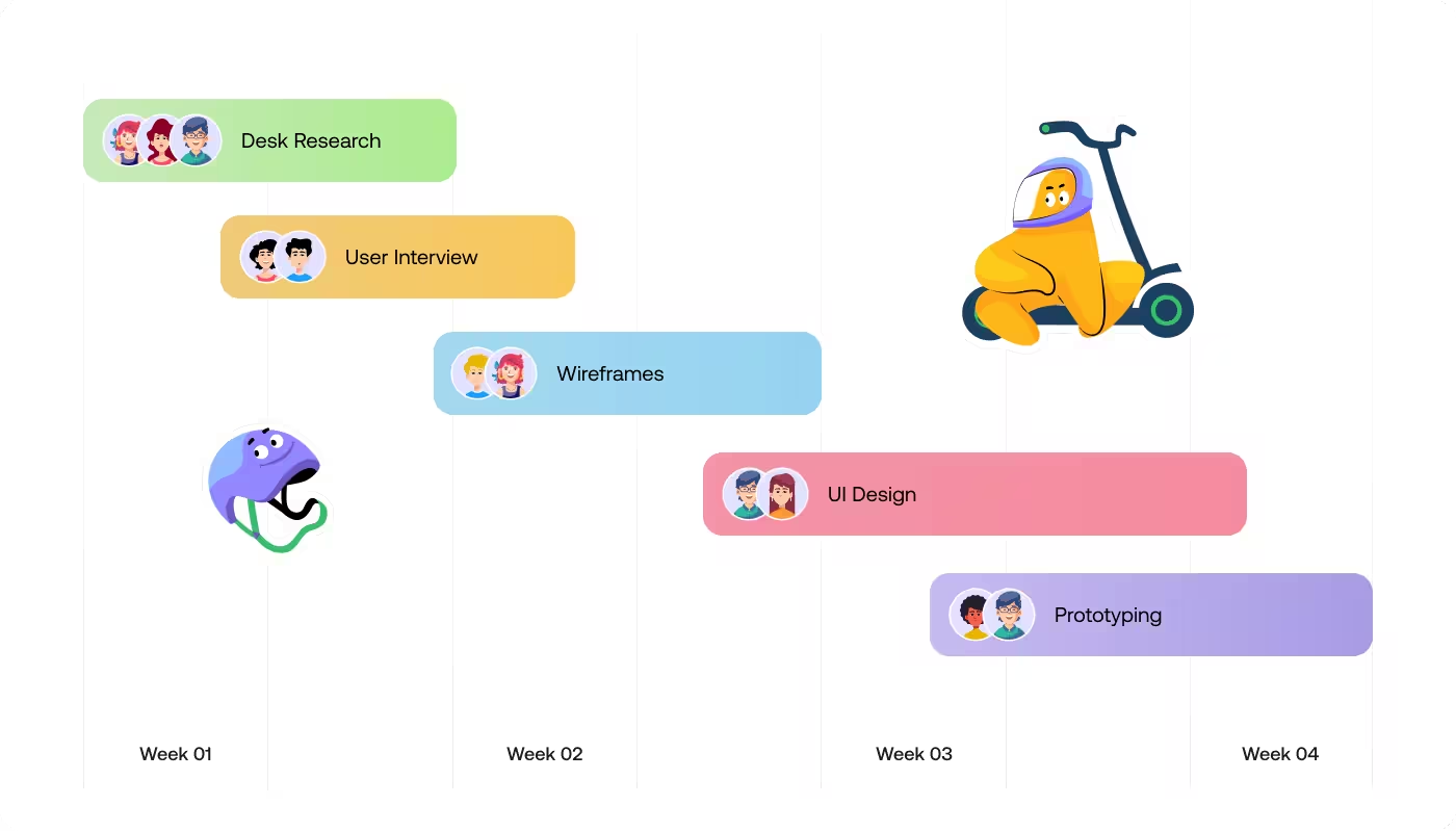
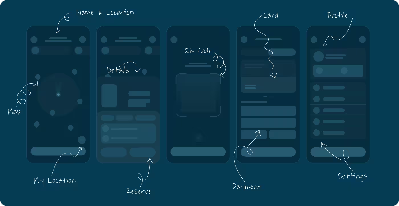
The goal was to make the app feel easy to use, so we broke the experience into small steps that were easier to understand and act on.
01
Understand
- Find the pain points
- See what users need
- Keep the focus on important tasks
02
Simplify
- Show less at once
- Use simple labels
- Make the next step easier to spot
03
Design
- Keep the layout clean
- Make important info stand out
- Use a style that feels friendly, not clinical
04
Refine
- Improve anything that felt confusing
- Make the flow easier to follow
- Keep the experience consistent across screens
RESEARCH
We Studied What Seniors and Caregivers Needed Most
Before designing, we looked at how older adults handle daily medication and what caregivers need to check without feeling overwhelmed.
- Older users need clarity fast: The biggest thing we found was that seniors do better when the app shows one clear action at a time.
- Too much data creates stress: Charts and numbers can be useful, but only if they are easy to understand right away.
- Caregivers need quick updates: They do not want to search through screens just to see if medication was taken or if something changed.
- Simple wording matters: Plain language helps the app feel less clinical and makes it easier for people to trust and use.
Services
Made the App Easier to Follow
The main focus was to turn a confusing health experience into something that felt simple and clear. Older users needed to understand what to do next without digging through too much information, so the flow was shaped around that.
We designed the app around daily tasks, not just data. That meant fewer steps, clearer labels, and a more direct path to the most important actions. For caregivers, the flow also needed to make it easy to check progress without searching around.
Services
Gave the App a Calm and Readable Look
The visual side of the app was built to feel soft, friendly, and easy on the eyes. Since the users included older adults, the interface needed to be clean, with enough space, clear contrast, and simple sections that were easy to scan.
Large cards, gentle colors, and easy-to-read layouts helped the app feel less stressful. The design also made key health details stand out without making the screen feel crowded or clinical.

RESULTS & OUTCOMES
The App Became Easier to Use and Easier to Trust
After the redesign, the app felt more calm, more readable, and more focused on what people needed to do each day. Instead of making users work hard to understand the screen, it gave them a clearer path and made the whole experience feel less stressful.
- Clearer daily use: People could see what to do next without guessing.
- Less confusion: The simpler layout made the app easier for older users to follow.
- Faster caregiver checks: Caregivers could quickly understand a patient’s status at a glance.
- Better peace of mind: The app felt more supportive, which made daily medication tracking feel less heavy.