Rezo Real Estate App Design
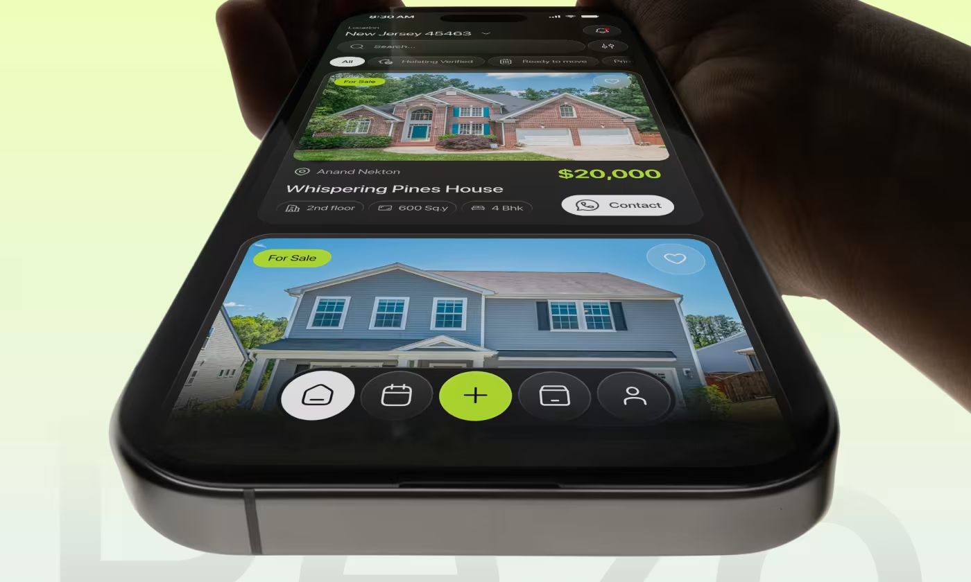
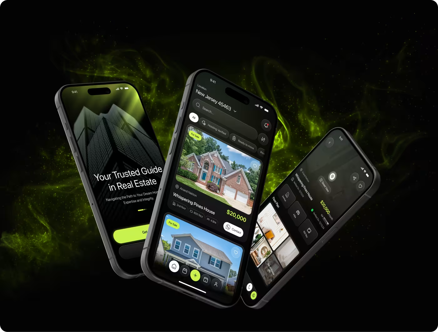
Rezo is a smart real estate platform designed to make property search easy and trustworthy.
The project focused on helping users discover trusted listings, view clear property details, and connect with expert guidance. The goal was to build an experience that makes finding a home feel safe, simple, and smart.
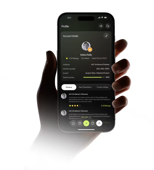
Our task was to design Rezo in a way that makes searching for properties quick and easy to understand. Users needed a clear way to browse listings, check details like pricing and layout, and find personalized service. Also, the experience had to support real estate partners by helping them present properties as trustworthy and engaging.

PROBLEM
Finding the Right Property Took More Time Than It Should
People searching for a home often have a clear goal in mind. Whether buying or renting, they want to quickly discover properties that match their needs. Instead, the experience made users spend too much time filtering listings, comparing options, and navigating complex screens.
• Property searches returned too many irrelevant results
• Important details were buried inside listing pages
• Comparing multiple properties felt difficult
• Contacting agents required unnecessary steps
• Too much information created decision fatigue
SOLUTION
Built a Faster Way to Discover and Evaluate Properties
We redesigned the experience around the actions users care about most: finding suitable properties, reviewing key details, and contacting agents quickly.
• Simplified the property discovery process
• Highlighted key listing information earlier
• Improved search and filtering experience
• Made agent contact actions more accessible
• Used visual elements to reduce cognitive load
Images, maps, and clear property cards helped users evaluate options faster.
PROCESS
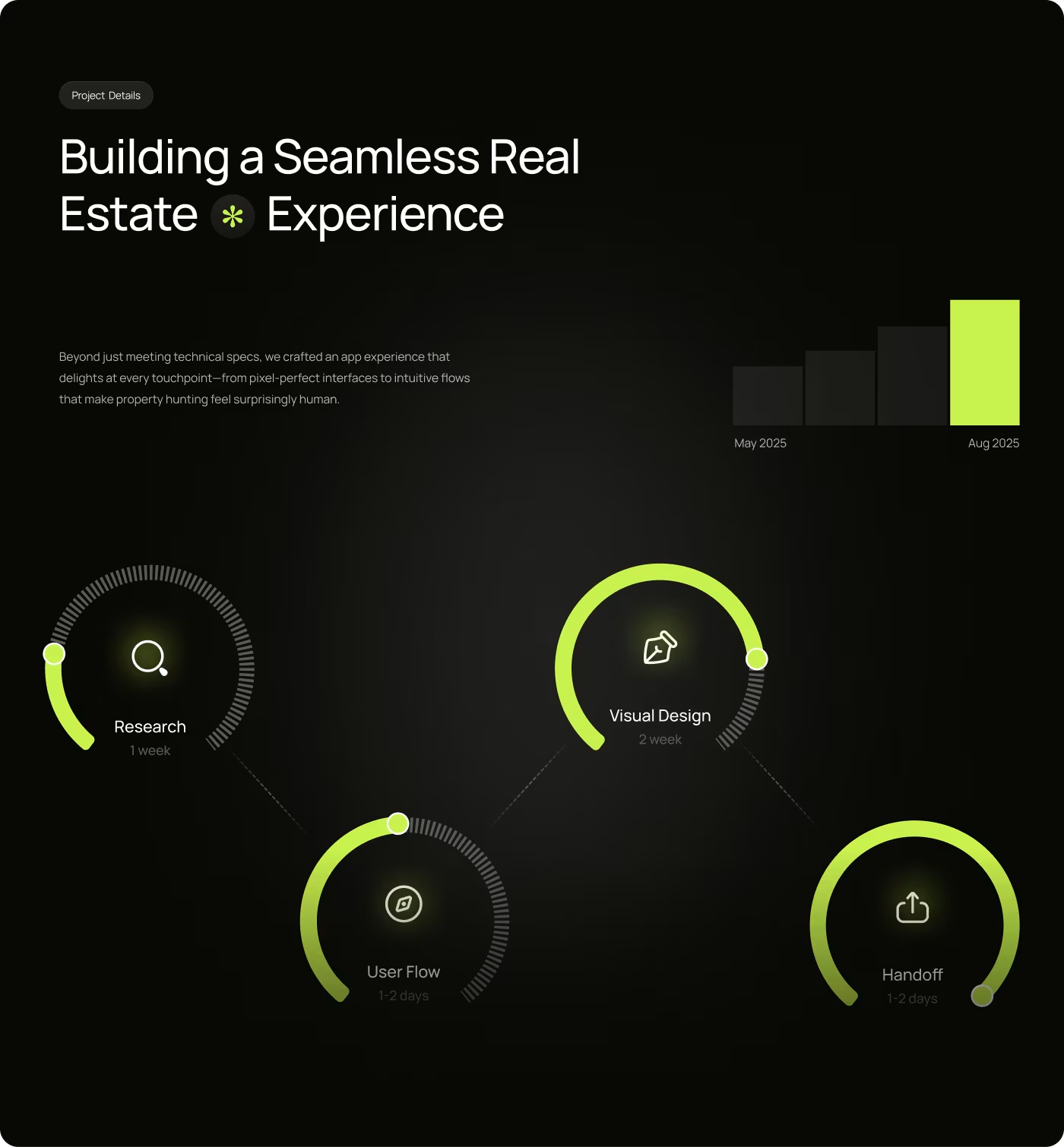
How We Turned Property Research Into a Simpler Home Search Experience
Before designing the final product, we explored user behavior, identified pain points, and refined every step of the property discovery journey.
01
Research
- 01We began by understanding how people search for homes and where existing platforms create friction.• Competitor Analysis• Market Research• User Behavior Analysis• Real Estate Platform Review
02
User Interviews
- 02Next, we focused on understanding the goals, frustrations, and decision-making process of buyers and renters.• User Interviews• Journey Mapping• Pain Point Analysis• User Insights
03
Wireframes & UX Flow
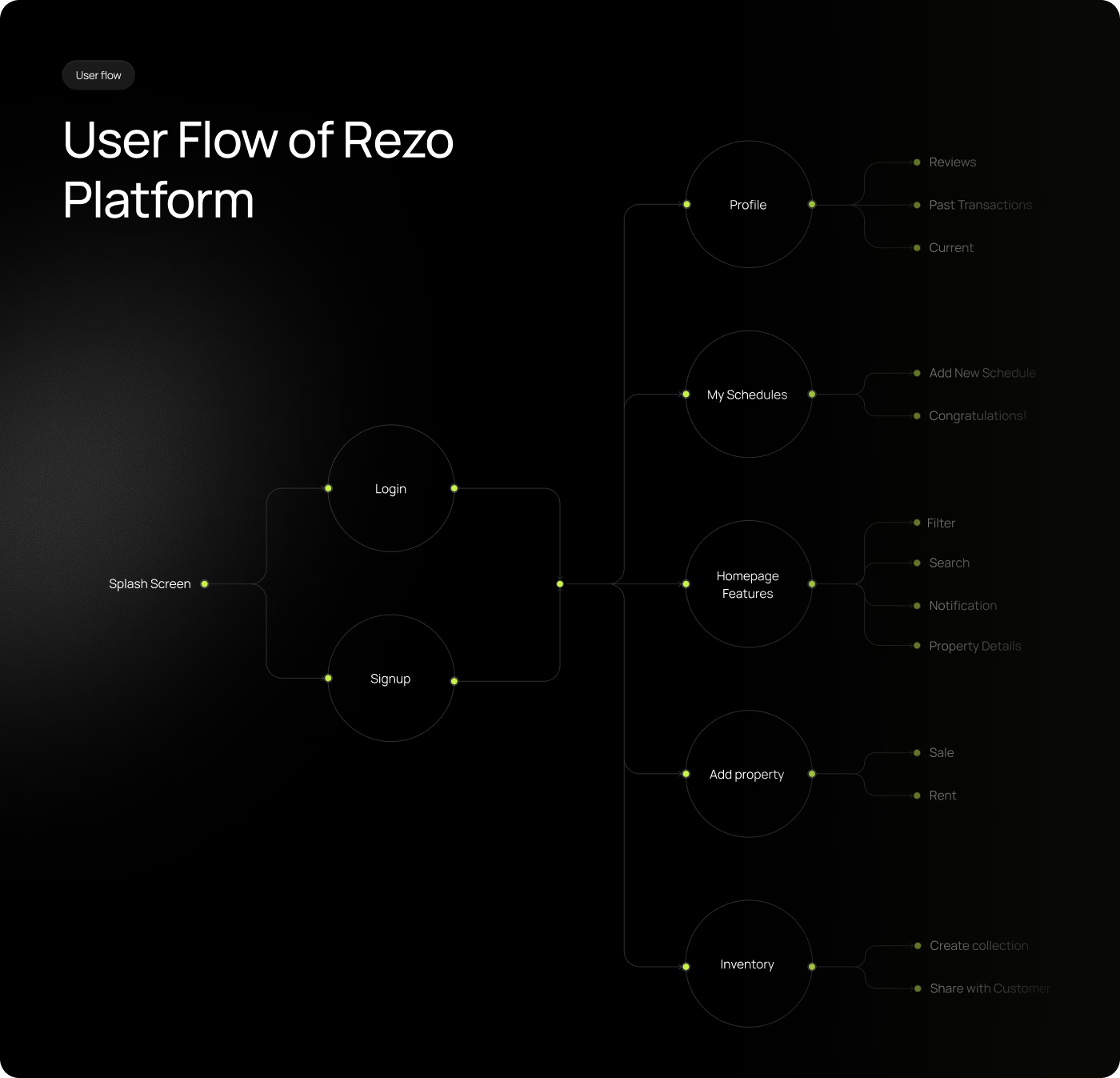
- 03Using research findings, we created a simpler structure for searching, exploring, and comparing properties.• User Flows• Information Architecture• Low-Fidelity Wireframes• Flow Validation
04
UI Design & Prototype
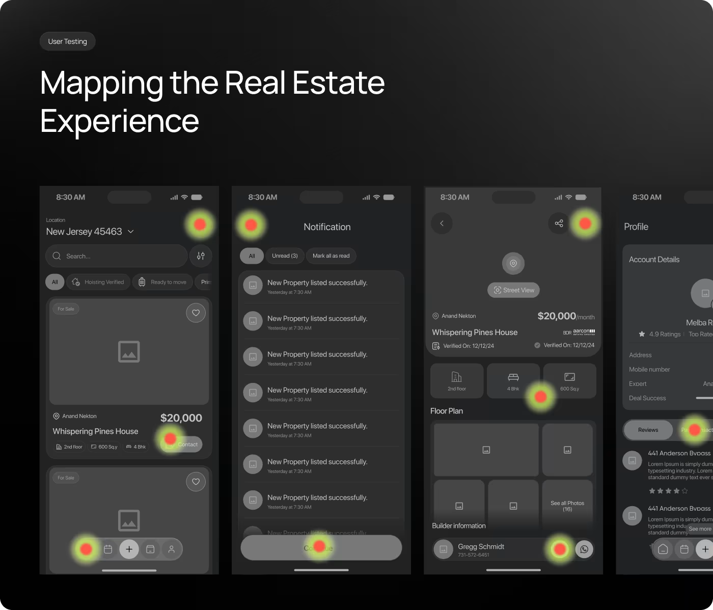
- 04After validating the experience, we transformed it into a complete product with intuitive interactions and polished visuals.• Visual Design• Design System• Interactive Prototype• Usability Testing
RESEARCH
Researching How People Search for Their Next Home
We analyzed user behavior, property browsing habits, and industry trends to understand what helps people make confident real estate decisions.
• Users want relevant listings quickly
Most people have a budget, location, and property type in mind before they start searching.
• Property details influence decisions
Photos, amenities, location, pricing, and property size are often the biggest deciding factors.
• Trust plays a major role
Users need confidence that listings are accurate and up to date.
• Too many options create overwhelm
People prefer focused recommendations and clear information over endless listings.
Services
Designing a Simpler Property Search Journey
The experience was designed around helping users find the right property with less effort. Most people arrive with a specific goal, whether that's finding a family home, an apartment, or an investment opportunity.
Our UX process focused on reducing friction throughout the journey. Research, user flows, and wireframes helped simplify navigation, improve property discovery, and make decision-making easier. Every screen was designed to move users closer to finding the right property without unnecessary complexity.
Services
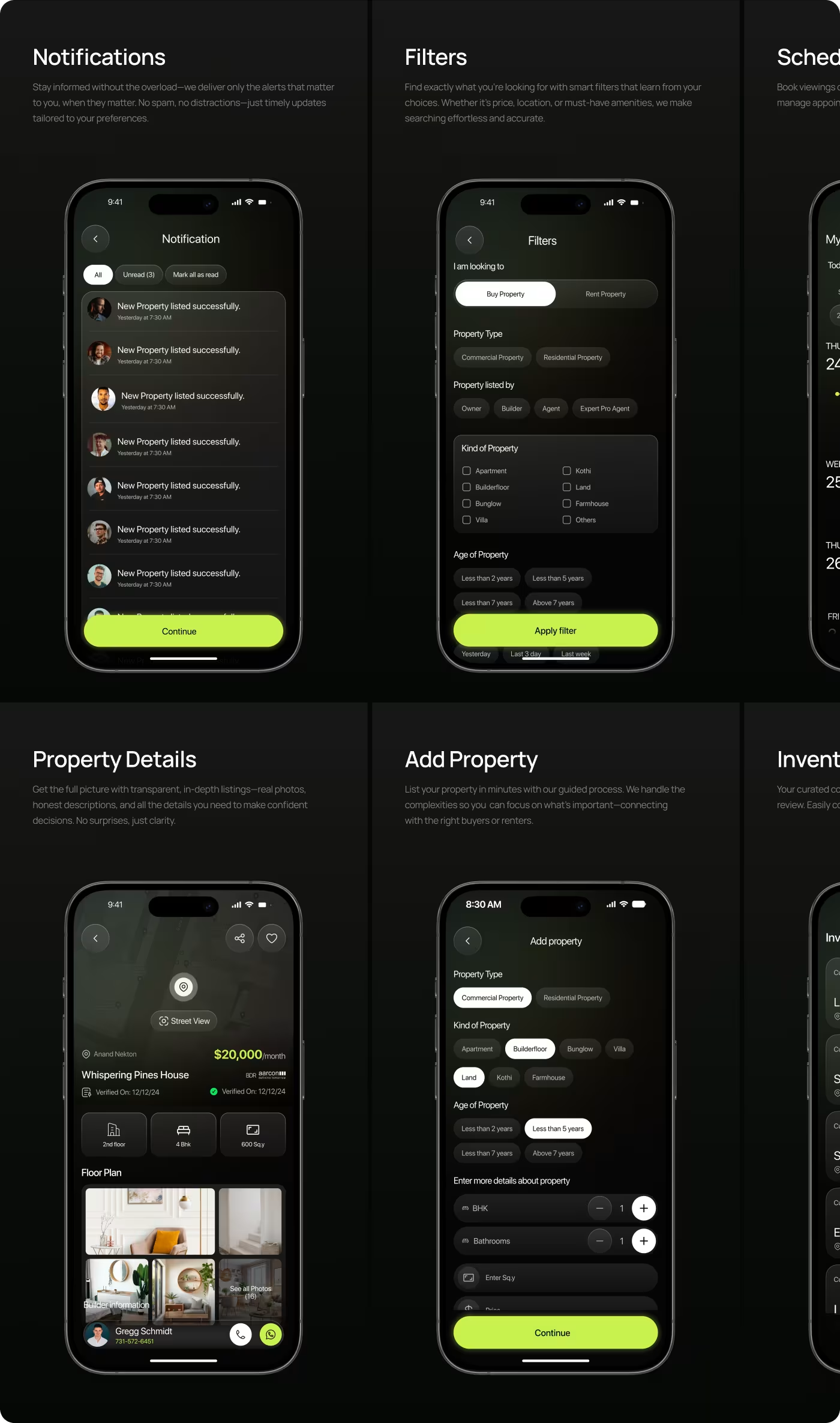
Making Property Information Easier to Explore
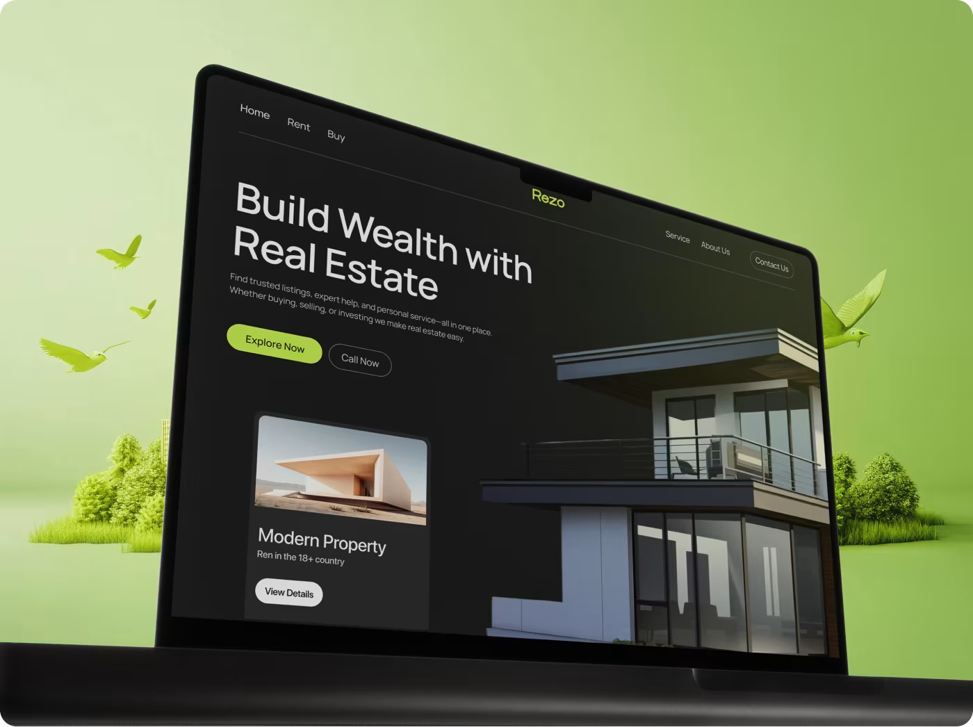
Once the user flow was simplified, the interface focused on presenting information in a clear and engaging way. Key details such as price, location, property size, and amenities were surfaced earlier to support faster decision-making.
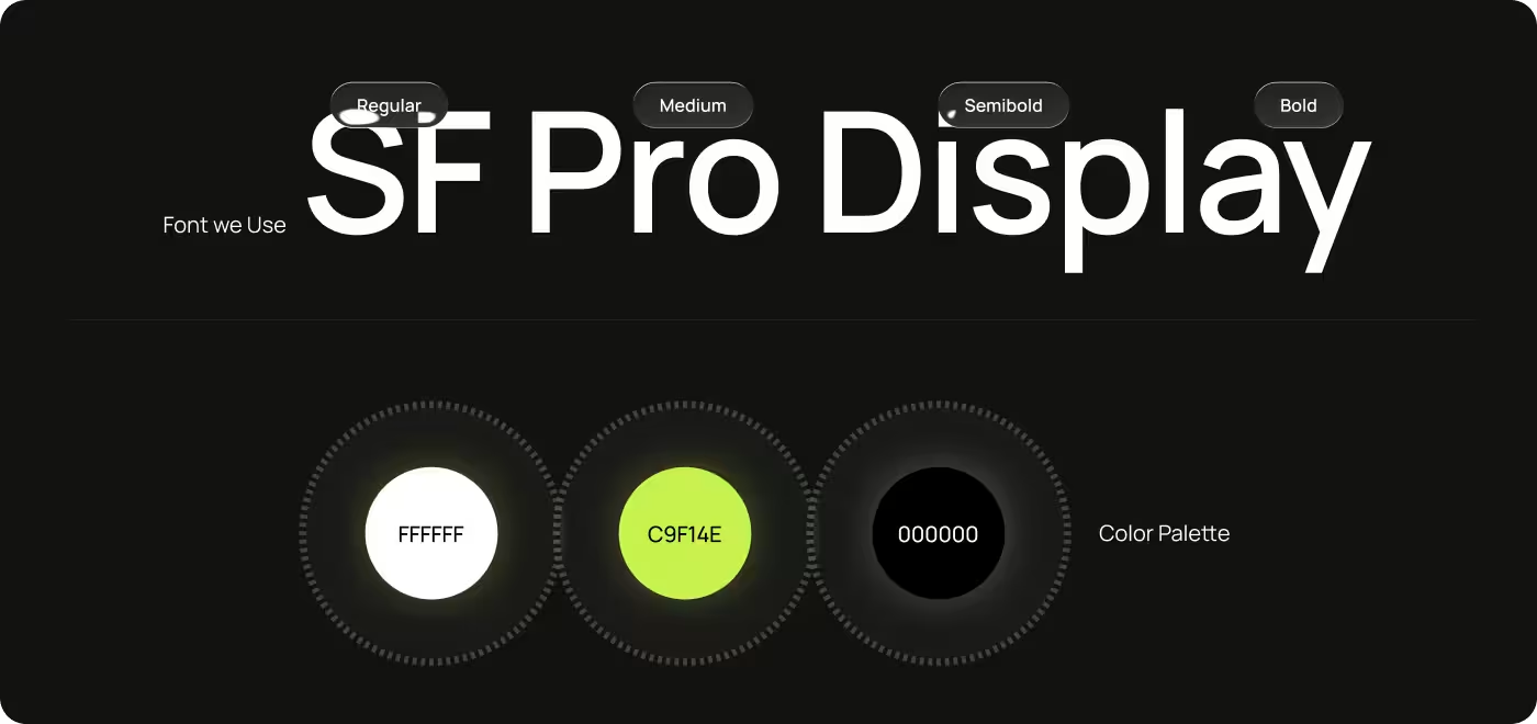
The visual design uses strong hierarchy, spacious layouts, and intuitive navigation patterns. Property cards, maps, and image galleries help users evaluate listings quickly while maintaining a clean and modern experience.
RESULTS & OUTCOMES
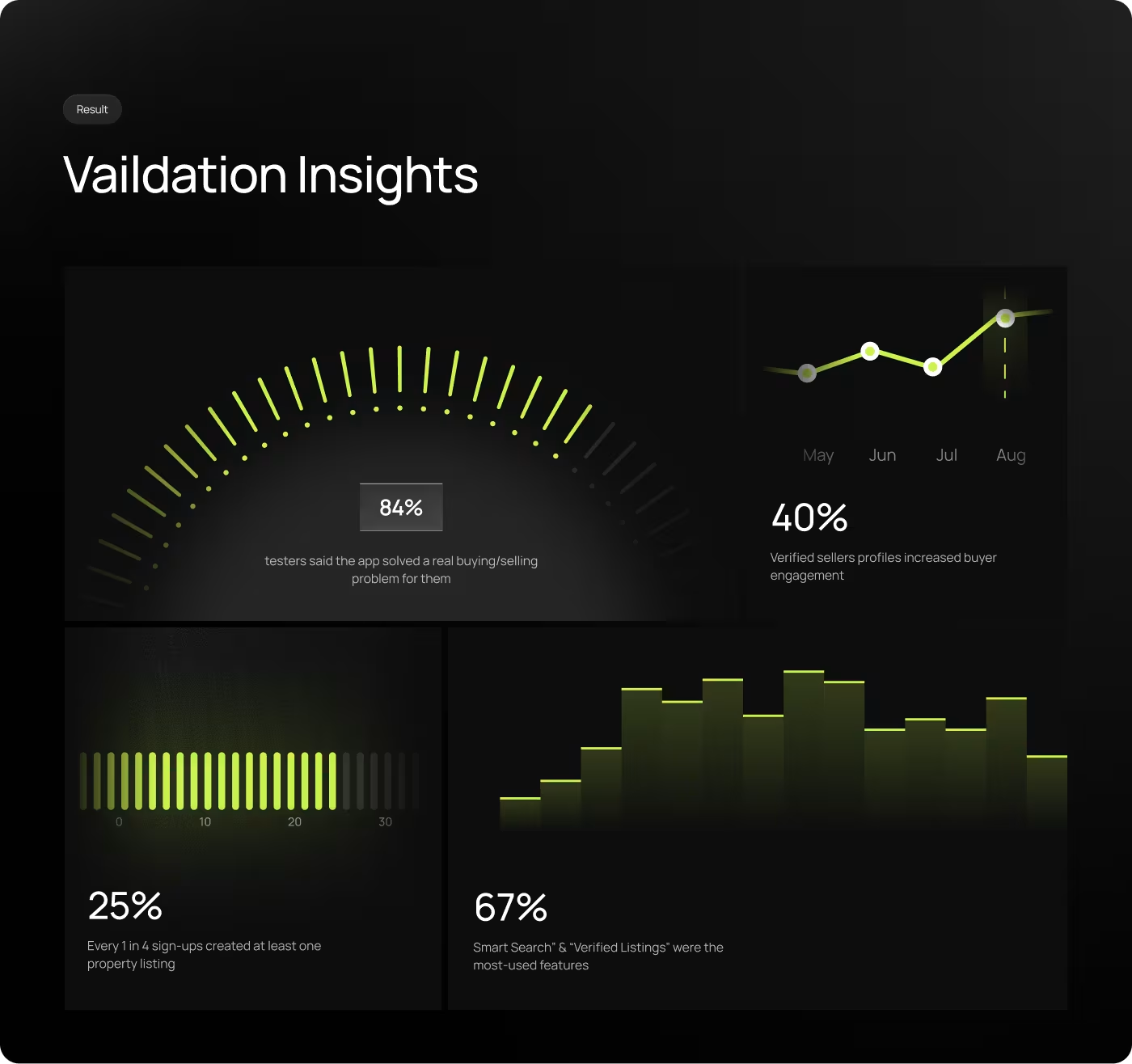
The changes made finding a property quicker to complete and easier to understand. Users could browse listings, read property details, and feel more confident without needing to double-check information.
- 40% faster property search completion
- User trust in listings improved significantly
- Drop-offs during property views reduced by 25%
- Connecting with expert guidance became smoother
- Managing property presentations became easier for agents