Swipe Drinks
UI/UX - XD

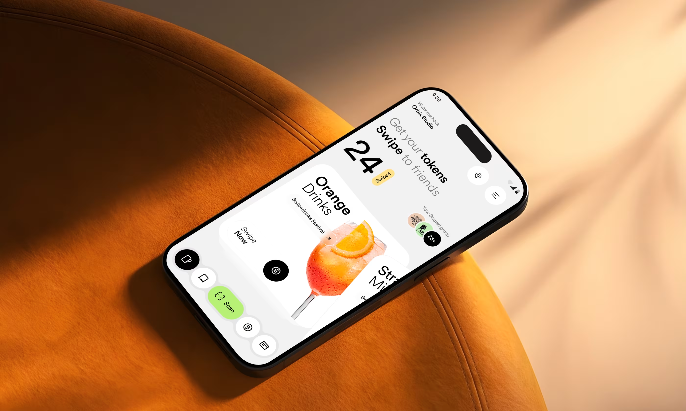
Swipe Drinks is a mobile app designed to replace cash at events by using digital tokens to buy beverages.
The project focused on making drink purchases fast and cashless, adding a social layer where users can send tokens to friends, and giving parents control over their children's spending.
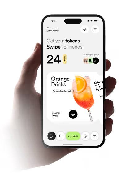
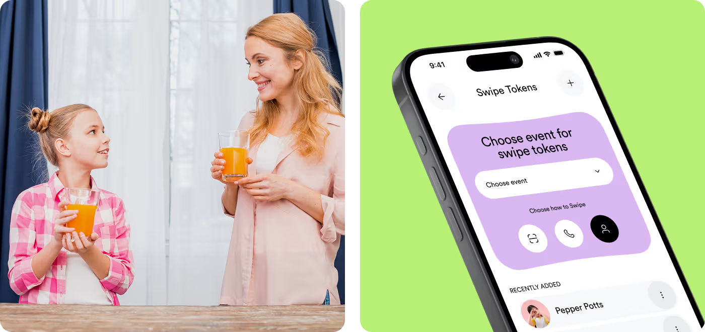
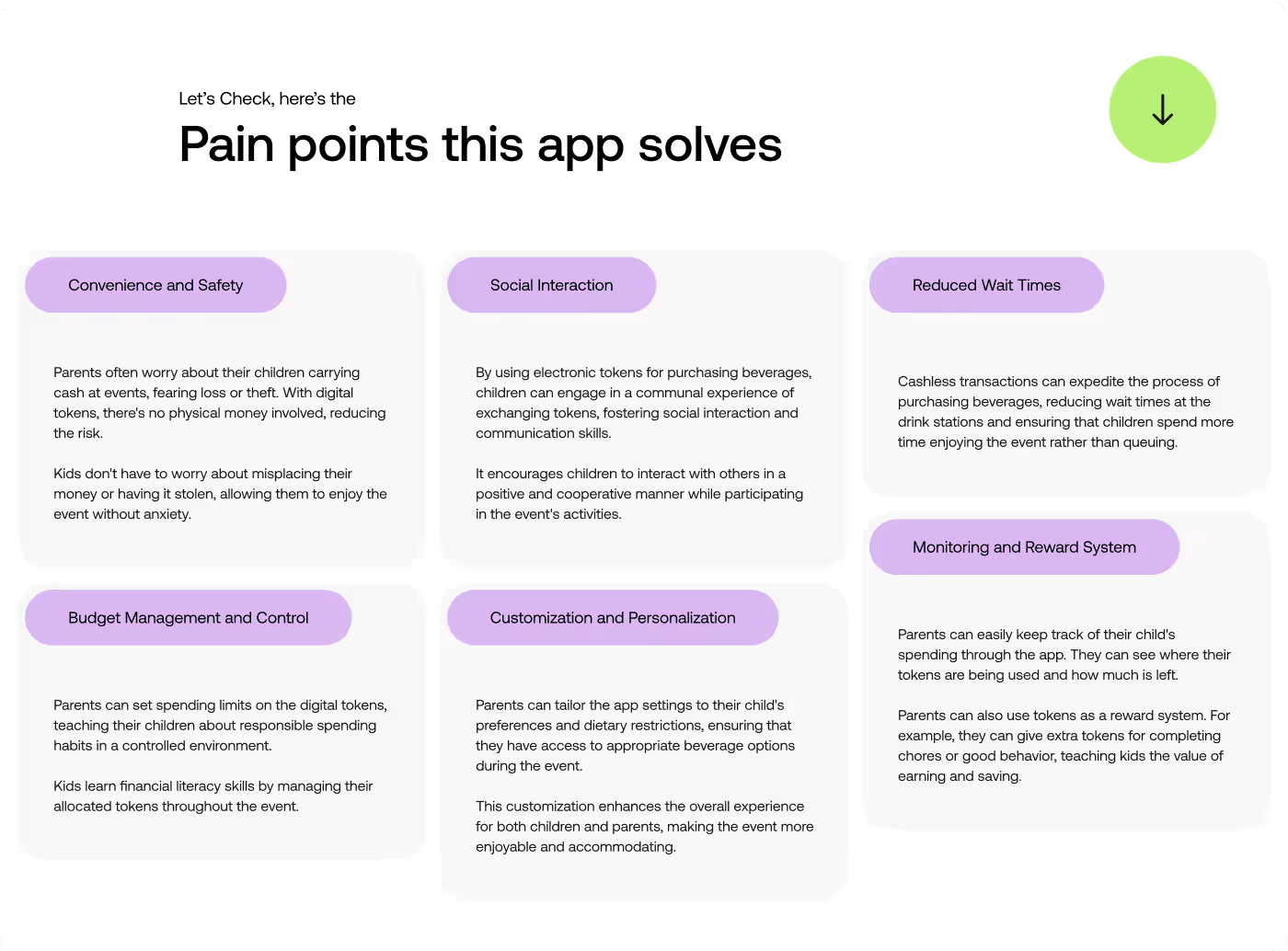
Our task was to design Swipe Drinks to serve two very different users. Kids and teens needed a fun, fast, and social way to buy drinks and send tokens to friends. Parents needed a secure way to load tokens, set spending limits, and monitor activity.
PROBLEM
People Needed a Clearer Way to Pick Drinks and Use Tokens
We had to make the flow feel easy right away, so users could see what was available, understand their token balance, and keep moving without slowing down.
- Unclear flow: Getting from the first screen to a drink choice needed to feel more direct.
- Token confusion: Users needed a simple way to see what they had and how to use it.
- Busy layout: The screens needed more structure so the main actions stood out faster.
- Weak event feel: The app had to feel tied to the event, not just like a plain drink menu.
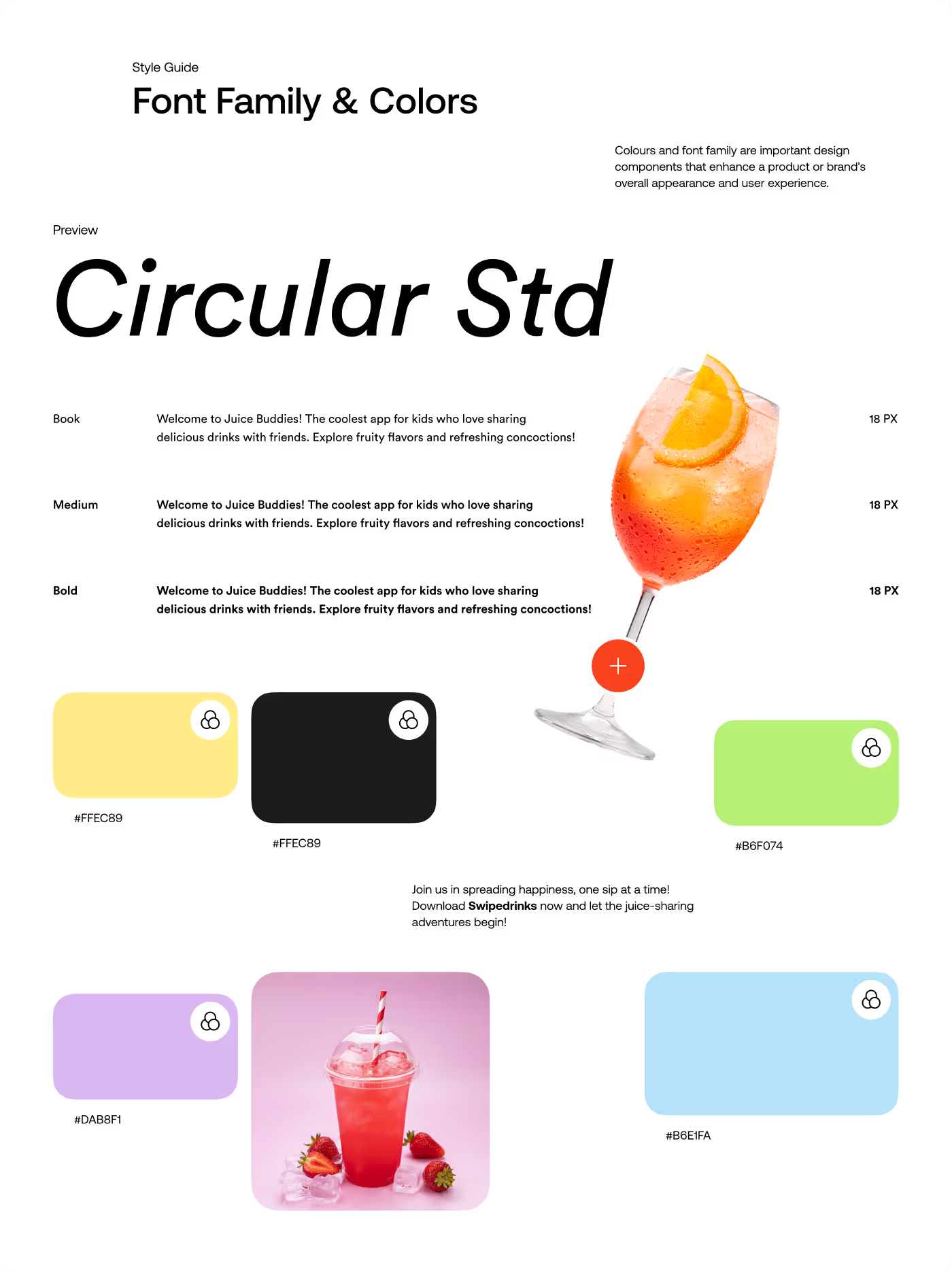
SOLUTION
Made the Drink Flow Easier to Follow
We simplified the layout, made token use easier to understand, and gave each screen a clearer path so people could move through the app without confusion.
- Clearer flow: Organized the steps so users could browse, choose, and continue more naturally.
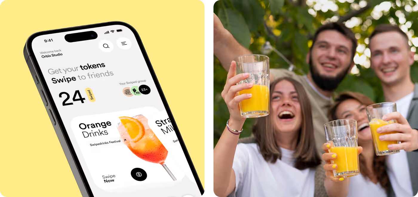
- Token visibility: Made token count and usage easier to spot at a glance.
- Stronger layout: Cleaned up the screens so the main actions felt more focused and easier to scan.
- Better event feel: We used a more playful visual style so the app felt tied to the experience.
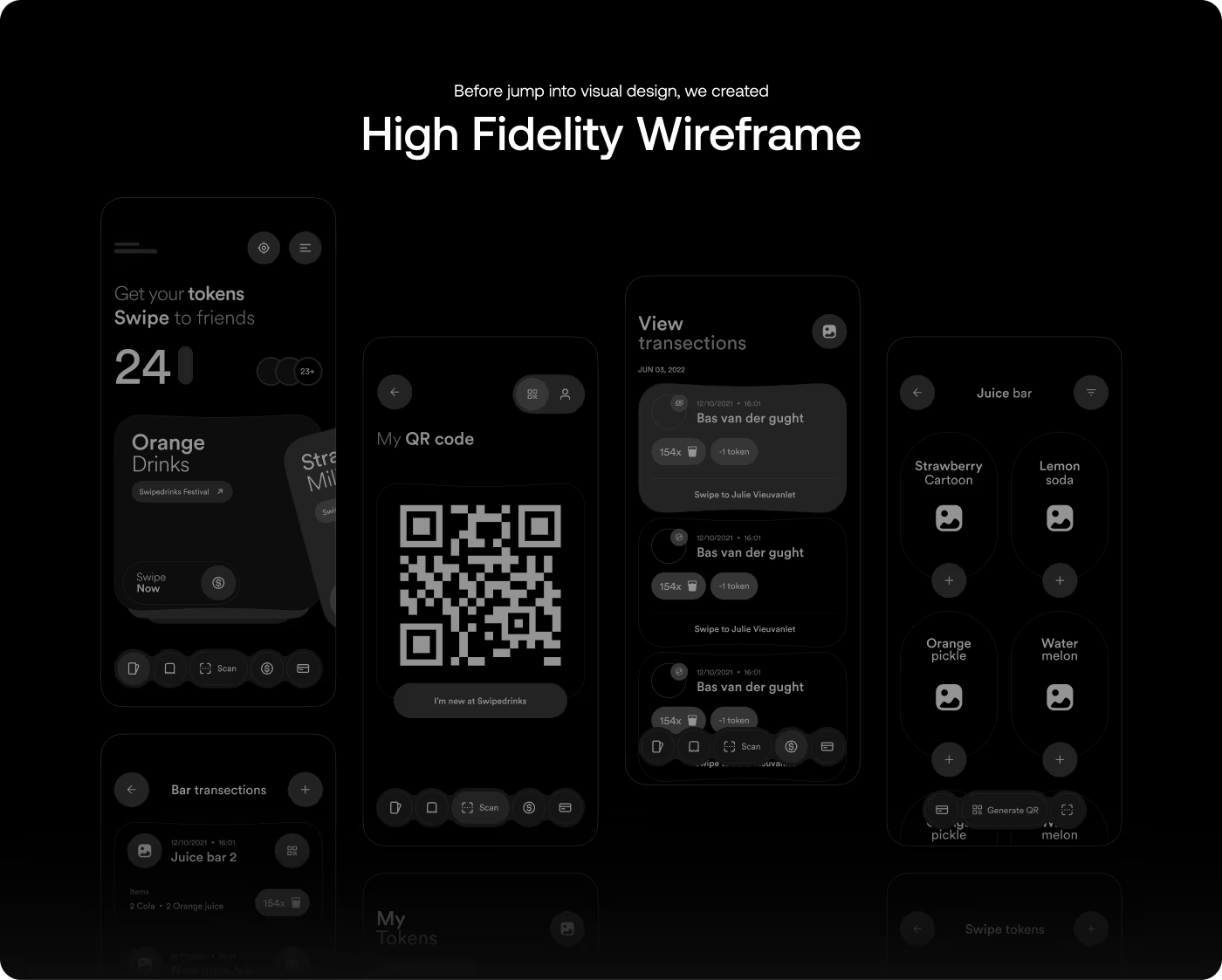
PROCESS
A Simple Design Process for Swipe Drinks App
The work focused on clearing up the screens, making tokens easier to understand, and keeping the experience easy to move through.
01
Research & Discovery
- User needs
- Event flow
- Pain points
- Feature focus
02
Flow & Structure
- Journey mapping
- User flow
- Screen order
- Action placement
03
Visual Design
- UI design
- Visual style
- Interaction states
- Mobile layout
04
Delivery & Refinement
- Final cleanup
- Design handoff
- Feedback updates
- Last refinements
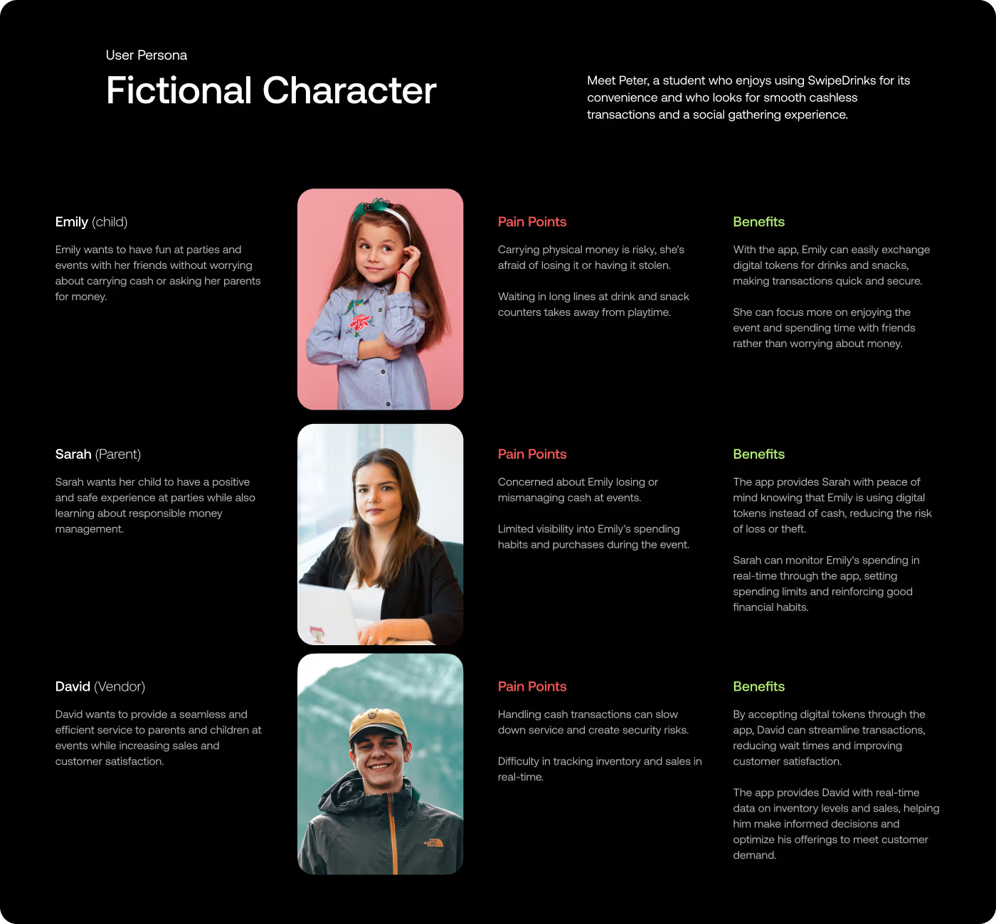
RESEARCH
What People Needed From the App
We looked at how the app would work in a real event setting, what users would need to understand fast, and where the experience might slow down.
- Event use: Looked at how the app would fit into a live event setting.
- Drink choice: Checked how people would browse and pick drinks.
- Token flow: Reviewed how token use should be shown clearly.
- Fast actions: Found that the experience needed to feel quick and easy.
Services
Making the Flow Easy to Understand
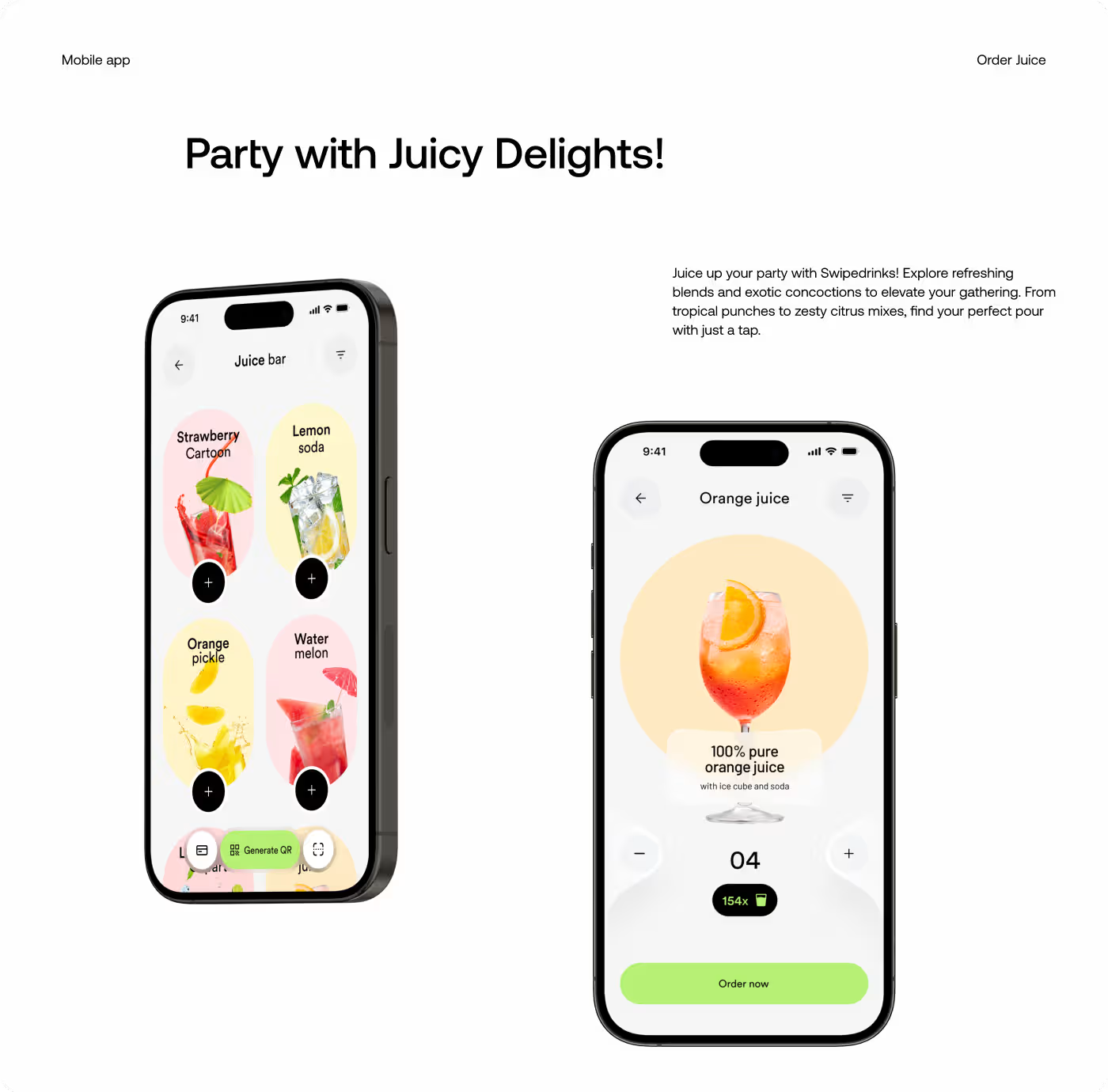
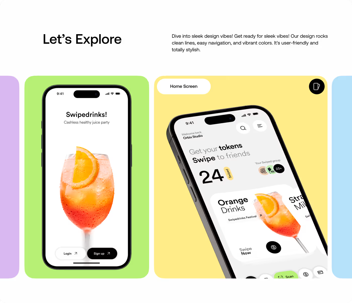
The first part of the work focused on how people would move through the app. The goal was to make the steps feel clear from the start, so users could understand the drink flow without stopping to figure things out.
That meant looking at how the token system worked, where the screen could feel confusing, and how each step could lead into the next one more naturally. The layout was kept simple so the main actions stayed easy to see.
Services
Giving the App a Fun, Event-Ready Look
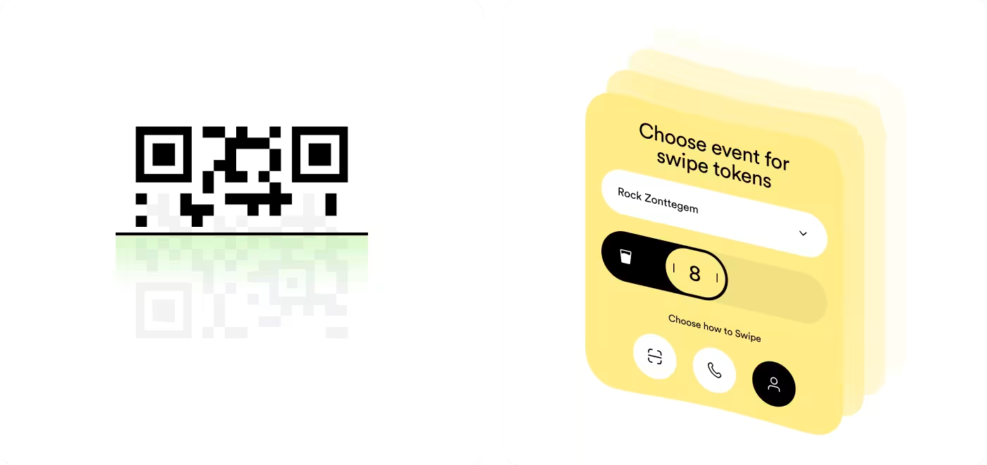
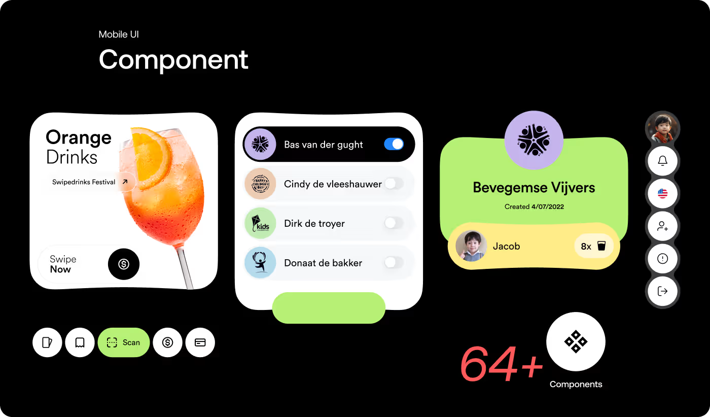
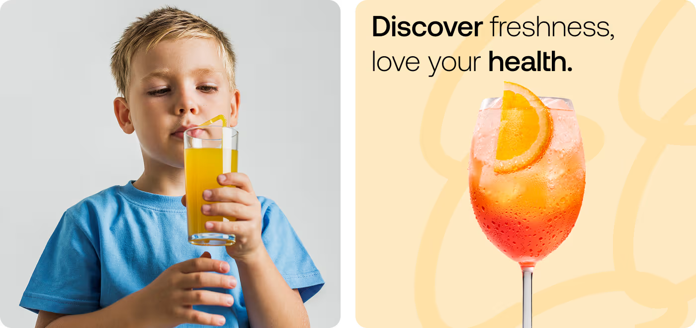
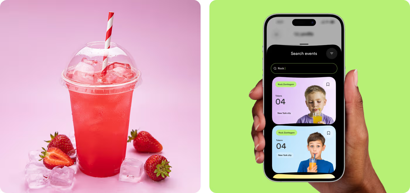
The visual side focused on making the app feel bright, playful, and tied to the event experience. The design needed to feel light and easy, while still looking polished and well put together.
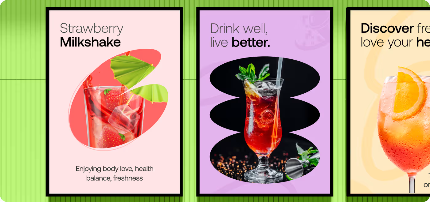
Color, spacing, and image treatment were used to make the screens more engaging without making them feel busy. The final look helped the app feel more alive and made the drink experience feel more interesting to use.
RESULTS & OUTCOMES
A Cleaner App That Was Easier to Use
After the design work, the app felt more organized, easier to scan, and smoother to move through. The main actions stood out better, the token part made more sense, and the whole experience felt more ready for an event setting.
- Clearer flow: The path from opening the app to choosing a drink felt easier to follow.
- Better token view: Users could see token info more quickly, with less confusion.
- Less clutter: The screens felt cleaner and gave the important parts more space.
- Stronger event feel: The visual style made the app feel more fun and more connected to the experience.