
Flowrix website
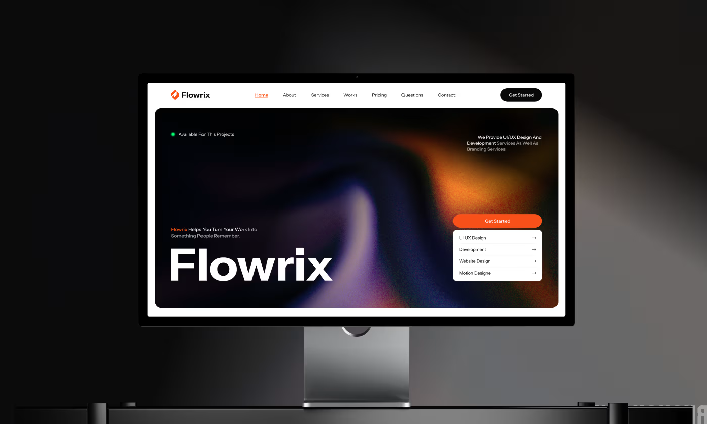
Flowrix is a personal finance platform designed to help users track income, expenses, and overall financial activity in one place.
The project focused on transforming a dense, overwhelming web experience into a clear, guided interface that makes financial management feel effortless.
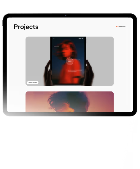
Our objective was to redesign the Flowrix website to eliminate user confusion. We needed to restructure how financial information and product features were presented, ensuring visitors could instantly understand the product's value and take action without feeling overwhelmed.
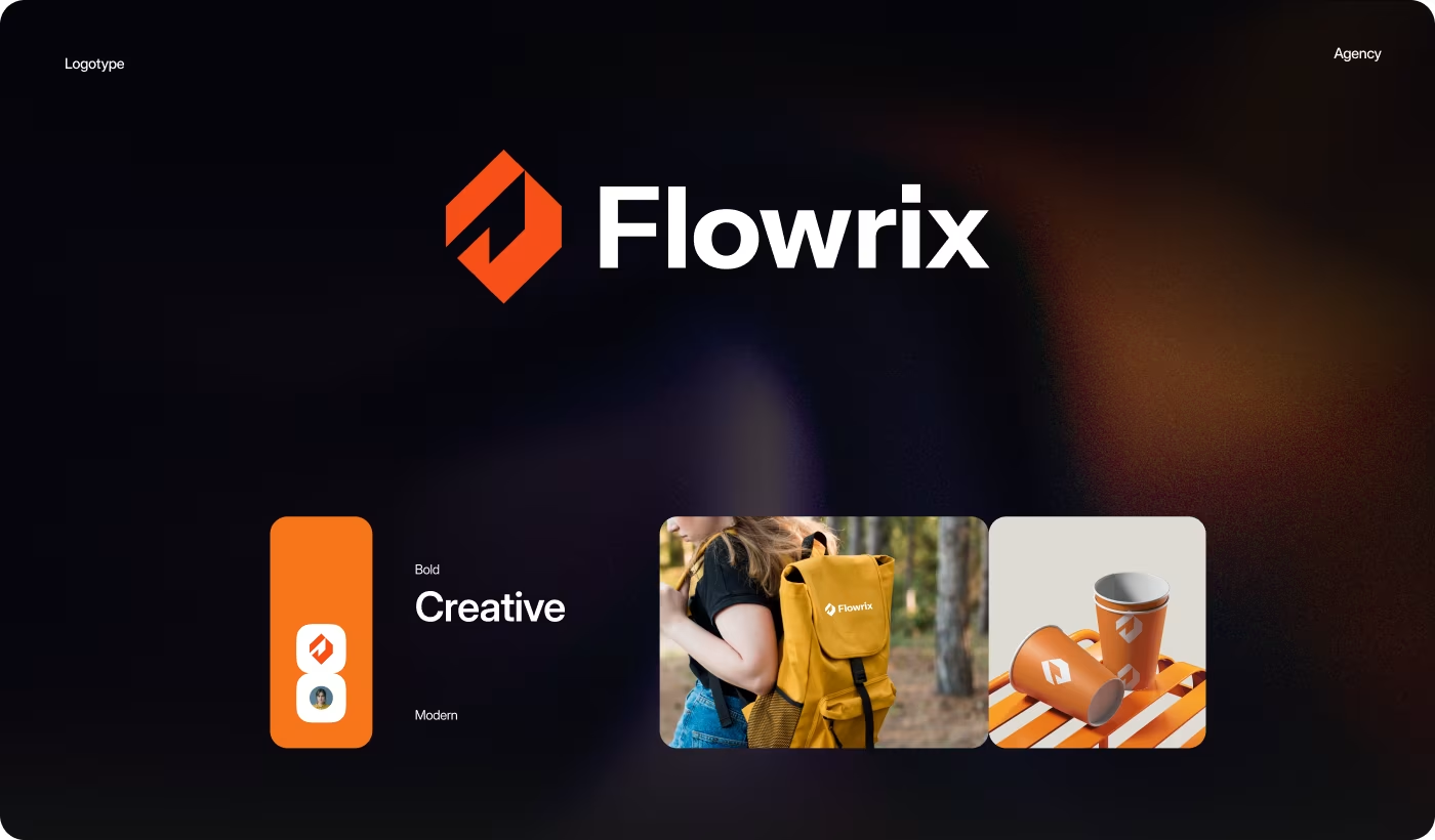
PROBLEM
Making Financial Information Easier to Understand
The biggest challenge was reducing the overwhelming feeling users experienced when trying to explore the platform and understand its financial features.
- Crowded Interface: Too much information was displayed at once, making the website feel difficult to scan and navigate.
- Weak First Impression: The homepage did not clearly explain what the platform does or why users should care.
- Unclear Feature Structure: Financial tools and services were presented without enough context or logical flow.
- Inconsistent Visual Experience: Different layouts and UI styles made the platform feel less polished and trustworthy.
SOLUTION
Creating a Clearer and More Structured Finance Experience
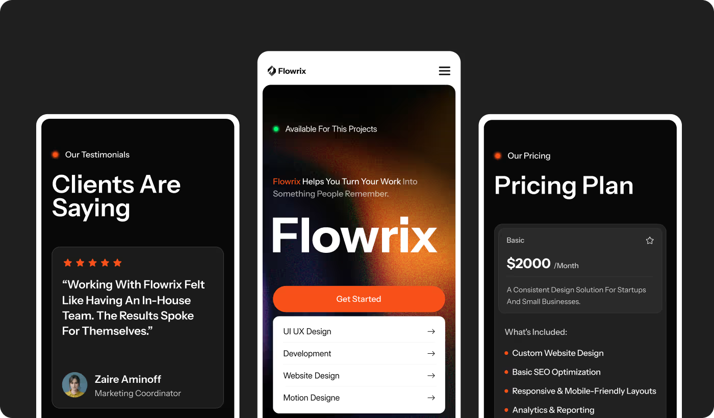
The website was redesigned to simplify financial information, improve visual clarity, and guide users through the platform in a more organized and understandable way.
- Simplified Page Structure: Content sections were reorganized to make information easier to scan and understand.
- Clearer User Journey: The homepage and feature sections were redesigned to guide users more naturally through the platform.
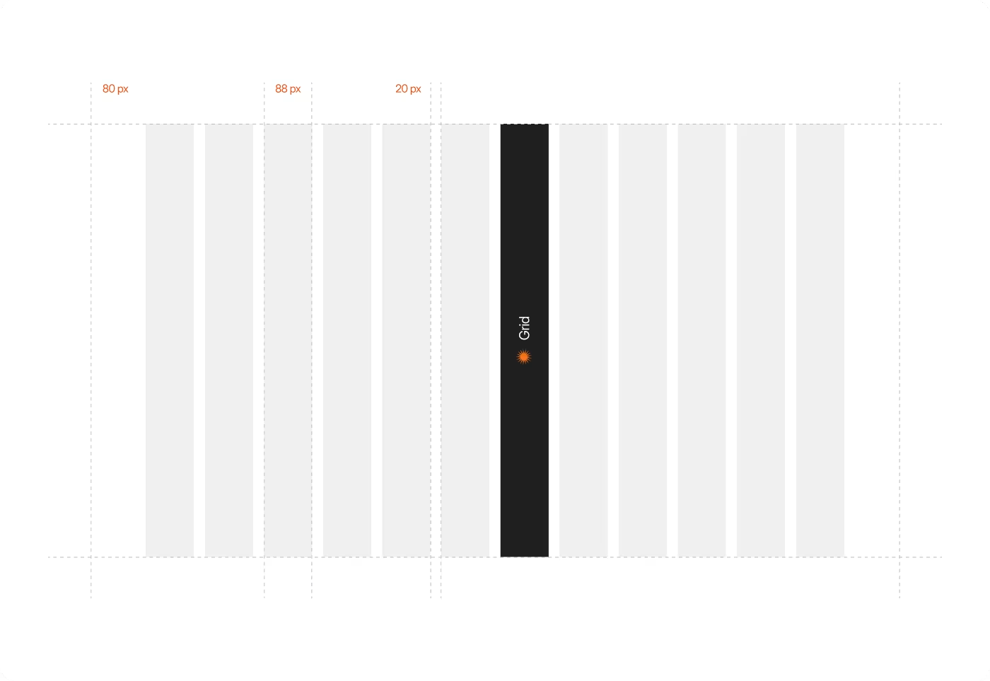
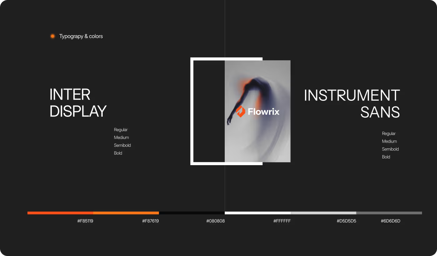
- Consistent Visual System: Shared typography, colors, spacing, and UI components created a more connected experience.
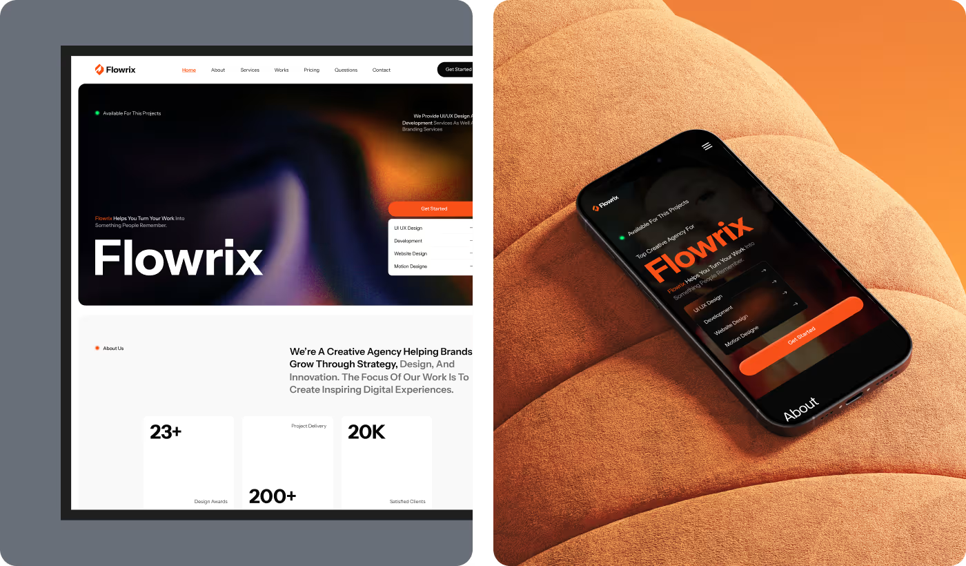
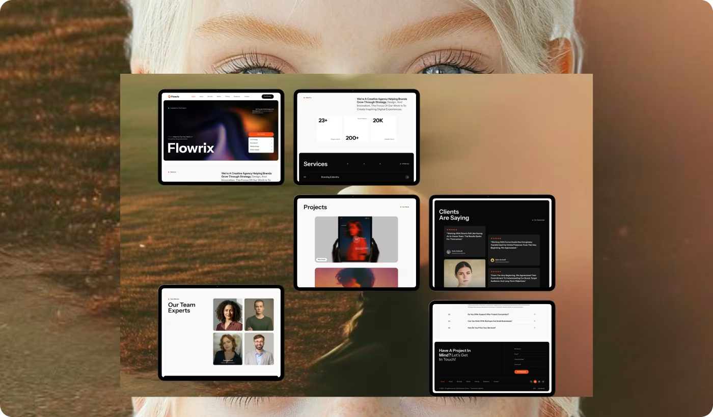
- Responsive Experience Design: The interface was optimized across desktop and mobile devices to maintain clarity on every screen size.
PROCESS
Designing a Cleaner and More Guided Finance Experience
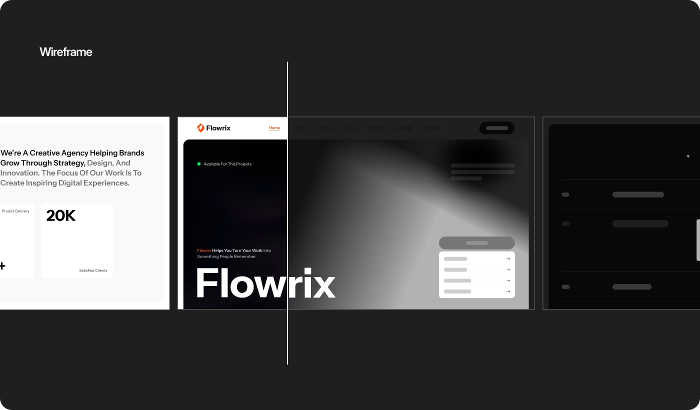
The redesign process focused on simplifying the website structure, improving clarity, and creating a more organized user journey across the platform.
01
Discovery
- Homepage review
- Content analysis
- Navigation issues
- User behavior
02
Structure Planning
- Clearer sections
- Better hierarchy
- Simpler layouts
- Guided flow
03
Visual Direction
- Typography system
- Color consistency
- UI components
- Brand alignment
04
Experience Refinement
- Mobile optimization
- UI polishing
- Faster navigation
- Consistent experience
RESEARCH
Creating a Clearer and More Structured Finance Experience
The website was redesigned to simplify financial information, improve visual clarity, and guide users through the platform in a more organized and understandable way.
- Simplified Page Structure: Content sections were reorganized to make information easier to scan and understand.
- Clearer User Journey: The homepage and feature sections were redesigned to guide users more naturally through the platform.
- Consistent Visual System: Shared typography, colors, spacing, and UI components created a more connected experience.
- Responsive Experience Design: The interface was optimized across desktop and mobile devices to maintain clarity on every screen size
Services
Simplifying the Financial Browsing Experience
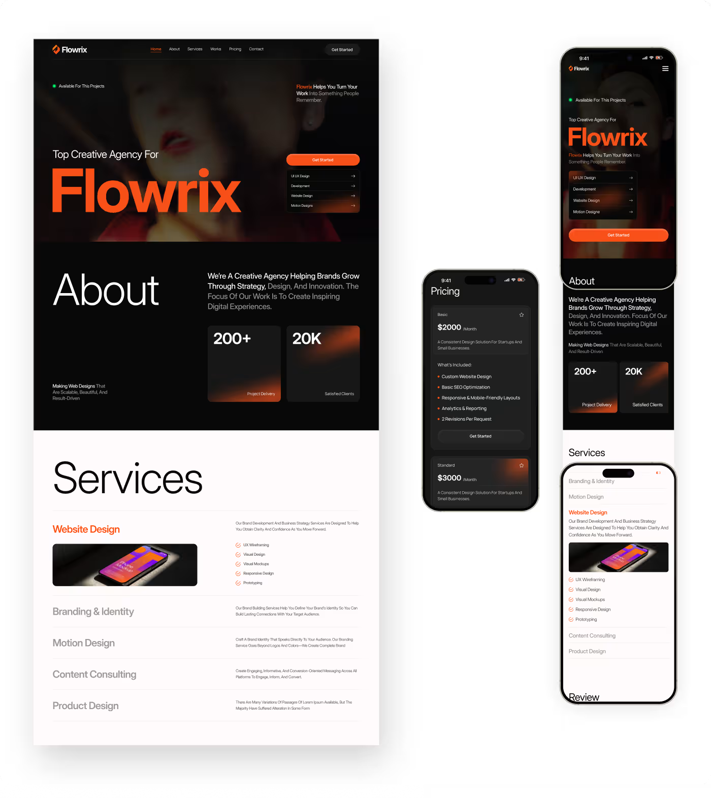
The website experience was redesigned to make financial information feel easier to understand and less overwhelming for users. Instead of presenting too much content at once, the structure focused on guiding visitors through the platform step by step with clearer sections and better content hierarchy.
The homepage and feature areas were reorganized to explain the product more naturally and help users understand what the platform offers without needing to read through dense blocks of information. Layouts and navigation patterns were simplified to create a smoother browsing experience across the site.
Services
Building a More Consistent and Trustworthy Interface
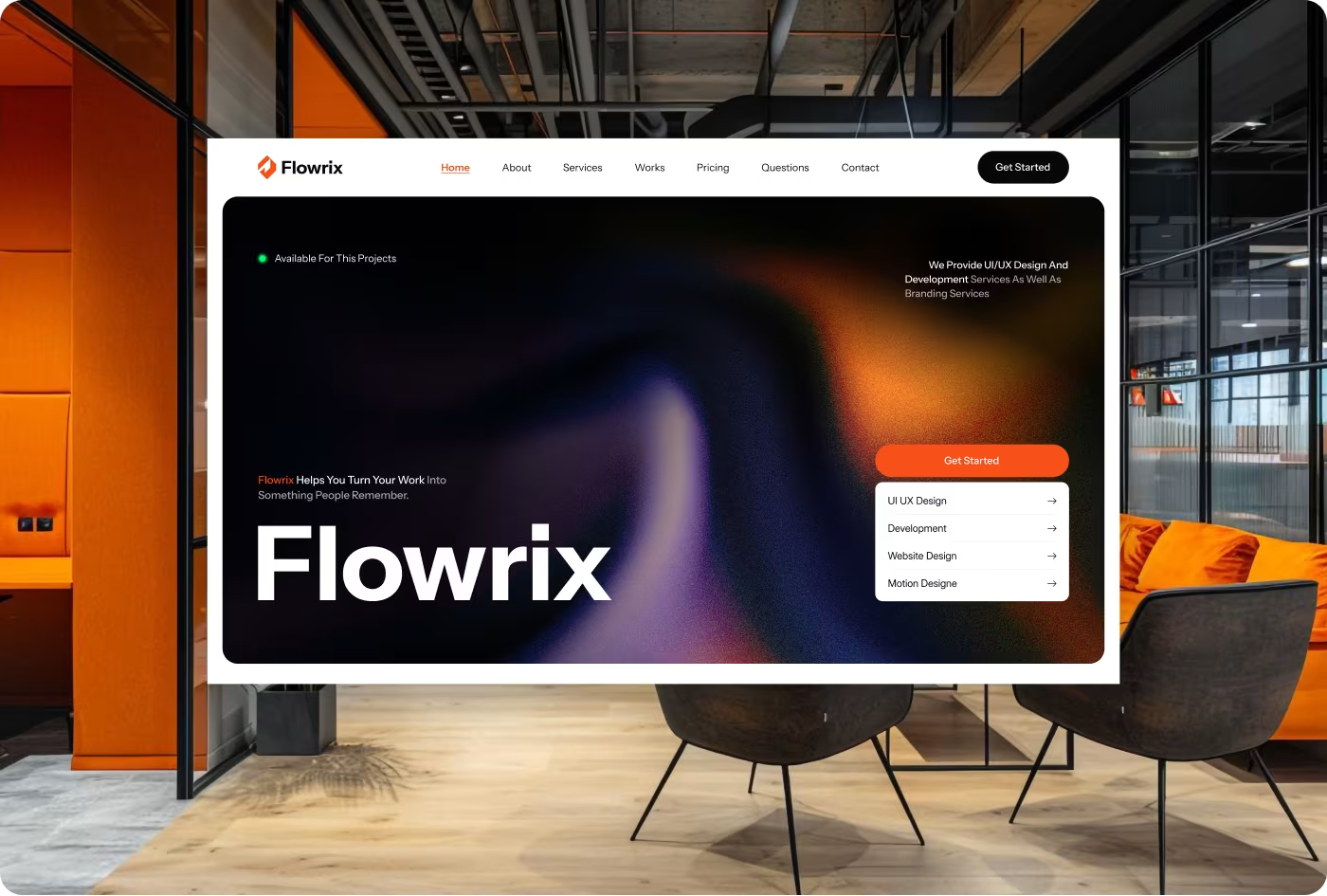
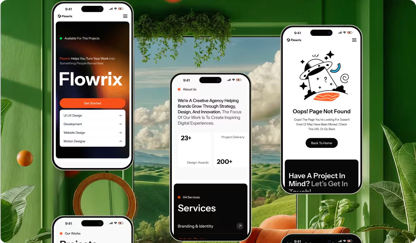
The interface was redesigned to create a cleaner and more connected visual system across the platform. Shared typography, spacing, colors, and UI components helped the website feel more polished and reliable while improving readability throughout the experience.
The darker visual direction and structured layouts were refined to support better focus on important content and actions. Responsive screens were also carefully optimized to maintain the same clarity and usability across desktop and mobile devices.
RESULTS & OUTCOMES
Creating a Clearer and More Engaging Finance Experience
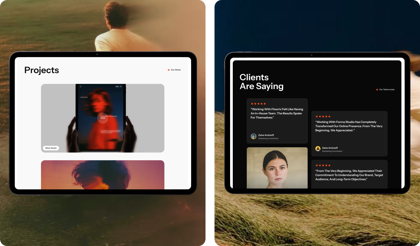
The redesigned website helped users understand the platform faster, navigate financial information more comfortably, and interact with the product with less confusion. The final experience also created a stronger sense of trust and consistency across the platform.
- Higher CTA engagement: Primary call-to-action clicks increased by 46% after simplifying the homepage structure.
- Better user interaction: More users continued exploring the website, with scroll depth increasing by 52%.
- Longer browsing sessions: Average session duration improved by 33% due to clearer layouts and content flow.
- Lower bounce rate: The redesigned experience helped reduce landing page exits by 27%.